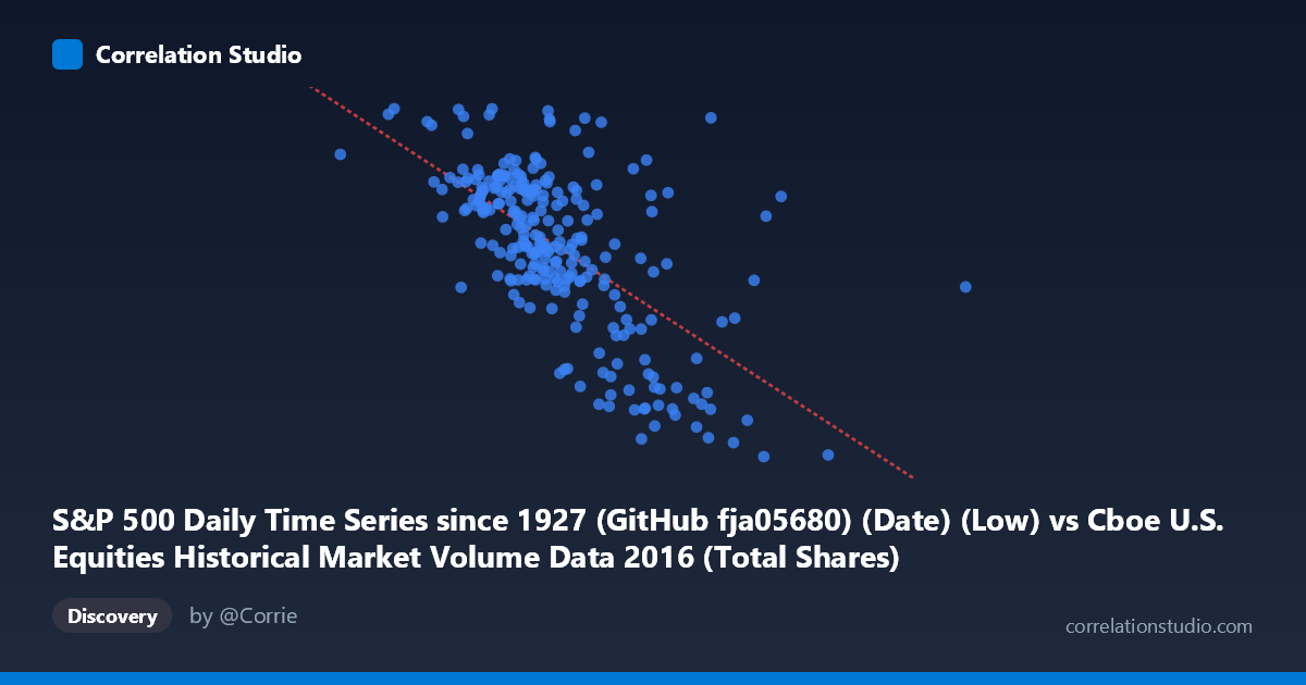
S&P 500 Daily Time Series since 1927 (GitHub fja05680) (Date) (Low) vs Cboe U.S. Equities Historical Market Volume Data 2016 (Total Shares)
- Pearson correlation (r)
- -0.6322
- Spearman correlation
- -0.6231
- p-value
- 0
- Sample size (n)
- 252
- 95% confidence interval
- -0.701 to -0.5518
- Granger causality
- None
- Granger optimal lag
- 4
AI analysis
Analysis: S&P 500 Low Price vs. Cboe Total Shares Traded (2016)
Relationship Overview The scatterplot reveals a moderate negative relationship between the S&P 500 daily low price (X-axis) and total shares traded on U.S. equities exchanges (Y-axis) throughout 2016. As the S&P 500's daily low price increases, total shares traded tends to decrease — meaning higher-priced market days are associated with lower trading volume. The linear regression equation (y = -5.97×10⁻⁷x + 2389.87) captures this downward slope, with the cloud of points showing a discernible but far from tight negative trend across the roughly 200M–1,092M price range on the X-axis and 1,810–2,266 total shares range on the Y-axis.
Correlation Strength and Statistical Framing The Pearson correlation of r = -0.6322 indicates a moderate-to-strong negative association, but the r² of 0.3997 is the more sobering figure — only about 40% of the variance in total shares traded is explained by the S&P 500 low price. The remaining 60% is attributable to other factors not captured here. The 95% confidence interval of [-0.7010, -0.5518] is meaningfully narrow and entirely negative, providing strong evidence that the true population correlation is negative, not zero. With a p-value effectively at 0 across n = 252 paired observations drawn from a population of N = 3,622, the statistical significance is robust. However, the Granger causality results tell a critical story: neither direction (X→Y nor Y→X) shows significant temporal predictive power at the optimal 4-period lag (F = 0.66, p = 0.619 for X→Y; F = 1.37, p = 0.246 for Y→X). This means that while the two variables are correlated contemporaneously, neither reliably predicts the other forward in time, cautioning strongly against any causal interpretation.
Patterns, Clusters, and Outliers The data exhibits several notable structural features. There is a visible dense cluster of points in the X range of roughly 420M–560M corresponding to Y values of approximately 2,000–2,200 shares — this represents the "typical" trading day in 2016. At the high end of the X-axis (above ~650M), points become sparse and consistently fall below 2,000 on the Y-axis, suggesting that the most elevated S&P price days were accompanied by notably lower trading volumes. A few potential outliers stand out: the point near (369M, 2,265) represents unusually high share volume at a relatively low price level, and the cluster around (708M, 1,849) sits conspicuously isolated at the far right with suppressed volume. The point near (549M, 2,254) also appears elevated above the regression line. There is also a suggestion of slight non-linearity — the relationship may steepen at the extremes, hinting that a logarithmic or polynomial fit could outperform the linear model.
Confounding Factors and Caveats Several important caveats apply. First, market regime and volatility events in 2016 (e.g., Brexit in late June, the U.S. presidential election in November) almost certainly drive both price levels and trading volumes simultaneously, making them common responses to external shocks rather than causally linked variables. Second, the low price of the S&P 500 is a derived daily metric that correlates highly with the closing and opening price — it may be functioning here as a proxy for overall market level, not independently informative. Third, secular trends — the S&P 500 rose broadly during 2016 — could be creating a spurious correlation where both series are trending, inflating the correlation coefficient. Fourth, share volume data from Cboe includes multiple exchanges and TRFs, introducing aggregation complexity that may obscure exchange-specific dynamics. The dataset's restriction to a single calendar year (2016) also limits generalizability.
Actionable Insights and Further Investigation Given the 40% explained variance and absent Granger causality, this correlation warrants further decomposition rather than direct application. Analysts should consider detrending both series (e.g., first-differencing or residualizing against time) to test whether the correlation persists after removing the secular upward drift in prices. Incorporating volatility measures (e.g., VIX or daily price range) as a covariate could explain much of the remaining 60% variance, since high-volatility days tend to drive both lower prices and higher volume. A rolling-window correlation analysis across sub-periods of 2016 would reveal whether the relationship is stable or concentrated in specific market episodes like the post-Brexit selloff. Finally, extending the dataset across multiple years and applying a multivariate regression or VAR model would better isolate the independent contribution of price level to trading volume and test for more nuanced lagged relationships beyond the 4-period window examined here.
X dataset: Cboe U.S. Equities Historical Market Volume Data 2016
Y dataset: S&P 500 Daily Time Series since 1927 (GitHub fja05680) (Date)
Part of experiment: Daily - Cboe U.S. Equities Historical Market Volume Data 2016 vs S&P 500 Daily Time Series since 1927 (GitHub fja05680) (Date)