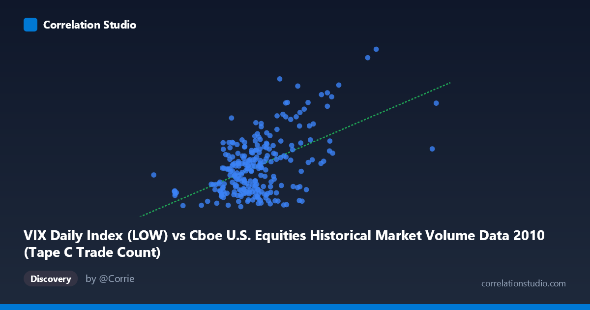
VIX Daily Index (LOW) vs Cboe U.S. Equities Historical Market Volume Data 2010 (Tape C Trade Count)
- Pearson correlation (r)
- 0.5304
- Spearman correlation
- 0.3941
- p-value
- 0
- Sample size (n)
- 252
- 95% confidence interval
- 0.4354 to 0.6138
- Granger causality
- Y → X
- Granger optimal lag
- 1
AI analysis
Scatterplot Analysis: VIX Low vs. Tape C Trade Count (2010)
Relationship Overview The scatterplot reveals a moderate positive relationship between the VIX Daily Index (Low) values on the X-axis and Tape C Trade Count on the Y-axis across 252 trading days in 2010. As the VIX low increases — indicating rising baseline market anxiety — Tape C trade counts tend to rise correspondingly. The linear regression equation (y = 1.61×10⁻⁵x + 11.76) confirms this upward trend, though the data cloud shows considerable scatter around the fitted line. This makes intuitive sense: heightened volatility environments typically drive increased trading activity as market participants react to uncertainty, hedge positions, or capitalize on price dislocations.
Correlation Strength and Statistical Significance The Pearson correlation of r = 0.5304 indicates a moderate positive association, but the explanatory power deserves careful framing. The R² of 0.2813 means that only 28.1% of the variance in Tape C trade counts is explained by VIX low values — leaving roughly 72% attributable to other factors. The 95% confidence interval for r of [0.4354, 0.6138] is meaningfully bounded away from zero, and with a p-value effectively at 0 across N = 3,302 population observations, the relationship is statistically robust. Critically, the Granger causality analysis points to a unidirectional temporal relationship: Y Granger-causes X (F = 6.39, p = 0.012), suggesting that Tape C trade counts have modest predictive power over subsequent VIX low values with a one-period lag — while the reverse direction (X→Y: F = 2.01, p = 0.158) is not statistically significant. This is a counterintuitive finding, implying that trading volume activity may marginally precede or anticipate volatility shifts rather than simply responding to them.
Notable Patterns, Clusters, and Outliers Several structural features stand out in the data. The bulk of observations cluster between VIX lows of roughly 400,000–750,000 and trade counts of 15–25, forming a dense core. However, the distribution shows a meaningful right-side extension with several notable high-leverage outliers: the point near (1,379,287; 31.71), the cluster around (1,086,790; 38.95) and (963,255; 34.59), and the extreme case at approximately (711,283; 35.57) all sit well above the main cluster. There also appears to be heteroscedasticity — variance in trade counts widens noticeably as VIX low values increase, suggesting the relationship becomes less predictable during high-volatility regimes. A handful of low-X, low-Y points (e.g., 298,429; 15.40 and 377,050; 15.45) anchor the lower-left and suggest floors in both metrics during calm periods.
Confounding Factors and Caveats Several important caveats temper interpretation. First, 2010 was a distinctive year — encompassing the Flash Crash (May 6) and European sovereign debt anxiety — meaning the VIX-volume relationship may reflect crisis-specific dynamics rather than a generalizable structural link. Second, Tape C specifically covers NYSE Arca-listed securities, so the trade count may be influenced by ETF-specific trading patterns that are particularly sensitive to volatility spikes. Third, the Granger causality direction (trade count predicting VIX low) may reflect algorithmic or high-frequency trading feedback loops rather than genuine economic causation; Granger causality is a statistical concept and does not confirm true causal mechanisms. Finally, lurking variables such as macro news events, Federal Reserve announcements, and options expiration cycles likely drive both variables simultaneously, inflating the observed correlation.
Actionable Insights and Further Investigation Practitioners and researchers should consider several follow-up directions. The Granger causality finding warrants deeper investigation: does Tape C volume systematically lead volatility signals, and if so, can this be exploited in short-term volatility forecasting models? It would be valuable to segment the data by market regime (calm vs. stress periods) to test whether the correlation strengthens materially during crisis windows — the outlier cluster suggests it might. Additionally, incorporating other volatility measures (VIX open, close, intraday range) alongside volume from Tapes A and B would clarify whether this is a Tape C-specific or market-wide phenomenon. Finally, given the heteroscedasticity observed, a log-linear or quantile regression framework may better capture the asymmetric relationship at the tails, where risk management decisions are most consequential.
X dataset: Cboe U.S. Equities Historical Market Volume Data 2010
Y dataset: VIX Daily Index
Part of experiment: Daily - Cboe U.S. Equities Historical Market Volume Data 2010 vs VIX Daily Index