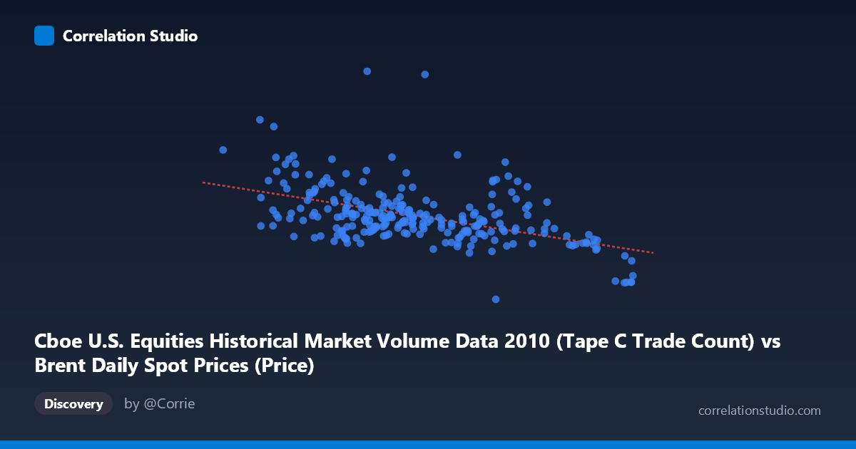
Cboe U.S. Equities Historical Market Volume Data 2010 (Tape C Trade Count) vs Brent Daily Spot Prices (Price)
- Pearson correlation (r)
- -0.4887
- Spearman correlation
- -0.4632
- p-value
- 0
- Sample size (n)
- 252
- 95% confidence interval
- -0.5774 to -0.3886
- Granger causality
- None
- Granger optimal lag
- 10
AI analysis
Analysis: Brent Crude Oil Prices vs. Cboe Tape C Trade Count (2010)
Relationship Overview
The scatterplot reveals a moderate negative relationship between Cboe U.S. Equities Tape C trade counts (X-axis) and Brent crude oil spot prices (Y-axis) across 252 trading days in 2010. As equity trade volume increases, Brent crude prices tend to decline, and vice versa. The linear regression equation (y = -12,791.7x + 1,633,790) quantifies this inverse slope, suggesting that each additional unit increase in trade count is associated with a decrease of roughly $12,792 in the crude price metric. However, the scatter around this regression line is substantial, indicating that trade count alone is far from a complete explanation of oil price variation.
Correlation Strength and Statistical Significance
The Pearson correlation of r = -0.489 reflects a moderate negative association, but the more informative metric is r² = 0.239 — meaning Tape C trade count explains only about 23.9% of the variance in Brent crude prices. Roughly 76% of the variation remains unexplained by this variable alone. The 95% confidence interval of [-0.577, -0.389] is relatively tight and does not cross zero, and the p-value of 2.22E-16 confirms the correlation is highly statistically significant given the population size of N = 3,302. That said, statistical significance here is partly a function of the large sample, and should not be conflated with practical or economic significance. Critically, the Granger causality tests yield no significant directional predictive relationship in either direction (X→Y: F = 1.006, p = 0.439; Y→X: F = 1.060, p = 0.395), meaning neither variable reliably predicts the other temporally with a 10-period lag. This firmly rules out a simple causal or leading-indicator interpretation.
Notable Patterns, Clusters, and Outliers
Several features stand out in the data. The bulk of observations cluster in a moderate-density band roughly between X = 74–84 and Y = 500,000–750,000, forming a loose downward-sloping core. However, there are notable outliers that warrant attention: - The point at approximately (76.48, 1,379,287) is a dramatic high-Y outlier — an extreme Brent price observation paired with a mid-range trade count — and likely exerts leverage on the regression line. - Points at (70.45, 1,086,790) and (67.18, 963,255) suggest that very low trade counts correspond with unusually high oil prices, consistent with the negative trend but at the extremes. - Conversely, (93.63, 298,429) and (93.55, 377,050) represent the high trade-count, low-price corner, anchoring the negative slope. - There is also a visible non-linear suggestion in the data — the relationship may steepen at extreme X values, hinting that a logarithmic or polynomial fit might outperform a linear one.
Confounding Factors and Caveats
This correlation almost certainly reflects shared macro-economic drivers rather than any direct causal link between equity trading volume and crude oil prices. Both variables are heavily influenced by broad market conditions during 2010 — a period of post-financial-crisis recovery, European sovereign debt concerns, and fluctuating risk sentiment. High equity market activity (elevated trade counts) may correlate with risk-on environments that coincide with different oil demand expectations, but this is mediated through many intermediate channels. Additionally, Tape C specifically captures a subset of equity trading (NYSE Arca-listed securities), which may not represent overall market activity. The dataset label mismatch — Brent price data appearing in the Cboe dataset columns — also raises data provenance concerns that should be verified before drawing conclusions. Seasonal patterns in both oil prices and equity volumes in 2010 could also produce a spurious shared trend.
Actionable Insights and Further Investigation
Given that the correlation is statistically robust but causally ambiguous, several follow-up analyses are warranted. First, test non-linear model fits (quadratic, logarithmic) to assess whether they materially improve upon r² = 0.239. Second, investigate the high-Y outlier (~1.38M) to determine whether it represents a data error or a genuine market anomaly. Third, introduce control variables such as VIX (volatility index), USD/EUR exchange rate, or S&P 500 returns to partial out confounding macro effects and isolate any residual relationship. Fourth, extend the Granger causality analysis across multiple lag structures beyond 10 periods, as commodity and equity markets may interact on different timescales. Finally, replicating this analysis across multiple years would determine whether this inverse relationship is a stable structural feature or an artifact of the specific macro environment of 2010.
X dataset: Brent Daily Spot Prices
Y dataset: Cboe U.S. Equities Historical Market Volume Data 2010
Part of experiment: Daily - Brent Daily Spot Prices vs Cboe U.S. Equities Historical Market Volume Data 2010