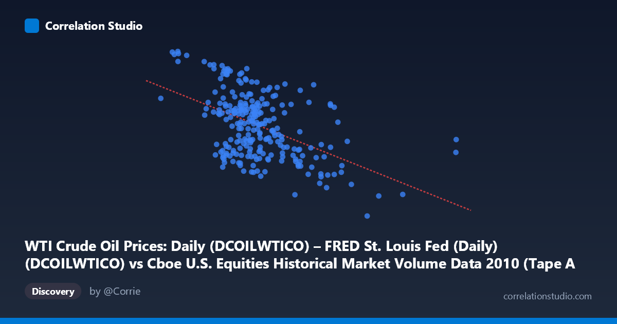
WTI Crude Oil Prices: Daily (DCOILWTICO) – FRED St. Louis Fed (Daily) (DCOILWTICO) vs Cboe U.S. Equities Historical Market Volume Data 2010 (Tape A Trade Count)
- Pearson correlation (r)
- -0.4967
- Spearman correlation
- -0.4199
- p-value
- 0
- Sample size (n)
- 252
- 95% confidence interval
- -0.5844 to -0.3975
- Granger causality
- None
- Granger optimal lag
- 1
AI analysis
Analysis: WTI Crude Oil Prices vs. Cboe U.S. Equities Tape A Trade Count (2010)
Relationship Overview The scatterplot reveals a moderate negative relationship between daily WTI crude oil prices and Cboe U.S. Equities Tape A trade counts during 2010. As oil prices rise, equity trade counts tend to decline, and vice versa. The linear regression equation (y = -6.74×10⁻⁶x + 88.35) quantifies this inverse slope, though the substantial scatter around the regression line immediately signals that oil prices alone are far from a complete explanation for trading activity levels. The relationship is visible but noisy — points are broadly dispersed across the plot rather than clustering tightly around the trend line.
Correlation Strength and Statistical Framing The Pearson correlation of r = -0.497 indicates a moderate negative association, but the coefficient of determination tells the more sobering story: R² = 0.247, meaning oil prices explain only about 24.7% of the variance in equity trade counts. Roughly three-quarters of the variation in trading activity is attributable to factors entirely unrelated to oil price movements. The 95% confidence interval of [-0.584, -0.398] is meaningfully narrow given the sample size of n = 252, and the p-value of effectively zero confirms this is not a chance finding — the negative relationship is statistically robust. However, the Granger causality results complicate any causal interpretation: neither direction achieves conventional significance at the 5% level (X→Y: F = 0.807, p = 0.370; Y→X: F = 3.645, p = 0.057). This means that past oil prices do not significantly help predict future trade counts, and vice versa — the correlation reflects contemporaneous co-movement, not a predictive temporal relationship.
Notable Patterns and Outliers Several features stand out in the sample points. There is a visible high-trade-count cluster at lower oil prices — points like (627,720, 90.84), (796,428, 89.83), and (888,899, 89.33) all combine relatively modest oil prices with elevated trade counts, consistent with the negative trend. Conversely, high oil price observations such as (2,474,888, 68.03) and (2,363,720, 64.78) anchor the lower-right region of the plot. The point (3,216,587, 75.10) stands out as a potential outlier — it represents an exceptionally high oil price value yet a mid-range trade count, sitting far to the right of the main data cloud and likely exerting meaningful leverage on the regression slope. There also appears to be heteroscedasticity: variance in trade counts seems larger at lower oil price values and compresses somewhat at higher prices, suggesting the linear model may not perfectly capture the underlying structure.
Confounding Factors and Caveats Several important caveats limit causal interpretation. First, 2010 was a recovery year following the 2008–2009 financial crisis, meaning both variables were influenced heavily by macroeconomic momentum — rising oil prices may reflect improving global demand while simultaneously, high-frequency trading volumes were declining from crisis-era peaks, creating a spurious correlation driven by a shared third factor (economic recovery trajectory). Second, algorithmic and high-frequency trading dynamics strongly influence Tape A trade counts independent of commodity markets. Third, the datasets appear to have been merged across different native frequencies or populations (N = 3,302 vs. n = 252 paired observations), which raises questions about alignment quality and potential data gaps. Finally, the axis labels suggest a possible dataset labeling swap (the description attached to each axis appears to reference the other variable's source), which should be verified before drawing firm conclusions.
Actionable Insights and Further Investigation Despite the caveats, the moderate negative correlation warrants deeper investigation. Analysts should consider controlling for broad market return and volatility (VIX) to determine whether the oil–volume relationship survives conditioning on overall market conditions. Including sector-level trade count data (rather than aggregate Tape A) could reveal whether energy-sector equities drive the aggregate signal. Testing across multiple years beyond 2010 would clarify whether this relationship is structural or an artifact of post-crisis dynamics. Given the near-significant Granger result (Y→X: p = 0.057), it may be worth exploring whether trade count activity marginally leads oil price movements at slightly longer lags, which could have practical relevance for market microstructure research. Lastly, non-linear modeling (e.g., regime-switching or quantile regression) may better capture the apparent heteroscedasticity and potential threshold effects visible in the data.
X dataset: Cboe U.S. Equities Historical Market Volume Data 2010
Y dataset: WTI Crude Oil Prices: Daily (DCOILWTICO) – FRED St. Louis Fed (Daily)
Part of experiment: Daily - Cboe U.S. Equities Historical Market Volume Data 2010 vs WTI Crude Oil Prices: Daily (DCOILWTICO) – FRED St. Louis Fed (Daily)