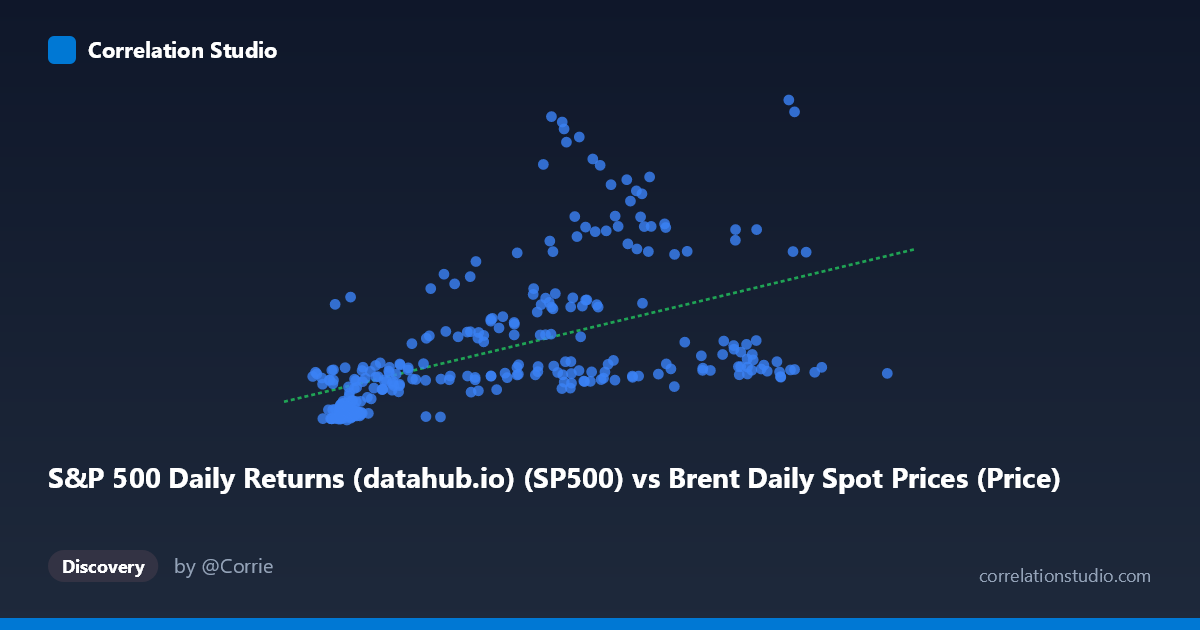
S&P 500 Daily Returns (datahub.io) (SP500) vs Brent Daily Spot Prices (Price)
- Pearson correlation (r)
- 0.5118
- Spearman correlation
- 0.6839
- p-value
- 0
- Sample size (n)
- 297
- 95% confidence interval
- 0.4225 to 0.5911
- Granger causality
- None
- Granger optimal lag
- 10
AI analysis
Analysis: Brent Crude Oil Prices vs. S&P 500 Index
1. What the Visualization Reveals
The scatterplot depicts the relationship between Europe Brent crude oil spot prices (X-axis) and the S&P 500 monthly price index (Y-axis) across nearly four decades of data (1987–2026). The plot reveals a positive but notably diffuse relationship: as oil prices rise, S&P 500 levels tend to be higher on average, but the spread around this trend is substantial. The linear regression line (y = 23.14x + 561.85) captures a general upward trajectory, yet the cloud of points is wide enough to suggest that oil prices alone are a poor predictor of equity index levels. This broad dispersion is the dominant visual feature — the relationship exists, but it is far from deterministic.
2. Correlation Strength, Direction, and Causality
The Pearson correlation of r = 0.51 indicates a moderate positive association, but the more meaningful figure is r² = 0.262, meaning oil prices explain only about 26% of the variance in S&P 500 levels — leaving roughly 74% of variation unexplained by this variable alone. The 95% confidence interval of [0.42, 0.59] is reasonably tight given the large sample (N = 1,865), and the p-value of effectively zero confirms the correlation is highly statistically significant rather than a sampling artifact. However, statistical significance should not be conflated with practical predictive power, which remains limited. Critically, Granger causality tests find no significant directional predictive relationship in either direction (X→Y: F = 1.00, p = 0.45; Y→X: F = 0.95, p = 0.48), even at the optimal lag of 10 periods. This means that past oil prices do not reliably help forecast future S&P 500 values, and vice versa — the correlation reflects co-movement, likely driven by shared macroeconomic forces, rather than any meaningful temporal lead-lag dynamic.
3. Notable Patterns, Clusters, and Outliers
Several structural features stand out in the data. There is a dense cluster of low-oil-price, low-S&P observations (X < 30, Y < 1,500) consistent with the pre-2000 era when both crude was cheap and equity valuations were lower. A second, more dispersed cluster appears in the mid-range (X: 50–90, Y: 1,000–5,000), reflecting the 2000s–2010s period of elevated oil and rising markets. Several high-leverage outliers are visible — points such as (67.09, 6584), (73.63, 5930), and (84.82, 5171) — where S&P 500 values are exceptionally high relative to the oil price, likely reflecting the post-2020 equity bull market during periods of moderate crude prices. Conversely, high oil prices (X 100) paired with relatively modest S&P values suggest periods like 2011–2014 when oil spiked but equities were recovering. The Spearman ρ exceeding Pearson r is a meaningful flag: the monotonic rank relationship is stronger than the linear one, suggesting a non-linear (likely logarithmic or power) relationship would capture the data structure better than the fitted line.
4. Confounding Factors and Caveats
This correlation is almost certainly spurious in a causal sense, driven by a shared underlying factor: long-run nominal growth and inflation. Both oil prices and the S&P 500 have trended upward over four decades due to dollar depreciation, economic expansion, and population growth — creating a textbook case of common trend confounding in time-series data. Without deflating both series to real terms or differencing to remove trends, the correlation captures little more than the fact that both variables were low in 1987 and high in 2025. Additionally, the relationship is likely regime-dependent: during supply shocks (e.g., 1990, 2008), rising oil prices were associated with equity declines, while in demand-driven expansions they co-move positively — averaging these opposing regimes produces a misleading aggregate correlation. The monthly frequency of S&P data paired with daily oil data also introduces temporal misalignment that could obscure true short-run dynamics.
5. Actionable Insights and Further Investigation
Given these findings, several analytical steps would sharpen the interpretation considerably. First, both series should be analyzed in first-differences or log-returns rather than price levels, which would remove the shared trend and isolate genuine co-movement. Second, fitting a logarithmic or polynomial regression (as suggested by the Spearman vs. Pearson discrepancy) should be tested formally via AIC/BIC comparison. Third, regime-based analysis — separating supply-shock oil spikes from demand-driven expansions using, for example, a Hamilton (2009) oil shock decomposition — would likely reveal that the sign and magnitude of the relationship varies dramatically by period. Fourth, controlling for macroeconomic confounders (real GDP growth, inflation, dollar index) in a multivariate framework would help isolate whether any residual oil-equity relationship persists. For practitioners, the Granger causality result is the most actionable takeaway: oil prices carry no reliable short-to-medium-term predictive signal for S&P 500 direction, making this correlation of limited use for trading or tactical asset allocation decisions.
X dataset: Brent Daily Spot Prices
Y dataset: S&P 500 Daily Returns (datahub.io)
Part of experiment: Daily - Brent Daily Spot Prices vs S&P 500 Daily Returns (datahub.io)