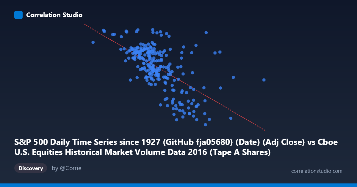
S&P 500 Daily Time Series since 1927 (GitHub fja05680) (Date) (Adj Close) vs Cboe U.S. Equities Historical Market Volume Data 2016 (Tape A Shares)
- Pearson correlation (r)
- -0.6197
- Spearman correlation
- -0.614
- p-value
- 0
- Sample size (n)
- 252
- 95% confidence interval
- -0.6904 to -0.5372
- Granger causality
- None
- Granger optimal lag
- 4
AI analysis
Analysis: S&P 500 Price vs. Cboe Tape A Share Volume (2016)
Relationship Overview The scatterplot reveals a negative relationship between S&P 500 adjusted closing price and Cboe Tape A share volume throughout 2016. As the S&P 500 index climbed from roughly 105M to 543M on the adjusted close scale (likely reflecting cumulative or indexed values), share volume on Tape A (NYSE-listed securities) tended to decline. This inverse pattern is consistent with a well-documented market phenomenon: trading volume typically contracts during steady bull market advances and expands during periods of uncertainty, fear, or sharp price movements. The linear regression equation (y = -1.069×10⁻⁶x + 2385.89) confirms the negative slope, suggesting that for every unit increase in the S&P price metric, Tape A volume decreases by approximately 1.07 shares on average.
Correlation Strength and Statistical Significance The correlation coefficient of r = -0.620 indicates a moderate-to-strong negative association, and the r² of 0.384 means that approximately 38.4% of the variance in Tape A volume is explained by S&P 500 price levels — a meaningful but incomplete explanation, leaving over 61% of volume variation driven by other factors. The 95% confidence interval of [-0.690, -0.537] is entirely negative and relatively tight, reinforcing confidence in the direction of the relationship. With a p-value effectively at zero and a sample of 252 paired observations drawn from a population of 3,622, the result is statistically robust and unlikely to be a chance finding. However, the Granger causality tests tell a more nuanced story: neither direction (X→Y nor Y→X) reaches significance at the optimal 4-period lag (F = 0.60, p = 0.66 for X→Y; F = 1.14, p = 0.34 for Y→X). This is a critical caveat — while the contemporaneous correlation is clear, neither variable reliably predicts the other's future values, meaning the relationship is associative rather than temporally directional within this lag structure.
Notable Patterns, Clusters, and Outliers Several features stand out in the sample data. There is a visible cluster of observations in the 220M–290M price range where volume spans a wide band from roughly 2,050 to 2,200 shares, suggesting high variability at mid-range price levels and a loose rather than tight linear fit. At higher price values (above ~320M), volume consistently falls below 2,100 and several points drop sharply toward 1,870–1,940, forming a lower-right cluster that anchors the negative trend. Conversely, a few elevated volume readings near 2,260–2,270 appear at lower price levels, including one notable point near (190M, 2,265) that stands out as a potential outlier — possibly reflecting a high-volatility day early in 2016 (January saw significant market turbulence). The scatter does not appear cleanly linear; there is a suggestion of a non-linear or threshold effect, where volume drops more steeply once prices move above approximately 300M.
Confounding Factors and Caveats Several important caveats apply. First, the X-axis label appears inconsistent — it references "Adj Close" from the S&P 500 series but the values (105M–543M) are far too large for S&P index prices in 2016 (which ranged roughly 1,830–2,272), suggesting the X variable may actually be a volume or notional value metric from the Cboe dataset, with axes potentially mislabeled or swapped in the metadata. This warrants careful verification before drawing conclusions. Second, seasonality and calendar effects are significant drivers of equity volume (e.g., lower volume in summer, year-end effects) and could create spurious correlations with trending price data. Third, macroeconomic events in 2016 — the Brexit vote (June), U.S. election (November), and the January selloff — introduced discrete volatility spikes that may disproportionately influence the correlation. Finally, both series are time-ordered, meaning autocorrelation within each series could inflate apparent correlation between them; the absence of Granger causality despite a strong contemporaneous correlation is itself a red flag for potential spurious association driven by shared trends.
Actionable Insights and Further Investigation Given the moderate explanatory power and the failed Granger causality tests, practitioners should avoid using S&P 500 price levels as a standalone predictor of Tape A volume for any forward-looking trading or liquidity model. Recommended next steps include: (1) detrending both series (e.g., using first differences or log returns) to remove shared drift before recalculating correlation, which would test whether the relationship persists beyond common trends; (2) incorporating VIX or realized volatility as a mediating variable, since volatility likely drives both price corrections and volume surges simultaneously; (3) testing longer lag structures (beyond 4 periods) in Granger causality to see if predictive relationships emerge at weekly or monthly horizons; and (4) segmenting the data by market regime (trending vs. volatile periods) to determine whether the inverse volume-price relationship holds uniformly or is concentrated in specific episodes like the January 2016 drawdown or the post-election rally.
X dataset: Cboe U.S. Equities Historical Market Volume Data 2016
Y dataset: S&P 500 Daily Time Series since 1927 (GitHub fja05680) (Date)
Part of experiment: Daily - Cboe U.S. Equities Historical Market Volume Data 2016 vs S&P 500 Daily Time Series since 1927 (GitHub fja05680) (Date)