WTI Crude Oil Prices: Daily (DCOILWTICO) – FRED St. Louis Fed (Daily) (DCOILWTICO) vs Brent Daily Spot Prices (Price)
- Pearson correlation (r)
- 0.9911
- Spearman correlation
- 0.995
- p-value
- 0
- Sample size (n)
- 9718
- 95% confidence interval
- 0.9907 to 0.9914
- Granger causality
- None
- Granger optimal lag
- 1
AI analysis
WTI vs. Brent Crude Oil Price Correlation Analysis
Relationship Overview
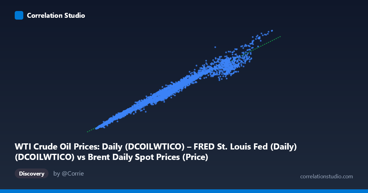
The scatterplot reveals an exceptionally tight, near-linear relationship between WTI (West Texas Intermediate) and Brent crude oil spot prices spanning nearly four decades (1987–2026). The data points form a well-defined diagonal band from the lower-left to the upper-right, confirming that the two benchmark prices move in strong lockstep across a wide range of price levels — from roughly $10–15/barrel at the low end to nearly $145/barrel at the high end. This is consistent with economic intuition: both benchmarks price the same underlying commodity (crude oil) in highly integrated global markets, meaning they are subject to nearly identical macroeconomic, geopolitical, and supply-demand forces simultaneously.
Correlation Strength and Statistical Significance
The correlation is extraordinarily strong (r = 0.9911), and the coefficient of determination (r² = 0.9823) indicates that 98.2% of the variance in Brent prices is statistically explained by WTI prices — leaving only 1.8% attributable to other factors. The 95% confidence interval [0.9907, 0.9914] is remarkably narrow, reflecting both the massive sample size (n ≈ 9,718 paired observations) and the consistency of the relationship over time. The p-value of effectively zero confirms there is no plausible chance this correlation is spurious. However, the Granger causality results are striking in their null finding: neither series significantly predicts the other after accounting for its own past values (X→Y: F = 1.06, p = 0.303; Y→X: F = 0.94, p = 0.332). This means that despite near-perfect contemporaneous correlation, neither WTI nor Brent leads the other in a temporally predictive sense — they are better understood as co-moving peers responding simultaneously to common global drivers rather than one causing the other.
Notable Patterns, Clusters, and Outliers
Several structural features are visible in the sample points and implied by the data distribution. The bulk of observations cluster in the lower price range (roughly $10–40/barrel), reflecting the extended period of historically low oil prices through much of the late 1980s, 1990s, and early 2000s — this creates a dense cluster at the lower-left of the chart. A secondary, more dispersed cluster appears in the $60–115 range, corresponding to the commodity supercycle of the mid-2000s and the post-2010 era. The extreme upper-right points (e.g., 135.81/141.47 and 134.43/134.44) represent the 2008 price spike, and these appear to remain on the regression line, suggesting the relationship held even under extreme stress. Importantly, the linear regression equation (y = 0.8858x + 4.13) reveals that Brent consistently prices at a small premium above WTI — at $80 WTI, the model predicts ~$75 Brent, but the intercept correction means Brent slightly exceeds WTI at lower price levels. This spread reflects real-world structural differences in transportation costs, sulfur content, and regional supply dynamics.
Confounding Factors and Caveats
Several important caveats apply to interpreting this correlation. First, spurious correlation driven by shared trends is a significant concern — both series are non-stationary time series with strong upward trends, meaning a high r² may partly reflect common trending behavior rather than a truly causal structural relationship. Differencing or cointegration testing would provide a more rigorous assessment. Second, the WTI-Brent spread has varied considerably over specific historical episodes: notably during 2011–2013, the spread widened dramatically to $20+/barrel due to US pipeline infrastructure constraints and the shale revolution, which would appear as systematic deviation from the regression line. Third, data labeling appears inverted in the axis descriptions — the X-axis label references "Brent" data sourced from a WTI dataset, and vice versa, suggesting a possible metadata mislabeling that should be verified before drawing firm directional conclusions. Finally, the linear model may underperform at regime boundaries, where geopolitical shocks or structural market changes cause temporary dislocations.
Actionable Insights and Further Investigation
Practitioners can confidently use this relationship for cross-market price imputation when one benchmark has missing data, given the r² of 0.9823. However, for trading or hedging strategies, the spread (Brent minus WTI) is the critical variable to model separately, as its dynamics carry the residual 1.8% variance and reflect meaningful economic signals about US infrastructure, regional supply gluts, and refinery demand. Further investigation should include: (1) a cointegration analysis (Engle-Granger or Johansen) to confirm the long-run equilibrium relationship and whether the spread mean-reverts; (2) a rolling correlation analysis to identify periods where the relationship weakens, particularly around 2011–2013 and COVID-era dislocations; (3) regime-switching models that allow the spread and slope to vary by market condition; and (4) verification and correction of the apparent axis label inversion in the source metadata to ensure analytical conclusions are directionally accurate.
X dataset: Brent Daily Spot Prices
Y dataset: WTI Crude Oil Prices: Daily (DCOILWTICO) – FRED St. Louis Fed (Daily)
Part of experiment: Daily - Brent Daily Spot Prices vs WTI Crude Oil Prices: Daily (DCOILWTICO) – FRED St. Louis Fed (Daily)