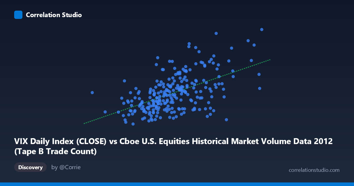
VIX Daily Index (CLOSE) vs Cboe U.S. Equities Historical Market Volume Data 2012 (Tape B Trade Count)
- Pearson correlation (r)
- 0.5454
- Spearman correlation
- 0.5296
- p-value
- 0
- Sample size (n)
- 250
- 95% confidence interval
- 0.4519 to 0.627
- Granger causality
- None
- Granger optimal lag
- 1
AI analysis
Scatterplot Analysis: VIX Daily Index vs. Tape B Trade Count (2012)
Relationship Overview
The scatterplot reveals a moderate positive relationship between the Cboe VIX Daily Index (Close) and the Tape B Trade Count for U.S. equities in 2012. As the VIX — a widely-used measure of expected market volatility — rises, Tape B trade counts tend to increase as well. This is an intuitively sensible pairing: elevated market fear or uncertainty (higher VIX) historically drives higher trading activity as investors reposition, hedge, or react to perceived risk. The linear regression equation (y = 3.46829E-05x + 11.711) confirms a positive slope, though the relationship is far from deterministic, with considerable scatter visible across the plot.
Correlation Strength and Statistical Framing
The Pearson correlation of r = 0.545 indicates a moderate positive association, but the explanatory power deserves careful scrutiny. The R² of 0.2975 means that only about 29.8% of the variance in Tape B Trade Count is explained by VIX levels — leaving roughly 70% of the variance unexplained by this relationship alone. The 95% confidence interval for r spans [0.452, 0.627], which is reassuringly narrow given the sample size (n = 250 drawn from N = 3,750), and the p-value of effectively 0 confirms the correlation is highly statistically significant and unlikely to reflect chance. However, statistical significance should not be conflated with practical completeness. Crucially, Granger causality tests in both directions fail to reach significance (X→Y: F = 1.434, p = 0.232; Y→X: F = 0.114, p = 0.736), meaning that neither variable demonstrably predicts the other temporally at a one-period lag. This is a critical caveat: the two variables move together, but neither reliably leads the other in a predictive sense.
Notable Patterns, Clusters, and Outliers
Several features stand out in the scatter. The bulk of observations cluster between VIX values of roughly 130,000–230,000 and Tape B counts of 14–20, forming a dense central mass with a loosely upward-trending envelope. However, there are notable high-leverage outliers visible in the upper portions of the chart — points such as (197,126, 24.27), (206,587, 24.14), and (211,236, 23.56) sit well above the regression line, suggesting episodes where high trade volume coincided with elevated VIX spikes. Conversely, some higher-X observations like (222,649, 14.51) and (231,485, 15.31) fall below expectations, indicating that large trade volumes do not uniformly correspond to high VIX readings. There is also visible heteroscedasticity — variance in Y appears to widen as X increases — suggesting that a simple linear model may not fully capture the structure of the relationship, and a log transformation or non-linear fit might be more appropriate.
Confounding Factors and Interpretive Caveats
Several confounders could be inflating or distorting the observed correlation. Day-of-week and end-of-month effects are well-documented in both volatility and volume data, and these systematic calendar patterns could create spurious co-movement. Macro events in 2012 — including the European sovereign debt crisis, U.S. fiscal cliff negotiations, and Federal Reserve policy announcements — generated episodic spikes in both VIX and trading activity that may disproportionately drive the correlation. The dataset is limited to a single calendar year, making it difficult to distinguish structural relationships from year-specific market dynamics. It is also worth noting the variable assignment appears somewhat inverted: VIX Close appears on the X-axis and Tape B Trade Count on the Y-axis, though the Granger results suggest neither directional framing is statistically justified. Finally, Tape B specifically covers NYSE American and regional exchange stocks, which may behave differently from broader market volume metrics.
Actionable Insights and Further Investigation
Despite the lack of Granger causality, the moderate correlation has practical relevance for market microstructure analysis and trading strategy design. Market participants and exchange operators could use elevated VIX regimes as a soft signal that Tape B activity may be elevated — useful for liquidity planning, fee modeling, or risk system calibration — while being careful not to rely on it for predictive timing. For deeper investigation, analysts should: (1) extend the time series beyond 2012 to test whether this relationship is structurally stable or regime-dependent; (2) test non-linear models (e.g., logarithmic or piecewise regression) given the apparent heteroscedasticity; (3) control for calendar effects and macro event windows to isolate the organic relationship; and (4) examine Tape A and Tape C volumes separately to determine whether the VIX–volume relationship is specific to Tape B or a broader market phenomenon. A vector autoregression (VAR) with additional control variables (e.g., S&P 500 returns, bid-ask spreads) could also help untangle confounding from genuine co-movement.
X dataset: Cboe U.S. Equities Historical Market Volume Data 2012
Y dataset: VIX Daily Index
Part of experiment: Daily - Cboe U.S. Equities Historical Market Volume Data 2012 vs VIX Daily Index