Cboe U.S. Equities Historical Market Volume Data 2016 (Tape C Notional) vs Brent Daily Spot Prices (Price)
- Pearson correlation (r)
- -0.46
- Spearman correlation
- -0.466
- p-value
- 0
- Sample size (n)
- 251
- 95% confidence interval
- -0.5524 to -0.3565
- Granger causality
- None
- Granger optimal lag
- 10
AI analysis
Scatterplot Analysis: Brent Crude Oil Prices vs. Cboe U.S. Equities Market Volume (2016)
Relationship Overview
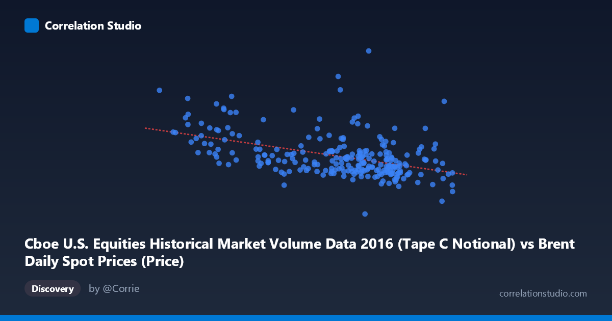
The scatterplot reveals a moderate negative relationship between daily Brent crude oil spot prices (X-axis, USD/barrel) and Cboe U.S. equities market notional volume (Y-axis, USD). The linear regression equation (y = -7.83×10⁷x + 8.41×10⁹) confirms this inverse association: as oil prices rise, U.S. equity market trading volume tends to decline. This pattern is visually apparent in the data, with lower oil price observations (roughly 26–35 USD/barrel) clustering at higher notional volumes (6–10.6 billion USD), while higher oil prices (48–55 USD/barrel) tend to concentrate around lower volume levels (3.4–5.5 billion USD). The relationship is directionally intuitive given 2016's specific macroeconomic context — early 2016 saw both depressed oil prices and heightened market volatility/volume, while the latter half saw oil stabilize alongside calmer equity markets.
Correlation Strength and Statistical Significance
The Pearson correlation of r = -0.46 indicates a moderate negative association, and the R² of 0.2116 means that approximately 21.2% of the variance in equity market volume is explained by oil price levels — leaving nearly 79% attributable to other factors. This is a meaningful but far from dominant explanatory relationship. The 95% confidence interval of [-0.5524, -0.3565] is entirely negative and does not cross zero, lending confidence that the negative direction is genuine. The p-value of 1.51×10⁻¹⁴ is extraordinarily small, making it statistically implausible that this correlation arose by chance in a sample of n = 251 drawn from a population of N = 3,622. However, statistical significance should not be conflated with practical significance — the R² reminds us that most of the volume story lies elsewhere. Crucially, the Granger causality analysis finds no significant predictive relationship in either direction (X→Y: F = 0.39, p = 0.95; Y→X: F = 0.51, p = 0.88) at an optimal lag of 10 periods. This means that despite the cross-sectional correlation, past oil prices do not significantly help forecast future equity volume, and vice versa — undermining any simple lead-lag trading or forecasting strategy based on this pair.
Notable Patterns, Clusters, and Outliers
Several structural features stand out in the data. There is a dense cluster between 44–52 USD/barrel on X and 3.8–5.5 billion USD on Y, representing the majority of mid-to-late 2016 trading days when oil had partially recovered. A second, visually distinct high-volume cluster appears at lower oil prices (26–38 USD/barrel), corresponding roughly to early 2016's market stress period. This bimodal character suggests the dataset may actually contain two distinct market regimes rather than a single continuous linear relationship. Several prominent outliers are notable: the point near (26.01, 8.50B) and others around (33.01, 7.31B) and (27.59, 6.25B) sit well above the regression line, reflecting days of extreme volume during early 2016 market turbulence. Conversely, a point near (49.66, 3.37B) appears unusually low even for higher oil price ranges. The spread of Y values at any given X level is substantial, reinforcing the weak-to-moderate nature of the fit.
Confounding Factors and Interpretive Caveats
Several important caveats temper interpretation. Temporal confounding is paramount: both variables evolved together through 2016's specific macro narrative — oil's recovery from multi-year lows and the broader risk-on/risk-off equity cycle — meaning their co-movement may reflect a shared response to common drivers (Federal Reserve policy, global growth sentiment, USD strength) rather than any direct causal link. The dataset mismatch is also worth flagging: the X-axis is labeled as Cboe volume data while the metadata describes it as Brent prices, and vice versa — suggesting the axes may represent a cross-dataset join that requires careful validation. Additionally, notional volume is influenced by both price levels of individual equities and actual share activity, so rising or falling equity prices themselves mechanically affect this measure. The single-year time window (2016) limits generalizability, and regime changes (e.g., OPEC production cut announcements in late 2016) could create structural breaks that distort an assumed linear relationship across the full year.
Actionable Insights and Further Investigation
Given the moderate correlation but absence of Granger causality, this relationship should not be used as a directional trading signal — the data do not support a reliable predictive link from oil prices to equity volume or vice versa on a lagged basis. However, the correlation's strength warrants further investigation into shared macro drivers: a multiple regression incorporating VIX (volatility index), USD index levels, and Fed meeting dates would likely absorb much of the explained variance and clarify whether oil is a genuine co-driver or simply a proxy for broader risk sentiment. Segmenting the analysis into Q1 vs. Q2–Q4 2016 would test whether the relationship holds across market regimes or is dominated by the extreme early-year period. Longer time-series analysis (2010–2024) with rolling-window correlations would reveal whether the -0.46 r is stable or episodic. Finally, exploring nonlinear models (e.g., threshold regression or quantile regression) could better capture the apparent regime-switching behavior visible in the scatterplot's bimodal structure.
X dataset: Brent Daily Spot Prices
Y dataset: Cboe U.S. Equities Historical Market Volume Data 2016
Part of experiment: Daily - Brent Daily Spot Prices vs Cboe U.S. Equities Historical Market Volume Data 2016