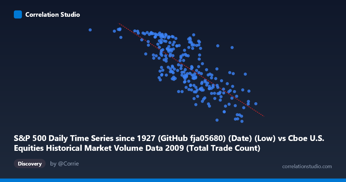
S&P 500 Daily Time Series since 1927 (GitHub fja05680) (Date) (Low) vs Cboe U.S. Equities Historical Market Volume Data 2009 (Total Trade Count)
- Pearson correlation (r)
- -0.7656
- Spearman correlation
- -0.7731
- p-value
- 0
- Sample size (n)
- 252
- 95% confidence interval
- -0.8123 to -0.7091
- Granger causality
- X → Y
- Granger optimal lag
- 10
AI analysis
Analysis: S&P 500 Daily Low vs. Cboe Total Trade Count (2009)
Relationship Overview The scatterplot reveals a moderately strong negative relationship between the S&P 500 daily low price (X-axis) and the total trade count on U.S. equity exchanges (Y-axis) throughout 2009. As the S&P 500 daily low increases — meaning prices are recovering — the number of trades executed per day tends to decline. This is visually intuitive given the temporal context: 2009 began in the depths of the Global Financial Crisis, when markets were volatile and heavily traded, and gradually recovered as the year progressed, with trading activity cooling alongside stabilizing prices.
Correlation Strength and Statistical Robustness The Pearson correlation of r = -0.7656 indicates a strong negative association, and the R² of 0.5862 means that approximately 58.6% of the day-to-day variance in trade count is explained by the S&P 500 daily low. This is a substantial explanatory share for a single variable in financial markets, though it also confirms that ~41% of variance remains unexplained by this relationship alone. The 95% confidence interval of [-0.8123, -0.7091] is relatively tight and does not cross zero, and the p-value is effectively zero, making this relationship highly statistically significant across the 252-day sample. The Granger causality analysis adds an important temporal dimension: X unidirectionally Granger-causes Y at a 10-period lag (F = 1.979, p = 0.037), while the reverse direction fails to reach significance (p = 0.120). This suggests that S&P 500 price levels carry meaningful predictive information about future trade counts, but trade count volume does not reliably predict future price levels — a directional asymmetry with practical implications for market microstructure analysis.
Notable Patterns and Structural Features The sample points reveal a clear two-regime clustering pattern. A dense cluster of high trade counts (Y ~ 950–1,125) corresponds to low S&P 500 values (X ~ 629,000–2,300,000), reflecting the panic-driven, high-frequency trading environment of Q1 2009 during market lows near 666–750. A second cluster of moderate-to-low trade counts (Y ~ 670–900) aligns with higher index values (X ~ 3,000,000–4,134,000), consistent with calmer, recovery-phase conditions in Q3–Q4 2009. Several potential outliers are visible: the point near (629,671; 1,121) — likely the March 2009 market bottom — represents extreme distress trading, while points above Y ~ 1,090 at mid-range X values may reflect episodic volatility spikes during the recovery. The relationship also displays a mild non-linear curvature, with trade counts declining steeply at low price levels and flattening somewhat at higher values, suggesting diminishing returns in the relationship and possible heteroscedasticity.
Confounding Factors and Interpretive Caveats Several important confounds must be acknowledged. First, time is the dominant latent variable — both series are driven by the same underlying temporal arc of crisis-to-recovery in 2009, meaning this correlation may substantially reflect a shared time trend rather than a direct causal mechanism. Second, the datasets are axis-swapped in an unusual way: the S&P 500 "Low" column appears to represent a scaled or index-derived numeric (in the millions range), which may reflect cumulative trading volume or a differently encoded variable rather than a raw price in dollars — this warrants careful verification of data provenance. Third, structural market changes during 2009, including regulatory interventions, the March 9 market bottom, and the April–May rally, create discrete regime shifts that violate the assumption of a stationary relationship. Finally, the Granger causality result should not be over-interpreted as true economic causation — lagged price levels may simply proxy for investor sentiment cycles that independently drive both variables.
Actionable Insights and Further Investigation Practitioners and researchers should consider detrending both series by removing the shared time trend before re-estimating the correlation, which would reveal whether a genuine contemporaneous relationship persists beyond the crisis-recovery arc. The 10-period optimal Granger lag (~2 trading weeks) is worth investigating as a potential signal window for volatility-regime trading models. It would also be valuable to segment the analysis by quarter to test whether the correlation is driven primarily by Q1 (crisis) conditions or persists through Q2–Q4. Incorporating the VIX or bid-ask spreads as control variables could help disentangle fear-driven trading from price-level effects. Finally, replicating this analysis across other crisis years (e.g., 2008, 2020) would test whether this negative price-volume-count relationship is a robust feature of market stress or an artifact specific to 2009's unique recovery trajectory.
X dataset: Cboe U.S. Equities Historical Market Volume Data 2009
Y dataset: S&P 500 Daily Time Series since 1927 (GitHub fja05680) (Date)
Part of experiment: Daily - Cboe U.S. Equities Historical Market Volume Data 2009 vs S&P 500 Daily Time Series since 1927 (GitHub fja05680) (Date)