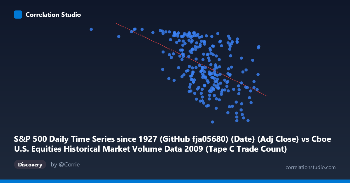
S&P 500 Daily Time Series since 1927 (GitHub fja05680) (Date) (Adj Close) vs Cboe U.S. Equities Historical Market Volume Data 2009 (Tape C Trade Count)
- Pearson correlation (r)
- -0.5109
- Spearman correlation
- -0.5167
- p-value
- 0
- Sample size (n)
- 252
- 95% confidence interval
- -0.5968 to -0.4134
- Granger causality
- Y → X
- Granger optimal lag
- 4
AI analysis
S&P 500 Adjusted Close vs. Cboe Tape C Trade Count (2009)
Relationship Overview The scatterplot reveals a moderate negative relationship between the S&P 500 daily adjusted closing price and the Cboe Tape C trade count during 2009. As the S&P 500 price rises, the number of trades in Tape C (NYSE Arca-listed securities) tends to decline. This is visually intuitive given the 2009 market context: the index began the year near multi-year lows (with prices concentrated in the lower X range), recovered sharply through the spring and summer, and trade counts — often elevated during periods of panic and high uncertainty — correspondingly diminished as calm returned. The linear regression equation (y = −0.000590x + 1,323) reflects this downward slope, predicting roughly 590 fewer trades per unit increase in the index price.
Correlation Strength and Statistical Framing The Pearson correlation of r = −0.51 indicates a moderate negative association, but the more informative figure is R² = 0.261, meaning S&P 500 price levels explain only about 26% of the variance in Tape C trade counts. The remaining ~74% is driven by factors outside this bivariate model. The 95% confidence interval [−0.597, −0.413] is meaningfully bounded away from zero, and the p-value of effectively 0 (against N = 3,232) confirms the relationship is highly statistically significant and not a sampling artifact. Granger causality adds an important directional nuance: Y Granger-causes X (unidirectionally, at lag 4 periods, F = 2.47, p = 0.045), suggesting that Tape C trade counts have modest but statistically detectable predictive power over future S&P 500 price movements — not the reverse. This is consistent with microstructure theory, where elevated retail/institutional trading activity can precede price discovery.
Patterns, Clusters, and Outliers Several structural features stand out in the data: - Left-side cluster (X < ~500,000): A dense group of high trade-count observations (Y 1,000) corresponding to early 2009 bear-market conditions, when volume and activity were elevated amid distress selling. - Right-side spread (X ~700,000): Higher price levels show a much wider dispersion in trade counts (ranging from ~680 to ~1,100), suggesting the relationship weakens at higher valuations — a potential non-linearity. - Notable outliers: The point near (185,887; 1,126) sits far to the left, likely representing the market trough period, and several points above 800,000 in X with trade counts below 700 suggest unusually quiet high-price days in late 2009. - The variance in Y visibly fans out as X increases, hinting at heteroscedasticity that a simple linear model may not fully capture.
Confounding Factors and Caveats Several important caveats apply. First, 2009 is a structurally unusual year — the global financial crisis trough (March 9, 2009) and subsequent 60%+ recovery create a highly asymmetric time series where price level and market regime are nearly collinear. The correlation may be capturing regime change (crisis vs. recovery) rather than a stable structural relationship. Second, Tape C specifically covers NYSE Arca securities; trade count dynamics may reflect ETF arbitrage activity and HFT patterns specific to that tape rather than broad market sentiment. Third, Granger causality at 4-day lags is statistically marginal (p = 0.045) and should not be overinterpreted as economic causation — it may reflect autocorrelation structure rather than genuine predictive signal. Finally, daily trade counts are sensitive to calendar effects (month-end rebalancing, options expiration) that are not controlled for here.
Actionable Insights and Further Investigation Practitioners and researchers should consider the following next steps: - Decompose the time series into distinct market regimes (pre/post March 2009 trough) and test whether the negative correlation holds within each regime or is driven entirely by the structural break. - Test non-linear specifications (e.g., logarithmic or polynomial regression) given the apparent heteroscedasticity and the widening variance at higher X values. - Expand the Granger causality analysis across multiple lags and incorporate additional tapes (A, B) and total market volume to assess whether the predictive signal from trade counts is robust or tape-specific. - Control for VIX or realized volatility as a confounder — elevated volatility in early 2009 simultaneously depressed prices and inflated trade counts, likely accounting for a significant portion of the observed correlation. - The 4-day Granger lag is practically interesting: trading desks could investigate whether elevated Tape C activity serves as a short-term leading indicator for index movements, though any signal would need to survive transaction cost and look-ahead bias corrections before being actionable.
X dataset: Cboe U.S. Equities Historical Market Volume Data 2009
Y dataset: S&P 500 Daily Time Series since 1927 (GitHub fja05680) (Date)
Part of experiment: Daily - Cboe U.S. Equities Historical Market Volume Data 2009 vs S&P 500 Daily Time Series since 1927 (GitHub fja05680) (Date)