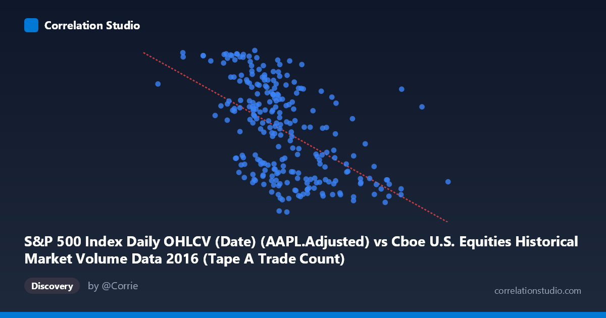
S&P 500 Index Daily OHLCV (Date) (AAPL.Adjusted) vs Cboe U.S. Equities Historical Market Volume Data 2016 (Tape A Trade Count)
- Pearson correlation (r)
- -0.5348
- Spearman correlation
- -0.5634
- p-value
- 0
- Sample size (n)
- 252
- 95% confidence interval
- -0.6176 to -0.4404
- Granger causality
- None
- Granger optimal lag
- 1
AI analysis
Analysis: AAPL Adjusted Price vs. Cboe Tape A Trade Count (2016)
1. Overall Relationship The scatterplot reveals a moderate negative relationship between Apple's adjusted stock price (X-axis) and Cboe's Tape A trade count (Y-axis) across 252 trading days in 2016. As AAPL's adjusted price increases — ranging from roughly $540K to $2.5M in the scaled units shown — the Tape A trade count tends to decline, moving from the higher range (~110–117) toward lower values (~89–95). The linear regression equation (y = −1.44×10⁻⁵x + 123.14) captures this downward slope, suggesting that higher AAPL price levels are associated with reduced trade count activity on Cboe's Tape A venue, though the scatter around the regression line is considerable.
2. Correlation Strength, Direction, and Causality The Pearson correlation of r = −0.53 indicates a moderate negative association, but the explanatory power is notably limited: R² = 0.286, meaning AAPL's price accounts for only about 28.6% of the variance in Tape A trade counts, leaving roughly 71% attributable to other factors. The 95% confidence interval of [−0.618, −0.440] is entirely negative and reasonably tight, confirming the direction is reliable, and the p-value of effectively zero rules out chance as an explanation for the observed correlation. However, Granger causality tests find no significant predictive direction in either direction (X→Y: F=0.38, p=0.54; Y→X: F=1.37, p=0.24), meaning that past values of AAPL price do not help predict future trade counts, nor vice versa. This is a critical distinction: the correlation is statistically real but temporally non-predictive, suggesting a shared underlying driver rather than any direct causal mechanism.
3. Notable Patterns, Clusters, and Outliers Several structural features stand out in the data. There is a visible clustering of points in the X range of roughly 1.0M–1.6M, which corresponds to AAPL's price trajectory through most of 2016 — this dense central cluster drives the bulk of the regression fit. At the lower X extreme (AAPL prices near $540K–$900K, likely early 2016 when AAPL was under pressure), trade counts are notably elevated (105–117 range), consistent with high market activity during volatile periods. Conversely, points at the upper X range (prices above $1.8M–$2.5M, likely late 2016 post-election rally) show suppressed trade counts in the 90–95 range. A few potential outliers are visible — notably points like (1,409,909, 89.01) and (1,000,524, 116.55) — which sit at the extremes of the Y-axis despite moderate X values, suggesting episodic market events that deviate from the general trend.
4. Confounding Factors and Interpretive Caveats This correlation almost certainly reflects a common temporal driver rather than a direct relationship between AAPL price and Cboe trade counts. Both variables are time-indexed across 2016, meaning broader market regime shifts — such as the post-Brexit volatility spike (June 2016) and the post-U.S. election rally (November 2016) — likely explain much of the pattern simultaneously. High-volatility regimes early in 2016 would naturally coincide with both lower AAPL prices and elevated trade counts across all venues. Additionally, the axis labels appear swapped in the source metadata (X references AAPL data from a Cboe dataset, Y references Cboe data from an S&P 500 dataset), which warrants verification before drawing firm conclusions. Seasonal liquidity patterns, index rebalancing events, and macro-driven rotation away from tech stocks are all plausible confounders.
5. Actionable Insights and Further Investigation Given that the correlation is statistically robust but causally unresolved, the most productive next step would be to introduce time as an explicit variable — plotting both series as time series overlaid would clarify whether the negative relationship is driven by a secular trend (AAPL rising across 2016 while market volume normalized) or by episodic co-movement. Partial correlation analysis controlling for VIX or overall S&P 500 volume would help isolate whether any residual AAPL-specific effect exists beyond broad market conditions. Additionally, testing non-linear fits (e.g., quadratic or spline) may better capture what appears to be a curved relationship at the extremes. Finally, expanding the analysis to other Tape segments (B, C) or other large-cap stocks would reveal whether this pattern is AAPL-specific or a general feature of market microstructure in 2016.
X dataset: Cboe U.S. Equities Historical Market Volume Data 2016
Y dataset: S&P 500 Index Daily OHLCV (Date)
Part of experiment: Daily - Cboe U.S. Equities Historical Market Volume Data 2016 vs S&P 500 Index Daily OHLCV (Date)