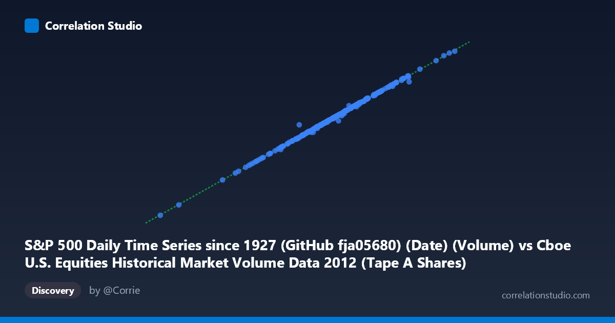
S&P 500 Daily Time Series since 1927 (GitHub fja05680) (Date) (Volume) vs Cboe U.S. Equities Historical Market Volume Data 2012 (Tape A Shares)
- Pearson correlation (r)
- 0.9989
- Spearman correlation
- 0.9982
- p-value
- 0
- Sample size (n)
- 250
- 95% confidence interval
- 0.9986 to 0.9992
- Granger causality
- None
- Granger optimal lag
- 10
AI analysis
Analysis: S&P 500 Volume vs. Cboe Tape A Shares (2012)
Relationship Overview The scatterplot reveals a striking, nearly perfect linear relationship between S&P 500 daily trading volume (X-axis, sourced from GitHub fja05680) and Cboe Tape A Shares (Y-axis, from Cboe U.S. Equities Historical Market Volume Data 2012) across the 2012 trading year. The data points align tightly along what appears to be a single, well-defined regression line (y = 14.91x + 18,772,400), with very little scatter deviation. This relationship spans an X range of roughly 83M to 354M shares and a corresponding Y range of approximately 1.25B to 5.27B shares, suggesting that Tape A share volume scales proportionally and predictably with overall S&P 500 volume activity throughout the year.
Correlation Strength and Statistical Significance The correlation is exceptionally strong at r = 0.9989, and the r² of 0.9978 means that 99.78% of the variance in Cboe Tape A Shares is statistically explained by S&P 500 volume — leaving less than 0.22% attributable to other factors. The 95% confidence interval [0.9986, 0.9992] is extremely narrow, indicating very high precision in this estimate with negligible uncertainty. The p-value of effectively zero (across n = 250 paired samples from a population of N = 3,750) confirms this relationship is not a chance finding. However, Granger causality tests reveal no significant temporal predictive direction in either direction (X→Y: F = 1.007, p = 0.439; Y→X: F = 0.989, p = 0.454), meaning that knowing yesterday's S&P 500 volume does not meaningfully improve forecasts of today's Tape A shares, and vice versa. This suggests the two series move contemporaneously rather than sequentially — they respond to the same underlying market forces simultaneously rather than one leading the other.
Notable Patterns, Clusters, and Outliers The data exhibits a remarkably clean linear distribution with no obvious non-linear curvature. However, several notable features deserve attention. At least two high-leverage points appear at the upper end of the distribution — notably the pair (354,354,104; 5,271,490,000) and (337,218,278; 5,041,990,000) — which represent extreme-volume days likely corresponding to high-volatility market events in 2012 (e.g., European debt crisis episodes or U.S. fiscal cliff concerns). These outliers sit on the regression line rather than away from it, reinforcing the relationship's robustness. The lower-volume cluster around the mean (~242M shares, ~3.63B Tape A shares) is dense, suggesting most trading days in 2012 were relatively moderate in volume, with high-volume days being episodic but conforming to the same linear pattern.
Confounding Factors and Caveats Despite the near-perfect correlation, several important caveats apply. The relationship likely reflects definitional overlap or double-counting — S&P 500 constituent stocks are predominantly Tape A (NYSE-listed) securities, so it would be structurally expected that aggregate S&P 500 volume and Tape A shares correlate almost tautologically. This is a case where the correlation may be largely mechanical rather than analytically informative. Additionally, the regression slope of ~14.91 suggests Tape A shares are consistently about 15 times larger than the S&P 500 volume metric, which warrants examination of how each dataset defines and aggregates "volume." There is also a risk of dataset alignment artifacts — both series are indexed by date, and any misalignment or calendar normalization differences could subtly affect the Granger results. The absence of temporal causality despite the strong contemporaneous correlation further raises the question of whether a common latent driver (e.g., overall market participation, algorithmic trading intensity, macro news events) is responsible for both series moving together.
Actionable Insights and Further Investigation Given these findings, several avenues merit deeper exploration. First, decompose the relationship by market regime — segment 2012 into distinct volatility periods (e.g., Q1 rally, Q2 European crisis, Q4 fiscal cliff) to determine whether the slope or intercept shifts across regimes, which would reveal whether the relationship is truly stable or an artifact of annual aggregation. Second, test against other Tape categories (B and C) to determine whether the ~15x multiplier holds universally, helping clarify whether the correlation is definitional. Third, investigate the high-volume outlier days specifically to identify whether these correspond to identifiable market events, and whether volume spikes in one series systematically precede or lag the other at intraday resolution. Finally, extending this analysis to multiple years (the S&P 500 dataset extends to 1927) could reveal whether this tight linear relationship is specific to 2012's market microstructure or a persistent, structural feature — which would have direct implications for using one series as a proxy or validator for the other in quantitative research workflows.
X dataset: Cboe U.S. Equities Historical Market Volume Data 2012
Y dataset: S&P 500 Daily Time Series since 1927 (GitHub fja05680) (Date)
Part of experiment: Daily - Cboe U.S. Equities Historical Market Volume Data 2012 vs S&P 500 Daily Time Series since 1927 (GitHub fja05680) (Date)