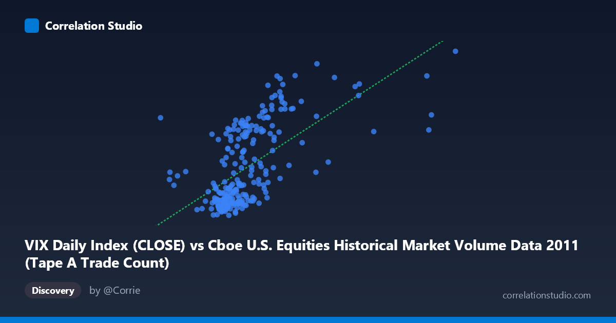
VIX Daily Index (CLOSE) vs Cboe U.S. Equities Historical Market Volume Data 2011 (Tape A Trade Count)
- Pearson correlation (r)
- 0.6187
- Spearman correlation
- 0.6639
- p-value
- 0
- Sample size (n)
- 252
- 95% confidence interval
- 0.5361 to 0.6895
- Granger causality
- None
- Granger optimal lag
- 1
AI analysis
Scatterplot Analysis: VIX Daily Index vs. Tape A Trade Count (2011)
Relationship Overview
The scatterplot reveals a moderate positive relationship between the CBOE Volatility Index (VIX) closing values and Tape A trade counts on U.S. equities exchanges throughout 2011. As VIX levels rise — indicating heightened market fear and uncertainty — the number of trades on Tape A (NYSE-listed securities) tends to increase correspondingly. This is intuitively sensible: periods of elevated volatility typically drive higher trading activity as market participants rush to rebalance, hedge, or liquidate positions. The linear regression equation (y = 1.59401E-05x + 5.15184) confirms a positive slope, and the scatter shows a broadly upward trend, though with considerable dispersion around the fitted line, particularly at higher VIX values.
Correlation Strength and Statistical Significance
The Pearson correlation of r = 0.6187 indicates a moderate-to-strong positive association, but the coefficient of determination r² = 0.3827 is the more grounding statistic: only 38.3% of the variance in Tape A trade counts is explained by VIX levels alone. This leaves over 61% of variability attributable to other factors entirely. The 95% confidence interval of [0.5361, 0.6895] is meaningfully narrow given the sample of n = 252, and the p-value of essentially zero confirms this relationship is highly unlikely to be a statistical artifact. However, the Granger causality results are notably absent in both directions — X→Y (F = 0.0384, p = 0.8447) and Y→X (F = 0.0468, p = 0.8288) — meaning that neither variable reliably predicts the other's future values at a 1-period lag. The contemporaneous correlation is real, but neither time series leads the other in a temporally predictive sense.
Notable Patterns, Clusters, and Outliers
The data exhibits several visually distinct features worth flagging. There is a dense cluster of points at lower VIX values (roughly 15–20) paired with lower trade counts, representing the calmer market periods of 2011. A second, more dispersed grouping emerges at higher VIX levels (30–48), corresponding to the European sovereign debt crisis and U.S. credit rating downgrade period in mid-to-late 2011, where both volatility and trading volume spiked. Several potential outliers appear at extreme VIX values (above 40), where trade counts remain high but show substantial spread, suggesting that at peak stress levels, the relationship becomes less predictable. The point at approximately (2,126,541, 39.00) stands out as an unusually high X-value relative to its VIX score, warranting closer inspection as a possible data anomaly or atypical trading day.
Confounding Factors and Caveats
Several important caveats temper interpretation. Seasonality is a likely confounder — 2011 was a year with distinct market regimes (relative calm in H1, acute stress in H2), so the correlation may partly reflect a temporal coincidence of rising VIX and structural shifts in market microstructure. Market structure changes, such as exchange rule modifications or shifts in algorithmic trading behavior, could independently drive trade counts. Additionally, Tape A specifically captures NYSE-listed securities, so volume migration between venues (e.g., to dark pools or alternative trading systems) could distort the relationship. The axis labels appear swapped from what one might expect — VIX data appears on the X-axis while trade count data is labeled from the VIX dataset, which may reflect a data labeling inconsistency worth verifying. Finally, one year of daily data limits the generalizability of findings to broader market cycles.
Actionable Insights and Further Investigation
Despite the moderate r², the finding has practical relevance for trading operations and risk management: elevated VIX regimes are associated with higher trade throughput, informing capacity planning for exchange infrastructure and clearing systems. To deepen this analysis, investigators should: (1) extend the time series across multiple years to test whether the relationship holds across different volatility regimes; (2) decompose the Tape A data by trade size or participant type to identify whether retail or institutional activity drives the volume-volatility link; (3) test non-linear models (e.g., polynomial or piecewise regression) given the visual suggestion of accelerating trade counts at extreme VIX levels; and (4) incorporate additional predictors such as SPX returns, put/call ratios, or bid-ask spreads to build a more complete explanatory model. The absence of Granger causality also warrants testing at longer lag structures (5–10 days) to rule out delayed predictive relationships.
X dataset: Cboe U.S. Equities Historical Market Volume Data 2011
Y dataset: VIX Daily Index
Part of experiment: Daily - Cboe U.S. Equities Historical Market Volume Data 2011 vs VIX Daily Index