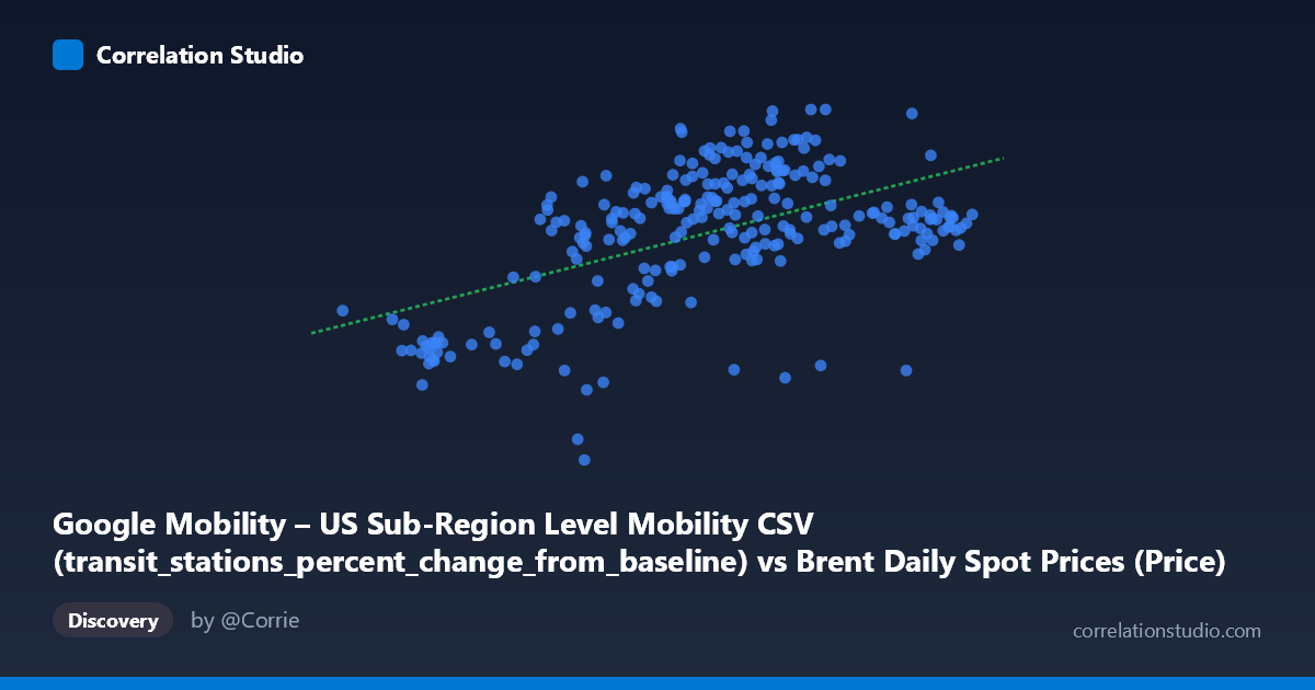
Google Mobility – US Sub-Region Level Mobility CSV (transit_stations_percent_change_from_baseline) vs Brent Daily Spot Prices (Price)
- Pearson correlation (r)
- 0.5408
- Spearman correlation
- 0.4295
- p-value
- 0
- Sample size (n)
- 253
- 95% confidence interval
- 0.4473 to 0.6226
- Granger causality
- None
- Granger optimal lag
- 1
AI analysis
Analysis: US Transit Station Mobility vs. Brent Crude Oil Prices (2021)
1. Overall Relationship
The scatterplot reveals a moderate positive relationship between US transit station mobility (percent change from baseline) and Brent crude oil spot prices across 2021. As oil prices rose throughout the year — ranging from roughly $50 to $86 per barrel — transit mobility also tended to improve relative to its COVID-era baseline, shifting from deeply negative values (as low as -38%) toward near-zero or modestly positive territory. The linear regression (y = 0.748x − 53.56) captures this upward trend, but the substantial scatter around the line makes clear that oil price alone is far from a complete explanation for mobility patterns.
2. Correlation Strength and Statistical Interpretation
The Pearson correlation of r = 0.54 indicates a moderate positive association, but the explained variance tells a more sobering story: R² = 0.29, meaning oil prices account for only about 29% of the variance in transit mobility. The remaining ~71% is driven by other factors entirely. The 95% confidence interval of [0.45, 0.62] is reasonably narrow given the large population (N = 9,893), and the p-value of effectively zero confirms this is not a chance finding — the signal is real, but modest. Critically, Granger causality testing finds no significant predictive direction in either direction (X→Y: F = 1.35, p = 0.25; Y→X: F = 0.15, p = 0.70), meaning oil prices do not temporally predict mobility changes, nor vice versa. This strongly cautions against any causal interpretation — both variables are most likely responding to a shared underlying driver rather than influencing each other directly.
3. Notable Patterns, Clusters, and Outliers
Several structural features stand out in the data. There is a visible cluster of low-mobility, low-price observations in the lower-left (roughly X: 50–60, Y: -38 to -18), corresponding to early 2021 when pandemic restrictions were still severe and oil prices had not yet recovered. A second, denser cluster occupies the mid-to-upper range (X: 68–85, Y: -5 to +20), reflecting the later months of 2021 as both reopening and energy demand accelerated. Several notable outliers exist — particularly the point near (75, -25) and a few observations below -20 despite mid-range oil prices — suggesting county-specific or event-driven disruptions. The spread of Y values widens at higher X values, hinting at possible heteroscedasticity, where higher oil prices are compatible with a broader range of mobility outcomes.
4. Confounding Factors and Caveats
The most important caveat is that 2021 was dominated by a single overriding factor — the COVID-19 pandemic recovery trajectory — which simultaneously drove both oil demand/prices upward and mobility restrictions downward. This shared temporal driver almost certainly creates the observed correlation as a spurious byproduct, rather than any genuine mechanistic link between gas prices and transit use. Additional confounders include seasonal patterns (winter vs. summer mobility and energy demand), vaccine rollout timing, geographic heterogeneity across US sub-regions (the Y variable aggregates across diverse counties), and policy interventions. The dataset mismatch also warrants attention: oil prices are a single national/global series, while transit mobility is sub-regional and highly granular — aggregating these introduces ecological fallacy risk.
5. Actionable Insights and Further Investigation
Given the absence of Granger causality, analysts should resist using oil prices as a leading indicator of transit mobility or vice versa. A more productive approach would be to control for pandemic phase (e.g., vaccination rates, case counts, or policy stringency indices) and re-examine the partial correlation — if the relationship disappears after controlling for time/pandemic trajectory, it confirms the spurious nature of this association. It would also be worthwhile to disaggregate by US region to test whether local energy-cost sensitivity moderates transit use differently across geographies. Finally, incorporating fuel price data at the consumer level (retail gasoline prices rather than Brent spot) might reveal more direct behavioral linkages to transit substitution if any genuine economic relationship exists.
X dataset: Brent Daily Spot Prices
Y dataset: Google Mobility – US Sub-Region Level Mobility CSV
Part of experiment: Daily - Brent Daily Spot Prices vs Google Mobility – US Sub-Region Level Mobility CSV