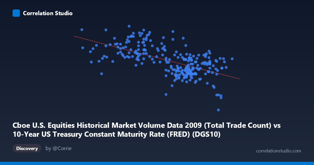
Cboe U.S. Equities Historical Market Volume Data 2009 (Total Trade Count) vs 10-Year US Treasury Constant Maturity Rate (FRED) (DGS10)
- Pearson correlation (r)
- -0.6033
- Spearman correlation
- -0.5869
- p-value
- 0
- Sample size (n)
- 250
- 95% confidence interval
- -0.6767 to -0.518
- Granger causality
- None
- Granger optimal lag
- 10
AI analysis
Analysis: 10-Year Treasury Yield vs. Cboe Equity Trade Count (2009)
Relationship Overview
The scatterplot reveals a moderate negative relationship between the 10-year US Treasury constant maturity rate (X-axis) and Cboe U.S. equity trade counts (Y-axis) during 2009. The linear regression equation (y = -927,316x + 5,699,730) indicates that for each one-unit increase in the Treasury yield, trade counts decline by approximately 927,316 units. Visually, this suggests that periods of lower interest rates — which characterized early 2009 during the depths of the financial crisis — corresponded with higher equity trading volumes, while the gradual yield recovery later in the year coincided with diminishing trade activity. The X range of roughly 2.23% to 3.98% captures the meaningful yield movement across 2009's dramatic market cycle.
Correlation Strength and Statistical Significance
The Pearson correlation of r = -0.60 reflects a moderate-to-strong negative association, and the r² of 0.364 means that approximately 36.4% of the variance in equity trade counts is explained by Treasury yield levels — a non-trivial but incomplete explanatory picture, with nearly two-thirds of variation attributable to other factors. The 95% confidence interval of [-0.677, -0.518] is notably narrow given the sample size of 250 paired observations drawn from a population of 3,232, and the p-value of effectively zero confirms this correlation is highly unlikely to be a statistical artifact. However, the Granger causality results complicate the narrative significantly: neither direction (X→Y: F=0.84, p=0.595; Y→X: F=1.74, p=0.073) achieves conventional significance thresholds at the optimal 10-period lag. This means that while the two series are contemporaneously correlated, neither variable reliably predicts the other's future values — a critical caveat for any causal interpretation.
Notable Patterns, Clusters, and Outliers
The sample points reveal considerable scatter around the regression line, suggesting the linear model captures a general trend but misses substantial variation. Several notable features stand out: the point at (3.82, 629,671) represents a striking outlier with an anomalously low trade count at a relatively high yield, potentially corresponding to a holiday-shortened session or an anomalous low-volume day late in the year. Conversely, (2.78, 4,134,003) anchors the upper-left extreme — very low yields paired with peak trading volume — consistent with the panic-driven hyperactivity of early 2009's market stress. A visible clustering of points in the yield range of 3.40–3.60% with trade counts between roughly 1.8M and 2.9M suggests that as yields normalized in the second half of 2009, trading volumes both declined and became less variable. The lower-yield region (2.3–2.9%) shows far wider vertical dispersion, hinting at heteroscedasticity where volatility in trade counts was highest during the most stressed market conditions.
Confounding Factors and Interpretive Caveats
The most significant caveat is that 2009 represents an extraordinary, non-representative year — spanning the trough of the Global Financial Crisis, the March 2009 equity market bottom, and a powerful recovery — making it difficult to disentangle yield-driven trading behavior from crisis-driven volatility and fear. Both variables were simultaneously being driven by a common third factor: macroeconomic stress and Federal Reserve intervention. The Fed's aggressive rate-cutting cycle and early quantitative easing programs suppressed Treasury yields while simultaneously generating enormous uncertainty and trading volume in equities. This classic confounding-by-crisis scenario means the observed correlation may largely reflect a shared response to systemic risk rather than any direct mechanical link between yield levels and trading activity. Additionally, the dataset label mismatch — where the X-axis column appears to originate from the Cboe dataset and the Y-axis from FRED — warrants verification that the data join on dates is correctly aligned, particularly around holidays and non-trading days.
Actionable Insights and Further Investigation
Despite the absence of Granger causality, the moderate correlation and the contextual richness of 2009 data suggest several productive investigative paths. First, segmenting the analysis by market regime — pre-March 2009 crisis period versus post-March recovery — would test whether the correlation holds consistently or is driven primarily by one phase. Second, incorporating the VIX or credit spreads as control variables would help isolate whether yield levels carry independent information about trading volume once systemic fear is accounted for. Third, extending the analysis across multiple years (e.g., 2005–2015) would clarify whether this negative relationship is a structural feature of markets or a 2009-specific artifact. Finally, given the Granger result's near-significance in the Y→X direction (p=0.073), exploring whether lagged trade volume contains weak predictive signal for yields with a larger dataset or alternative lag structures could be worthwhile — high trading activity may reflect information aggregation that marginally anticipates rate movements.
X dataset: 10-Year US Treasury Constant Maturity Rate (FRED)
Y dataset: Cboe U.S. Equities Historical Market Volume Data 2009
Part of experiment: Daily - 10-Year US Treasury Constant Maturity Rate (FRED) vs Cboe U.S. Equities Historical Market Volume Data 2009