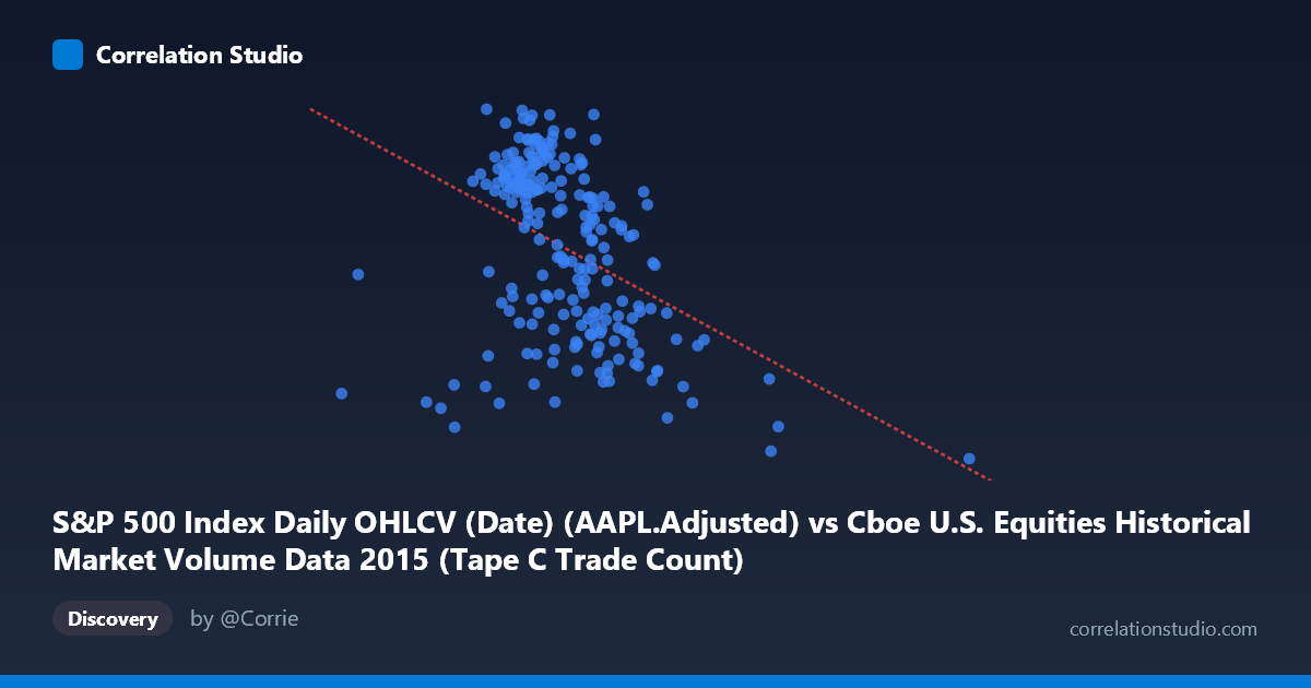
S&P 500 Index Daily OHLCV (Date) (AAPL.Adjusted) vs Cboe U.S. Equities Historical Market Volume Data 2015 (Tape C Trade Count)
- Pearson correlation (r)
- -0.4132
- Spearman correlation
- -0.4458
- p-value
- 0
- Sample size (n)
- 222
- 95% confidence interval
- -0.5168 to -0.2978
- Granger causality
- None
- Granger optimal lag
- 1
AI analysis
Scatterplot Analysis: AAPL Adjusted Price vs. Cboe Tape C Trade Count (2015)
Relationship Overview The scatterplot reveals a moderate negative relationship between Apple's adjusted stock price (X-axis) and the Cboe U.S. Equities Tape C trade count (Y-axis) across 2015. As AAPL's adjusted price increases, Tape C trade counts tend to decline. The linear regression equation (y = -2.077×10⁻⁵x + 132.661) confirms this downward slope, suggesting that higher AAPL valuations coincide with reduced trading activity on Tape C venues. Visually, the data cloud slopes modestly downward from left to right, though with considerable scatter throughout the range, indicating this is far from a deterministic relationship.
Correlation Strength and Statistical Significance The Pearson correlation of r = -0.413 indicates a moderate negative association, but the variance explained metric tells a more sobering story: r² = 0.171 means only 17.1% of the variance in Tape C trade counts is accounted for by AAPL's price level, leaving roughly 83% unexplained by this relationship alone. The 95% confidence interval of [-0.517, -0.298] is entirely negative, confirming directional consistency, and the p-value of 1.45×10⁻¹⁰ establishes the result as highly statistically significant — this correlation is almost certainly not a chance artifact given n = 222 paired observations. However, Granger causality tests reveal no significant temporal predictive direction in either direction (X→Y: F = 0.521, p = 0.471; Y→X: F = 0.017, p = 0.897). This is a critical caveat: while a contemporaneous correlation exists, neither variable reliably predicts the other's future values at a one-period lag, undermining any causal narrative.
Notable Patterns, Clusters, and Outliers Several features stand out in the data. The bulk of observations cluster between roughly X = 600,000–900,000 and Y = 110–127, forming a dense central cloud where the negative trend is most visible. Two prominent outliers demand attention: the point near (1,611,853, 100.01) sits far to the right with the lowest Y value in the dataset — likely corresponding to a high-volume, low-price event or market stress day — and a second outlier near (1,194,528, 100.61) follows a similar pattern. These extreme X-axis values, substantially above the mean of ~762,000, appear to represent episodic spikes in AAPL trading volume coinciding with depressed trade counts on Tape C, potentially August 2015 market volatility. There also appears to be a lower-left cluster around X = 290,000–500,000 with Y values spanning a wide range, suggesting that low-price periods carry more variable trading activity.
Confounding Factors and Interpretive Caveats Several confounds complicate interpretation. First, AAPL adjusted price is not a volume or activity metric — correlating a price level with a trade count mixes fundamentally different variable types, and any relationship may be spurious or driven by shared temporal trends across 2015 (e.g., the summer 2015 correction affecting both). Second, Tape C trade count reflects activity across all Nasdaq-listed securities, not AAPL specifically, so the correlation may reflect market-wide conditions rather than anything AAPL-specific. Third, the axis labels appear transposed relative to intuitive expectations — notably, the dataset descriptions indicate the axes are drawn from each other's opposing datasets, which raises a data-joining concern that should be verified. Fourth, outlier leverage is significant here; the two extreme X values visibly pull the regression line and inflate the negative correlation, and their removal would likely weaken r substantially.
Actionable Insights and Further Investigation Given these findings, several next steps are warranted. Outlier investigation should be prioritized — identifying the specific dates of the two extreme observations (likely August–September 2015) and assessing whether they represent genuine signal or data anomalies would clarify their influence on the overall correlation. Analysts should partial out time trends by detrending both series or using first-differences to test whether the correlation persists beyond shared temporal drift across the year. Since Granger causality failed at lag-1, testing multiple lag structures (2–5 periods) might reveal delayed predictive relationships. Finally, replacing AAPL price with AAPL-specific volume or trade count would create a more apples-to-apples comparison with Tape C activity, potentially revealing whether Apple's trading intensity genuinely co-moves with broader Cboe venue utilization — a more actionable insight for market microstructure analysis.
X dataset: Cboe U.S. Equities Historical Market Volume Data 2015
Y dataset: S&P 500 Index Daily OHLCV (Date)
Part of experiment: Daily - Cboe U.S. Equities Historical Market Volume Data 2015 vs S&P 500 Index Daily OHLCV (Date)