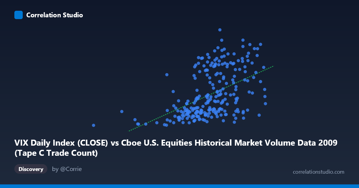
VIX Daily Index (CLOSE) vs Cboe U.S. Equities Historical Market Volume Data 2009 (Tape C Trade Count)
- Pearson correlation (r)
- 0.5002
- Spearman correlation
- 0.5446
- p-value
- 0
- Sample size (n)
- 252
- 95% confidence interval
- 0.4014 to 0.5875
- Granger causality
- None
- Granger optimal lag
- 1
AI analysis
Analysis: VIX Daily Index vs. Tape C Trade Count (2009)
Relationship Overview The scatterplot reveals a moderate positive relationship between the Cboe VIX Daily Index (close) and Tape C trade count during 2009. As the VIX — a widely-used measure of expected market volatility — rises, Tape C trading activity tends to increase alongside it. This is broadly intuitive: periods of heightened market uncertainty and fear (high VIX) typically drive elevated trading volumes as investors reposition, hedge, or react to news. The linear regression equation (y = 4.54E-05x + 2.61) confirms this upward slope, though the relatively modest coefficient suggests the relationship, while real, is far from deterministic.
Correlation Strength and Statistical Significance The Pearson correlation of r = 0.50 indicates a moderate positive association. More importantly, the r² = 0.25 reveals that VIX explains only about 25% of the variance in Tape C trade counts — meaning three-quarters of the variation in trading activity is driven by factors entirely outside the VIX. The 95% confidence interval of [0.40, 0.59] is meaningfully above zero and relatively tight given n = 252, lending credibility to the estimate. The p-value of effectively 0 confirms this correlation is statistically significant and not a sampling artifact. However, Granger causality analysis tells a cautionary tale: neither direction (X→Y: F = 0.45, p = 0.50; Y→X: F = 0.03, p = 0.85) achieves significance at a one-period lag, meaning that despite the contemporaneous correlation, past VIX values do not reliably predict future trade counts, nor vice versa. This sharply limits any predictive or causal narrative one might draw from the cross-sectional relationship alone.
Notable Patterns, Clusters, and Outliers Several structural features stand out in the sample points. There is a visible lower cluster of points with VIX values roughly between 500,000–600,000 and trade counts between 19–27, suggesting a regime of lower volatility and subdued trading activity — likely corresponding to the more stabilized second half of 2009. A second, more dispersed upper cluster occupies the 620,000–830,000 VIX range with trade counts spanning 30–56, consistent with the volatile early-2009 environment during the financial crisis nadir. Points such as (761,867, 52.65) and (679,961, 52.62) appear as high-leverage outliers with notably elevated trade counts, potentially corresponding to specific crisis events or expiration dates. The point at (185,886, 19.47) is a clear low-end outlier — possibly a holiday-shortened session or data anomaly — and could exert disproportionate influence on the regression fit.
Confounding Factors and Interpretation Caveats Several important caveats temper interpretation. First, 2009 was a structurally unusual year: it spanned the tail of the global financial crisis through a historic recovery rally, meaning the data likely conflates two distinct market regimes rather than representing a stable equilibrium relationship. Second, Tape C specifically covers NYSE Arca-listed securities, so trade count dynamics may reflect venue-specific routing decisions, regulatory changes, or competitive dynamics rather than purely volatility-driven behavior. Third, the absence of Granger causality warns that the contemporaneous correlation may reflect a common driver — such as macroeconomic news events, Federal Reserve announcements, or earnings seasons — rather than any direct mechanistic link between VIX and Tape C volume. Finally, the relatively wide scatter around the regression line (75% unexplained variance) suggests non-linear or threshold effects that a simple linear model inadequately captures.
Actionable Insights and Further Investigation Practitioners should treat the 25% explained variance as a floor, not a ceiling — the relationship is real but insufficient for standalone predictive use. Several next steps would be valuable: (1) Segment the data by market regime (pre/post March 2009 market bottom) to test whether the correlation differs materially across periods; (2) Incorporate additional predictors such as overall market return, Federal Reserve event dates, or options expiration calendars to improve explanatory power; (3) Test non-linear specifications (e.g., log-log or spline regression) given the apparent clustering and heteroscedasticity visible in the chart; (4) Examine other Tape designations (A and B) to determine whether the VIX-volume relationship is Tape C-specific or market-wide; and (5) explore intraday data to better capture the within-day dynamics that daily aggregation may obscure, which could also improve the Granger causality detection at sub-daily lags.
X dataset: Cboe U.S. Equities Historical Market Volume Data 2009
Y dataset: VIX Daily Index
Part of experiment: Daily - Cboe U.S. Equities Historical Market Volume Data 2009 vs VIX Daily Index