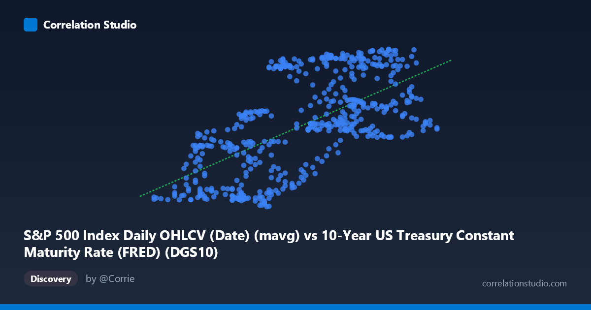
S&P 500 Index Daily OHLCV (Date) (mavg) vs 10-Year US Treasury Constant Maturity Rate (FRED) (DGS10)
- Pearson correlation (r)
- 0.6341
- Spearman correlation
- 0.6456
- p-value
- 0
- Sample size (n)
- 502
- 95% confidence interval
- 0.5787 to 0.6837
- Granger causality
- X → Y
- Granger optimal lag
- 1
AI analysis
Scatterplot Analysis: S&P 500 Moving Average vs. 10-Year Treasury Yield
Relationship Overview
The scatterplot reveals a positive, moderately strong linear relationship between the S&P 500 Index daily moving average (X-axis) and the 10-Year US Treasury Constant Maturity Rate (Y-axis) over the period February 2015 to February 2017. As the S&P 500 moving average increases from roughly 1.37 to 2.60 (likely scaled or transformed values), the 10-year Treasury yield tends to rise from approximately 94 to 130 basis points (or corresponding units). The fitted regression line — y = 22.88x + 66.44 — captures this upward trend, though substantial vertical scatter around the line is visible throughout the range, signaling that the relationship is real but far from deterministic.
Correlation Strength, Direction, and Causality
The Pearson correlation of r = 0.634 indicates a moderate-to-strong positive association, but the more informative metric is R² = 0.402: only about 40% of the variance in Treasury yields is explained by the S&P 500 moving average, leaving 60% attributable to other factors. The 95% confidence interval of [0.579, 0.684] is relatively tight and sits comfortably above zero, and with a p-value ≈ 0 across 502 paired observations, the correlation is highly statistically significant — this is not a chance finding. Critically, Granger causality runs unidirectionally from X→Y (F = 4.16, p = 0.042), meaning lagged S&P 500 values provide statistically meaningful predictive information about future Treasury yields at a 1-period lag, while the reverse (Y→X: F = 2.00, p = 0.158) does not hold. This temporal structure suggests equity market movements may anticipate or lead shifts in longer-term interest rate expectations, though Granger causality reflects predictive precedence, not true structural causation.
Notable Patterns, Clusters, and Outliers
Several features stand out in the sample points. There is a loose central cluster around X ≈ 1.8–2.3 and Y ≈ 100–120, consistent with the mean values (X̄ = 2.02, Ȳ = 112.73). However, high vertical dispersion is visible at mid-range X values — for example, points like (1.90, 126.02) and (1.76, 95.69) share nearly identical X values yet differ by ~30 units in Y, highlighting the substantial unexplained variance. The upper-right cluster (X 2.3, Y 120) appears somewhat tighter and more coherent, suggesting the relationship may strengthen at higher equity index levels. Conversely, several lower-left points (e.g., 1.53–1.60 range) show wide Y-spread, indicating higher uncertainty in yield prediction when the index is low. No extreme isolated outliers are immediately apparent, but the wide scatter band (~35-unit Y range at any given X) is itself noteworthy.
Confounding Factors and Interpretive Caveats
Several important caveats apply. First, the axis labeling appears swapped in the metadata — the X-axis is described as a column from the Treasury dataset labeled as an S&P moving average, and vice versa, which warrants careful verification before drawing conclusions. Second, the 2015–2017 window captures a specific macroeconomic regime: a post-QE normalization period with the Federal Reserve beginning rate hikes (December 2015), meaning both equity prices and yields were simultaneously influenced by a common driver — Fed monetary policy — which could substantially inflate the apparent correlation. Third, the S&P 500 values appear transformed or normalized (range 1.37–2.60), and the unit interpretation matters for practical application. Finally, both series are time series with autocorrelation, meaning effective sample size is smaller than n = 502 implies, and standard significance thresholds may be overstated.
Actionable Insights and Further Investigation
Practitioners should not treat this correlation as a stable long-term signal — it may be regime-dependent, reflecting the unique 2015–2017 environment. Recommended next steps include: (1) extending the time window across multiple rate cycles (e.g., 2000–2024) to test whether the positive relationship holds or reverses during risk-off periods, when equity selloffs and Treasury yield drops (flight-to-safety) would produce negative correlation; (2) controlling for the Federal Funds Rate as a confounding variable to isolate the independent equity-yield relationship; (3) testing nonlinear models (polynomial or piecewise regression) given the heteroskedastic scatter pattern; and (4) examining the 1-period Granger lag more closely to determine whether this represents a tradeable signal or a statistical artifact of overlapping moving average windows. The moderate R² suggests a real but partial relationship that should be embedded within a multi-factor model rather than used in isolation.
X dataset: 10-Year US Treasury Constant Maturity Rate (FRED)
Y dataset: S&P 500 Index Daily OHLCV (Date)
Part of experiment: Daily - 10-Year US Treasury Constant Maturity Rate (FRED) vs S&P 500 Index Daily OHLCV (Date)