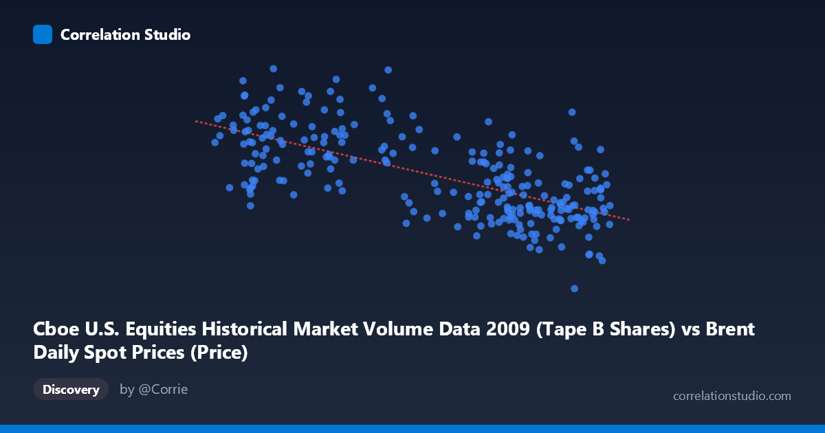
Cboe U.S. Equities Historical Market Volume Data 2009 (Tape B Shares) vs Brent Daily Spot Prices (Price)
- Pearson correlation (r)
- -0.6659
- Spearman correlation
- -0.6473
- p-value
- 0
- Sample size (n)
- 252
- 95% confidence interval
- -0.7294 to -0.5909
- Granger causality
- None
- Granger optimal lag
- 10
AI analysis
Scatterplot Analysis: Brent Crude Oil Prices vs. Cboe Tape B Trading Volume (2009)
Relationship Overview
The scatterplot reveals a moderately strong negative relationship between Europe Brent crude oil spot prices (X-axis, in USD/barrel) and Cboe Tape B equity share volume (Y-axis). As oil prices increase, equity trading volume on Tape B exchanges tends to decline. The linear regression equation (y = -2,307,760x + 289,318,000) quantifies this inverse slope, suggesting that for each additional dollar per barrel in oil price, Tape B volume decreases by approximately 2.3 million shares on average. This pattern spans the full 2009 calendar year, a period that began near the trough of the Global Financial Crisis and saw oil prices roughly double from ~$40 to ~$79/barrel, while equity market activity was gradually normalizing from crisis-era volatility extremes.
Correlation Strength and Statistical Significance
The Pearson correlation of r = -0.666 indicates a moderate-to-strong negative association, and the R² of 0.443 means that approximately 44.3% of the day-to-day variance in Tape B trading volume is statistically explained by oil price levels alone — a non-trivial but incomplete explanatory share. The 95% confidence interval of [-0.729, -0.591] is relatively tight and does not cross zero, and the p-value is effectively 0, confirming that this correlation is highly unlikely to be a chance artifact in the sample of 252 paired trading days. However, the Granger causality tests complicate the narrative considerably: neither direction of temporal predictability is statistically significant (X→Y: F=1.70, p=0.082; Y→X: F=1.45, p=0.159). This means that, despite the cross-sectional correlation being robust, neither variable systematically leads the other at the optimal 10-period lag. Oil prices do not help predict future trading volume, and trading volume does not help predict future oil prices — the relationship appears to be co-movement driven by shared underlying forces rather than a direct causal mechanism in either direction.
Notable Patterns, Clusters, and Outliers
The scatterplot shows several features worth highlighting. There is a visible concentration of high-volume observations (180M shares) clustered at lower oil price ranges (roughly $40–$55/barrel), consistent with early-2009 conditions when post-crisis panic trading was still elevated. Conversely, the bulk of observations in the $65–$79 range show tighter, lower volume clustering, reflecting calmer mid-to-late 2009 markets. Several prominent outliers are visible: one point near (75.15, 33,822,027) represents an unusually low-volume day at a moderately high oil price — this single point is the minimum Y value in the dataset and likely reflects a holiday-shortened or anomalous trading session. Another cluster of high-volume points above 220M shares at lower oil prices (e.g., ~$42–$50 range) pulls the regression slope steeply negative. The spread of Y values at any given X level is also quite wide, suggesting substantial unexplained daily variability even after accounting for the oil price effect.
Confounding Factors and Caveats
This correlation almost certainly reflects common exposure to macroeconomic regime change rather than any direct link between oil prices and Tape B equity volume. The year 2009 was exceptional: it began amid the depths of the financial crisis (peak fear, elevated trading volume, depressed asset prices including oil) and ended in a recovery phase (reduced volatility, lower volume, recovering oil). This temporal confound — both variables trending in opposite directions over the same recovery arc — is the most probable driver of the observed r. Essentially, the correlation may largely be a spurious artifact of shared trend, where crisis-era conditions produced high volumes and low oil prices simultaneously, and recovery conditions produced the reverse. Additionally, Tape B specifically covers regional exchanges (NYSE American, etc.), so volume dynamics may reflect idiosyncratic microstructure changes from 2009 exchange competition rather than broad market sentiment. The dataset mismatch (the X column is described as originating from "Brent Daily Spot Prices" dataset but labeled as Cboe volume data, and vice versa for Y) warrants a careful audit of column assignment before drawing further conclusions.
Actionable Insights and Further Investigation
Given the lack of Granger causality, practitioners should not use oil prices as a leading indicator for Tape B volume forecasting in a trading or risk management context. However, the shared macro-regime sensitivity is itself actionable: both variables could serve as coincident indicators of broader risk appetite, useful in regime-classification models. To disentangle the spurious trend component from any genuine relationship, it would be valuable to detrend or difference both series and re-examine the correlation on residuals. Extending the analysis across multiple years (the underlying dataset extends to present) would test whether this negative correlation is stable or unique to the 2009 recovery dynamic. Finally, controlling for the VIX (volatility index) as a covariate would likely absorb much of the shared variance, clarifying whether oil prices carry any incremental explanatory power for equity volume beyond generalized market stress levels.
X dataset: Brent Daily Spot Prices
Y dataset: Cboe U.S. Equities Historical Market Volume Data 2009
Part of experiment: Daily - Brent Daily Spot Prices vs Cboe U.S. Equities Historical Market Volume Data 2009