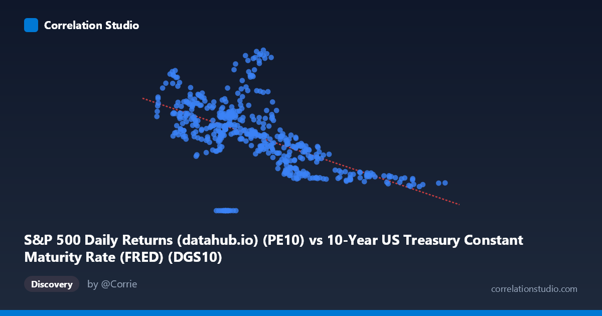
S&P 500 Daily Returns (datahub.io) (PE10) vs 10-Year US Treasury Constant Maturity Rate (FRED) (DGS10)
- Pearson correlation (r)
- -0.57
- Spearman correlation
- -0.6397
- p-value
- 0
- Sample size (n)
- 493
- 95% confidence interval
- -0.6267 to -0.5072
- Granger causality
- None
- Granger optimal lag
- 1
AI analysis
Analysis: S&P 500 PE10 vs. 10-Year US Treasury Yield (1962–2026)
1. Overall Relationship The scatterplot reveals a negative relationship between the S&P 500's Cyclically Adjusted PE Ratio (PE10, on the X-axis) and the 10-Year US Treasury yield (DGS10, on the Y-axis). As the PE10 ratio rises, Treasury yields tend to fall, and vice versa. The linear regression equation (y = -1.76x + 30.71) captures this inverse slope, suggesting that for every one-unit increase in PE10, the 10-year yield is associated with roughly a 1.76 percentage point decline. This pattern is consistent with the well-documented "Fed Model" intuition — that equity valuations and long-term interest rates compete for capital, moving in broadly opposite directions across historical cycles.
2. Correlation Strength and Statistical Significance The Pearson correlation of r = -0.57 indicates a moderate negative association, with R² = 0.325, meaning approximately 32.5% of the variance in Treasury yields is explained by PE10 alone. While statistically meaningful, this also means nearly 67.5% of the variance remains unexplained, pointing to substantial influence from other factors. The 95% confidence interval of [-0.627, -0.507] is entirely negative and relatively tight given the large sample (N = 1,865), and the p-value of essentially zero confirms this correlation is highly unlikely to be a chance artifact. That said, statistical significance should not be confused with causal magnitude — the explained variance is real but modest. Crucially, Granger causality tests show no significant predictive direction in either direction (X→Y: p = 0.80; Y→X: p = 0.24), meaning that lagged values of PE10 do not reliably predict future Treasury yields, nor do lagged yields predict PE10. This absence of Granger causality cautions strongly against any assumption that one variable drives the other in a temporally structured way.
3. Notable Patterns, Clusters, and Outliers The scatterplot exhibits several distinctive features. There is a dense cluster of points at lower PE10 values (roughly 1–7) paired with higher yields (20–38), consistent with the high-inflation, high-rate environment of the late 1970s and early 1980s when equity valuations were depressed. Conversely, higher PE10 values (10–15+) cluster at lower yields (6–10), reflecting the post-2000 and post-2008 low-rate era of elevated equity multiples. Two prominent outliers stand out: a point near (6.21, 44.20) — an extraordinarily high yield observation — and (4.77, 0.00), representing a near-zero yield, both of which fall well outside the central data cloud and likely reflect extreme historical episodes (e.g., early 1980s peak rates or post-2008/COVID near-zero rate environments). The relationship also appears to carry a non-linear character, with yields compressing at higher PE10 values in a way that a linear model may not fully capture.
4. Confounding Factors and Caveats Several important caveats apply. First, both variables are heavily influenced by the macroeconomic regime — inflation, Federal Reserve policy, and business cycle phases drive both equity valuations and interest rates simultaneously, making it difficult to isolate a direct causal link. The correlation may largely reflect shared exposure to inflation regimes rather than any structural PE10-to-yield mechanism. Second, the data spans over six decades (1962–2026), a period encompassing radically different monetary frameworks (Bretton Woods, Volcker disinflation, quantitative easing), which means the relationship may be non-stationary — stronger in some eras, reversed or absent in others. Third, PE10 is a slow-moving, backward-looking metric (averaging 10 years of earnings), which may create spurious correlations with contemporaneous yield levels that share long secular trends. The absence of Granger causality reinforces this concern that the correlation is largely a coincident, regime-driven co-movement rather than a predictive relationship.
5. Actionable Insights and Further Investigation Given these findings, several avenues warrant deeper exploration. Regime-segmented analysis — splitting the data into sub-periods (e.g., pre/post-1980, post-2008) — could reveal whether the correlation is consistent or concentrated in specific eras, which would sharpen or undermine the "Fed Model" interpretation. Incorporating inflation (CPI) as a control variable would help disentangle whether the PE10-yield relationship persists after accounting for the shared inflationary driver. A non-linear model (e.g., spline regression or quadratic fit) should be tested, given the visual compression of yields at high PE10 levels. Finally, since Granger causality found no temporal predictive structure, researchers interested in market timing or forecasting should be cautious about using PE10 as a leading indicator of yield movements — the signal, while real in cross-sectional terms, does not appear to carry exploitable directional timing information at a one-period lag.
X dataset: 10-Year US Treasury Constant Maturity Rate (FRED)
Y dataset: S&P 500 Daily Returns (datahub.io)
Part of experiment: Daily - 10-Year US Treasury Constant Maturity Rate (FRED) vs S&P 500 Daily Returns (datahub.io)