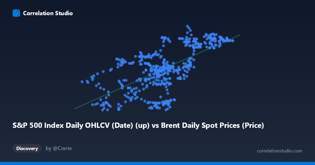
S&P 500 Index Daily OHLCV (Date) (up) vs Brent Daily Spot Prices (Price)
- Pearson correlation (r)
- 0.6603
- Spearman correlation
- 0.6404
- p-value
- 0
- Sample size (n)
- 504
- 95% confidence interval
- 0.6081 to 0.7069
- Granger causality
- None
- Granger optimal lag
- 1
AI analysis
Analysis: Brent Crude Oil Prices vs. S&P 500 Index (2015–2017)
Relationship Overview The scatterplot reveals a moderate positive relationship between daily Brent crude oil spot prices (X-axis) and S&P 500 values (Y-axis) over the two-year period from February 2015 to February 2017. The linear regression equation (y = 0.822x + 78.46) suggests that for every $1 increase in Brent crude prices, the S&P 500 tends to rise by approximately 0.82 points. Visually, the data points form a discernible upward-sloping cloud, though with considerable scatter around the trend line — particularly in the middle X range (roughly $43–$55/barrel), where Y values span nearly 40 points, indicating that the relationship is far from deterministic in that price zone.
Correlation Strength and Statistical Interpretation The Pearson correlation of r = 0.6603 indicates a moderate-to-strong positive association, but the more telling figure is r² = 0.436 — meaning that Brent crude prices explain only 43.6% of the variance in S&P 500 values, leaving 56.4% attributable to other factors. The 95% confidence interval [0.608, 0.707] is relatively tight and does not approach zero, and the p-value is effectively 0 (n = 504), confirming this correlation is highly statistically significant and not a sampling artifact. However, the Granger causality analysis tells a critically different story: neither variable meaningfully predicts the other temporally (X→Y: F = 0.117, p = 0.732; Y→X: F = 0.076, p = 0.783). Both results are far from significance at any conventional threshold, meaning that despite the contemporaneous correlation, changes in Brent prices do not lead or lag S&P 500 movements in a statistically meaningful way at a one-period lag — the two series move together without one reliably forecasting the other.
Notable Patterns, Clusters, and Outliers Several structural features are visible in the sample data. There is a notable lower-left cluster around $30–$38/barrel corresponding to S&P 500 values of roughly 98–122, likely reflecting the late-2015 to early-2016 oil price collapse period. A second cluster appears in the upper-right region ($57–$66/barrel, S&P 500 ~128–139), consistent with the oil price recovery into late 2016. The dense middle cluster ($43–$55/barrel) shows the highest vertical spread — for example, at roughly $49–$50/barrel, Y values range from ~101 to ~133 — suggesting that at intermediate oil price levels, S&P 500 behavior was driven by many other forces. A few potential outliers are notable: the point near (54.16, 138.81) sits at the upper boundary of Y, and (35.76, 97.76) sits at the lower boundary, both appearing somewhat detached from the main cloud.
Confounding Factors and Caveats This correlation is almost certainly spurious co-movement driven by shared macroeconomic forces rather than a direct causal link. Both Brent crude prices and S&P 500 levels were heavily influenced during this period by Federal Reserve monetary policy, global growth expectations, the USD exchange rate, and geopolitical events (e.g., OPEC supply decisions). The 2015–2016 oil price crash and subsequent recovery created a time-trend structure in both series, which can artificially inflate correlation between any two trending financial variables — a classic manifestation of spurious regression in non-stationary time series. The mislabeled axis metadata (dataset names appear swapped between axes) also warrants data provenance verification before drawing firm conclusions. Additionally, using closing/spot prices without accounting for serial autocorrelation may inflate the effective sample size beyond what n = 504 implies.
Actionable Insights and Further Investigation Given the strong contemporaneous correlation but absent Granger causality, practitioners should not use either series to forecast the other in a trading or risk model — the relationship reflects synchronized response to common drivers rather than a lead-lag dynamic. Recommended next steps include: (1) testing stationarity (ADF/KPSS tests) on both series and re-running the analysis on first-differences or log-returns, which would eliminate trend-driven inflation of r; (2) extending the Granger analysis to multiple lags (beyond lag-1) to rule out slower-moving predictive relationships; (3) introducing controlling variables such as USD index, VIX, and global PMI to partial out shared macro drivers and isolate any residual direct relationship; and (4) segmenting the analysis into the crash phase vs. recovery phase to test whether the correlation structure differs across market regimes, which the visual clustering strongly suggests it might.
X dataset: Brent Daily Spot Prices
Y dataset: S&P 500 Index Daily OHLCV (Date)
Part of experiment: Daily - Brent Daily Spot Prices vs S&P 500 Index Daily OHLCV (Date)