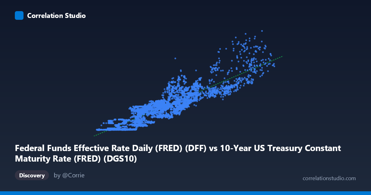
Federal Funds Effective Rate Daily (FRED) (DFF) vs 10-Year US Treasury Constant Maturity Rate (FRED) (DGS10)
- Pearson correlation (r)
- 0.8975
- Spearman correlation
- 0.9021
- p-value
- 0
- Sample size (n)
- 16083
- 95% confidence interval
- 0.8944 to 0.9004
- Granger causality
- None
- Granger optimal lag
- 1
AI analysis
Analysis: Federal Funds Rate vs. 10-Year Treasury Yield
Relationship Overview
The scatterplot reveals a strong, positive relationship between the Federal Funds Effective Rate (X-axis) and the 10-Year US Treasury Constant Maturity Rate (Y-axis), spanning over six decades of daily observations from 1962 to 2026. As the federal funds rate rises, the 10-year Treasury yield tends to rise in tandem, which aligns well with established fixed-income theory: the short-term policy rate anchored by the Federal Reserve exerts meaningful gravitational pull on longer-duration yields through expectations of future monetary policy. The linear regression equation (y = 1.118x − 1.661) suggests that for every percentage point increase in the fed funds rate, the 10-year yield increases by approximately 1.12 percentage points, though the intercept penalty implies that at very low policy rates, the 10-year yield still trades above zero — consistent with term premium dynamics.
Correlation Strength and Statistical Significance
The correlation is strong (r = 0.8975), and the R² of 0.8054 tells us that roughly 80.5% of the variance in 10-year Treasury yields is explained by variation in the federal funds rate across this dataset. The 95% confidence interval for r is extremely tight [0.8944, 0.9004], and the p-value is effectively zero — reflecting the statistical power derived from a paired sample of over 16,000 observations. These figures leave virtually no ambiguity about the existence or strength of this association. However, the Granger causality results are notably absent in both directions: neither X→Y (F = 0.516, p = 0.473) nor Y→X (F = 0.003, p = 0.956) achieves significance at lag 1. This means that while the two series are strongly co-associated, neither rate meaningfully predicts the other's next-period movement in a temporal sense — a crucial distinction between correlation and predictive causality. The relationship appears contemporaneous and likely driven by shared macroeconomic forces rather than one rate mechanically leading the other.
Patterns, Clusters, and Outliers
Several structural features are visible in the sample points. The data shows reasonable linear tracking across the moderate range (roughly X: 2–10, Y: 1–10), where the bulk of observations cluster. However, there are clear outlier-like observations at higher values — notably points such as (13.46, 15.76), (14.19, 14.60), and (12.39, 20.89) — which correspond to the extreme rate environment of the early 1980s Volcker era. The point (12.39, 20.89) is particularly striking: the 10-year yield far exceeds what the linear model would predict, suggesting that during periods of acute inflation expectations, the long end of the curve can decouple significantly from the fed funds rate. Conversely, near the lower bound (e.g., 0.60, 0.05; 1.61, 0.16), the data compresses near zero, reflecting the post-2008 and post-2020 zero interest rate policy (ZIRP) environments. This compression hints at non-linearity: the relationship may behave differently at policy extremes than in the middle of the historical range.
Confounding Factors and Caveats
Several important caveats apply. First, regime changes in monetary policy — the Volcker disinflation, the Greenspan era, the post-GFC ZIRP period, and post-COVID rate hikes — create structurally distinct sub-periods that a single linear model cannot fully capture; pooling them inflates apparent explanatory power. Second, term premium — the extra yield investors demand for holding longer-duration bonds — varies independently of the fed funds rate based on inflation uncertainty, fiscal deficits, and global demand for safe assets (e.g., foreign central bank purchases of Treasuries). Third, daily data introduces autocorrelation: consecutive observations are not independent, which means the effective sample size is far smaller than 16,000 for inference purposes, and the tight confidence interval may be overstated. Fourth, the swapped axis labeling (each dataset appears to contain the other's series as a column) warrants verification that variables are correctly assigned before drawing policy conclusions.
Actionable Insights and Further Investigation
Practitioners should consider segmenting this analysis by monetary policy regime (e.g., pre/post-2008, pre/post-2020) to test whether the slope and intercept shift meaningfully across eras — this would reveal whether the current tightening cycle follows historical patterns. The breakdown of Granger causality suggests that simple lag-1 models are insufficient for forecasting; researchers should explore longer lag structures, vector autoregression (VAR) models incorporating inflation expectations (breakevens), or yield curve decomposition models that separate the policy expectations component from term premium. The outlier cluster in the early-1980s high-rate environment merits robust regression or quantile regression to reduce its leverage on the overall fit. Finally, incorporating macroeconomic covariates — CPI, unemployment, QE program indicators — as controls would help isolate the true marginal relationship between the funds rate and the 10-year yield, and better frame the ~20% of variance currently left unexplained.
X dataset: 10-Year US Treasury Constant Maturity Rate (FRED)
Y dataset: Federal Funds Effective Rate Daily (FRED)
Part of experiment: Daily - 10-Year US Treasury Constant Maturity Rate (FRED) vs Federal Funds Effective Rate Daily (FRED)