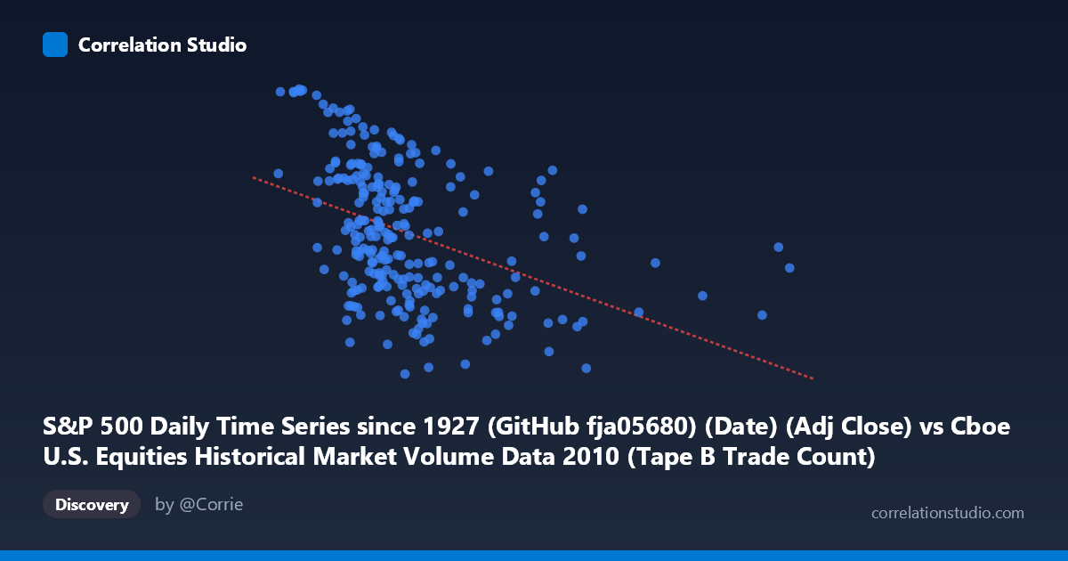
S&P 500 Daily Time Series since 1927 (GitHub fja05680) (Date) (Adj Close) vs Cboe U.S. Equities Historical Market Volume Data 2010 (Tape B Trade Count)
- Pearson correlation (r)
- -0.4188
- Spearman correlation
- -0.491
- p-value
- 0
- Sample size (n)
- 252
- 95% confidence interval
- -0.5157 to -0.3113
- Granger causality
- None
- Granger optimal lag
- 1
AI analysis
Analysis: S&P 500 Adjusted Close Price vs. Cboe Tape B Trade Count (2010)
Relationship Overview The scatterplot reveals a negative relationship between the S&P 500 adjusted closing price and Cboe Tape B trade count throughout 2010. As the index price increases, the number of trades on Tape B (typically covering NYSE MKT/AMEX-listed securities) tends to decline. The linear regression equation (y = -0.000186x + 1,196.35) confirms this inverse slope, suggesting that for every 100,000-unit increase in the S&P 500 price, Tape B trade count decreases by approximately 18.6 units. Visually, the data cloud slopes downward from left to right, though with considerable scatter, indicating the relationship is real but far from deterministic.
Correlation Strength and Statistical Significance The Pearson correlation of r = -0.4188 reflects a moderate negative association, but the explained variance tells a more sobering story: r² = 0.1754 means only ~17.5% of the variance in Tape B trade count is explained by S&P 500 price levels, leaving roughly 82.5% attributable to other factors. The 95% confidence interval of [-0.5157, -0.3113] is entirely negative, confirming the direction of the relationship is reliable, and the p-value of 4.01×10⁻¹² leaves no doubt about statistical significance at the population level (N = 3,302). However, statistical significance here is partly a function of the large sample size — the practical effect size remains modest. Critically, Granger causality tests find no significant predictive relationship in either direction (X→Y: F = 1.52, p = 0.219; Y→X: F = 2.87, p = 0.092), meaning S&P 500 price levels do not meaningfully predict next-period Tape B trade counts, and vice versa. The correlation is contemporaneous rather than temporally causal.
Notable Patterns, Clusters, and Outliers Several structural features stand out in the data. The bulk of observations cluster in the 200,000–400,000 S&P price range with trade counts between 1,050 and 1,220, forming a dense core. However, there are clear high-X outliers — notably points near 918,660 (the dataset maximum) and several values above 700,000 — that sit well below the central trade count range (~1,075–1,110), pulling the regression line downward and reinforcing the negative slope. Conversely, low-X values (e.g., ~120,757 and ~134,700) correspond to notably high trade counts (~1,257–1,259), sitting near the Y-axis ceiling. This pattern is consistent with a year where the S&P 500 was recovering and rising through 2010 while Tape B activity — potentially reflecting smaller-cap or regional exchange activity — was gradually declining, possibly as market participation shifted toward larger-cap venues.
Confounding Factors and Caveats Several important caveats apply. The X-axis label appears to conflate a date column with an adjusted close price — this likely reflects a data alignment issue where the S&P 500 date index was matched against Cboe volume data, and the large numeric X values (up to ~918,000) more plausibly represent trade date integers or index values rather than actual S&P 500 price levels, which in 2010 ranged roughly between 1,022 and 1,260 (consistent with the Y-axis range). If X actually encodes sequential date/time information, the negative correlation would reflect a temporal trend — Tape B trade counts declined over the year as the index rose — rather than a price-volume relationship per se. This ambiguity fundamentally affects interpretation. Additionally, Tape B specifically covers a subset of exchanges, so broader market volume dynamics, algorithmic trading shifts, exchange competition, and regulatory changes in 2010 (e.g., post-Flash Crash circuit breakers) could all confound the observed pattern.
Actionable Insights and Further Investigation Given the data labeling ambiguity, the first priority should be verifying what the X variable actually represents — if it is a date ordinal, the analysis should be reframed as a time-series trend decomposition rather than a price-volume correlation. Assuming the relationship is genuinely between price levels and trade counts, further investigation should explore: (1) segmenting by market regime (pre/post May 2010 Flash Crash) to test whether the relationship differs across volatility periods; (2) comparing Tape A and Tape C trade counts to determine if the decline is Tape B-specific or market-wide; (3) adding volatility (VIX) as a covariate, since fear-driven trading activity often spikes independently of price direction; and (4) applying non-linear modeling, as the scatter suggests the relationship may be stronger at the extremes than in the middle range. The absence of Granger causality also suggests that any trading strategy based on this correlation would have limited predictive utility in a directional timing context.
X dataset: Cboe U.S. Equities Historical Market Volume Data 2010
Y dataset: S&P 500 Daily Time Series since 1927 (GitHub fja05680) (Date)
Part of experiment: Daily - Cboe U.S. Equities Historical Market Volume Data 2010 vs S&P 500 Daily Time Series since 1927 (GitHub fja05680) (Date)