S&P 500 Daily Time Series since 1927 (GitHub fja05680) (Date) (Volume) vs Cboe U.S. Equities Historical Market Volume Data 2010 (Tape A Shares)
- Pearson correlation (r)
- 0.9218
- Spearman correlation
- 0.8892
- p-value
- 0
- Sample size (n)
- 252
- 95% confidence interval
- 0.9009 to 0.9385
- Granger causality
- Bidirectional
- Granger optimal lag
- 10
AI analysis
Analysis: S&P 500 Trading Volume vs. Cboe Tape A Shares (2010)
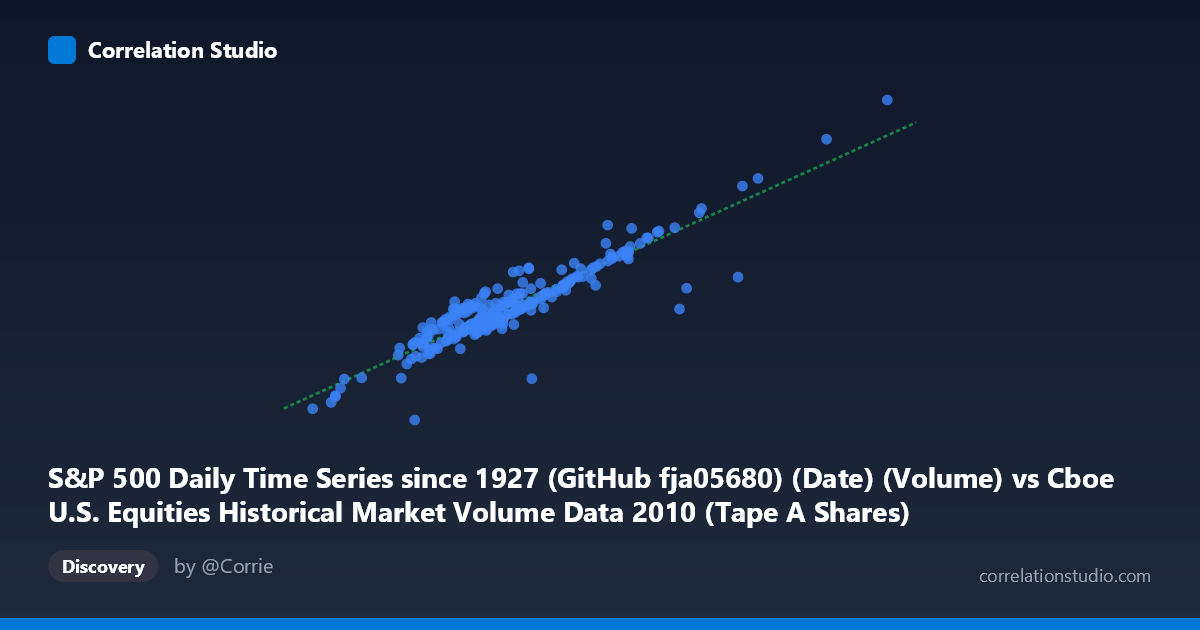
Relationship Overview The scatterplot reveals a strong, positive linear relationship between S&P 500 daily trading volume (X-axis, sourced from GitHub fja05680) and Cboe Tape A shares (Y-axis, from the Cboe U.S. Equities Historical Market Volume Data). As total market volume increases, Tape A share volume rises proportionally, which is intuitive given that Tape A securities (NYSE-listed equities) constitute a substantial and relatively stable fraction of overall U.S. equity market activity. The linear regression equation y = 9.625x + 9.669×10⁸ suggests that for every additional unit of S&P 500 volume, Tape A shares increase by approximately 9.6 units, with a meaningful baseline intercept reflecting the structural floor of exchange activity even on lower-volume days.
Correlation Strength and Statistical Significance The correlation is notably strong (r = 0.9218), and the r² of 0.8497 means that ~85% of the day-to-day variance in Tape A shares is statistically explained by total S&P 500 volume — a remarkably high figure for market microstructure data. The 95% confidence interval of [0.9009, 0.9385] is tight and entirely above 0.9, confirming this is not a sampling artifact, and the p-value of effectively 0 across n = 252 trading days (from a population of N = 3,302) makes spurious correlation essentially impossible. The remaining ~15% of unexplained variance is attributable to routing decisions, venue competition, dark pool activity, or exchange-specific events not captured by aggregate volume. The Granger causality results indicate bidirectional temporal predictive influence at a 10-period lag (X→Y: F = 2.247, p = 0.016; Y→X: F = 2.052, p = 0.030), meaning neither series purely leads the other — they co-evolve, consistent with the idea that both reflect the same underlying market liquidity regime rather than one mechanically driving the other.
Notable Patterns, Clusters, and Outliers The data points cluster most densely in the mid-range (X: ~250M–450M; Y: ~3.1B–5.5B), reflecting the typical volume environment of 2010's relatively calm post-crisis market. Several notable outliers are visible at the upper end — one point near (812M, 9.47B) stands dramatically above the main cluster, likely corresponding to a high-volatility event such as the May 6, 2010 Flash Crash, which generated extraordinary volume spikes. Another interesting anomaly appears at approximately (247M, 1.29B) — an extremely low Tape A reading relative to its X-axis position, suggesting a day where volume was disproportionately routed away from Tape A venues (perhaps to dark pools or regional exchanges). A modest cluster of points around (530M–540M, 6.0B–6.2B) also separates slightly from the main body, hinting at a secondary volume regime possibly tied to specific market events or seasonal patterns in early 2010.
Confounding Factors and Caveats Several important caveats apply. First, the directionality of the axis labels appears counterintuitive — the X-axis is labeled as an S&P 500 "Date/Volume" column from a price dataset while the Y-axis is labeled as Tape A shares from the Cboe dataset, suggesting the datasets may have been joined on date and that variable assignment warrants careful verification. Second, both series are measuring aspects of the same underlying phenomenon (U.S. equity trading activity), so high correlation may partly reflect tautological overlap rather than independent economic signals. Third, secular trends in market structure during 2010 — including the proliferation of high-frequency trading, fragmentation across venues, and regulatory changes following the Flash Crash — could create non-stationary subperiods that inflate the apparent cross-sectional correlation while masking structural breaks. Finally, the Granger causality, while statistically significant, uses a 10-period lag that may capture weekly (two-week) rhythms in institutional trading rather than true economic causation.
Actionable Insights and Further Investigation Practitioners and researchers should consider several follow-up steps. Decomposing the residuals chronologically would reveal whether the unexplained 15% clusters around known market events (Flash Crash, FOMC announcements, quarter-ends), which could inform event-driven trading strategies or risk models. The bidirectional Granger causality suggests that neither volume series is a clean leading indicator, but testing shorter lags (1–5 days) could identify asymmetric short-term predictive windows. The outlier at (812M, 9.47B) deserves isolation and study — if it corresponds to the Flash Crash, removing it and re-fitting would test model robustness. More broadly, extending the analysis across multiple years (the underlying dataset spans back to 1927) would reveal whether the 2010 relationship is structurally stable or a period-specific artifact of post-GFC market conditions. Finally, incorporating venue market share data alongside Tape A volumes would help quantify how exchange fragmentation modulates this otherwise tight relationship.
X dataset: Cboe U.S. Equities Historical Market Volume Data 2010
Y dataset: S&P 500 Daily Time Series since 1927 (GitHub fja05680) (Date)
Part of experiment: Daily - Cboe U.S. Equities Historical Market Volume Data 2010 vs S&P 500 Daily Time Series since 1927 (GitHub fja05680) (Date)