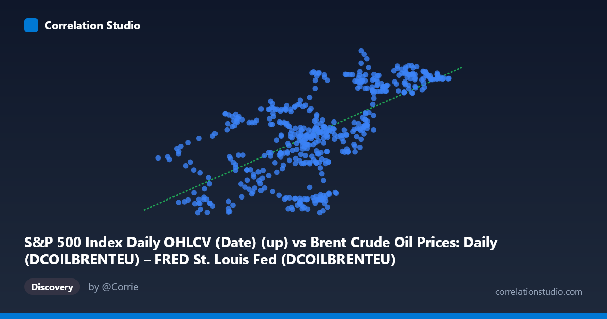
S&P 500 Index Daily OHLCV (Date) (up) vs Brent Crude Oil Prices: Daily (DCOILBRENTEU) – FRED St. Louis Fed (DCOILBRENTEU)
- Pearson correlation (r)
- 0.6603
- Spearman correlation
- 0.6404
- p-value
- 0
- Sample size (n)
- 504
- 95% confidence interval
- 0.6081 to 0.7069
- Granger causality
- None
- Granger optimal lag
- 1
AI analysis
Scatterplot Analysis: Brent Crude Oil Prices vs. S&P 500 Index (2015–2017)
1. Overall Relationship The scatterplot reveals a moderate positive relationship between the S&P 500 Index daily values (X-axis) and Brent Crude Oil prices (Y-axis) over the two-year window from February 2015 to February 2017. As S&P 500 values increase from roughly 26 to 66 (likely a normalized or transformed scale), Brent crude prices tend to rise from approximately 97 to 139 USD per barrel. The linear regression equation (y = 0.822x + 78.46) confirms this upward slope, meaning each unit increase in the S&P 500 index metric is associated with roughly an 0.82 USD per barrel increase in Brent crude prices.
2. Correlation Strength and Statistical Interpretation With r = 0.6603, the correlation is moderate-to-strong and clearly positive. However, the R² value of 0.436 is the more practically meaningful figure — it indicates that only 43.6% of the variance in Brent crude prices is explained by S&P 500 movements, leaving the majority (56.4%) attributable to other factors. The 95% confidence interval of [0.608, 0.707] is relatively tight and does not include zero, and the p-value of essentially 0 (with n = 504) confirms this correlation is highly statistically significant and not a chance finding. That said, statistical significance with large samples is almost guaranteed, so the effect size (R² ≈ 0.44) should anchor practical interpretation. Critically, the Granger causality tests show no significant predictive directionality in either direction (X→Y: F = 0.117, p = 0.732; Y→X: F = 0.076, p = 0.783), meaning neither series reliably predicts the other's future values at a 1-period lag. This strongly suggests the observed correlation reflects co-movement driven by shared underlying forces rather than any causal temporal pathway.
3. Notable Patterns, Clusters, and Outliers The sample points reveal several noteworthy features. There is a visible central cluster around X = 43–55 and Y = 110–125, consistent with the mean values (X̄ = 48.27, Ȳ = 118.16), suggesting that most observations fall in a moderate-price regime. A distinct upper-right cluster exists around X = 57–66, Y = 128–139 (e.g., points like (64.68, 132.67) and (65.09, 131.71)), representing periods of simultaneously elevated equity and oil prices — likely late 2016 into early 2017 as markets recovered. Conversely, there are lower-left observations near X = 30–37, Y = 98–110 (e.g., (32.35, 100.93), (35.76, 97.76)) that correspond to the oil price trough of early-to-mid 2015 when Brent fell sharply. A few potential outliers stand out: (54.16, 138.81) and (49.04, 132.62) show unusually high crude prices relative to their S&P levels, while (50.73, 102.50) and (46.72, 98.50) show the inverse. These deviations suggest episodic supply-side oil shocks temporarily decoupling the two series.
4. Confounding Factors and Caveats Several important caveats apply. First, this two-year window (2015–2017) coincided with a specific macroeconomic regime — the oil price crash and recovery — which may artificially inflate correlation by creating a common trend (both falling then rising together). This is a classic spurious correlation through shared trend rather than structural linkage. Second, the axes appear to represent transformed or normalized values (S&P 500 ranging 26–66 is not the raw index level), so interpretations about the regression slope must account for whatever transformation was applied. Third, omitted variables such as USD strength, global GDP growth expectations, and risk appetite indices (e.g., VIX) almost certainly drive both series simultaneously, creating confounding co-movement. Fourth, with daily data and only a 1-period Granger lag tested, longer-lag dynamics may exist but were not captured.
5. Actionable Insights and Further Investigation Given the moderate correlation and absent Granger causality, practitioners should avoid using either variable as a short-term predictor of the other. Instead, this relationship is better understood as a risk-appetite proxy — both series tend to rise in "risk-on" environments and fall in "risk-off" periods. For further investigation, it would be valuable to: (1) extend the time window beyond 2015–2017 to test whether this correlation holds across different oil price regimes (e.g., the 2020 crash); (2) introduce a USD index variable to test whether dollar strength mediates or explains much of the shared variance; (3) test longer Granger lags (e.g., 5–20 days) to check for delayed predictive relationships; and (4) apply regime-switching or rolling-window correlation analysis to determine whether the r = 0.66 relationship is stable over time or concentrated in specific sub-periods, which would significantly change how it should be interpreted for modeling or portfolio strategy purposes.
X dataset: Brent Crude Oil Prices: Daily (DCOILBRENTEU) – FRED St. Louis Fed
Y dataset: S&P 500 Index Daily OHLCV (Date)
Part of experiment: Daily - Brent Crude Oil Prices: Daily (DCOILBRENTEU) – FRED St. Louis Fed vs S&P 500 Index Daily OHLCV (Date)