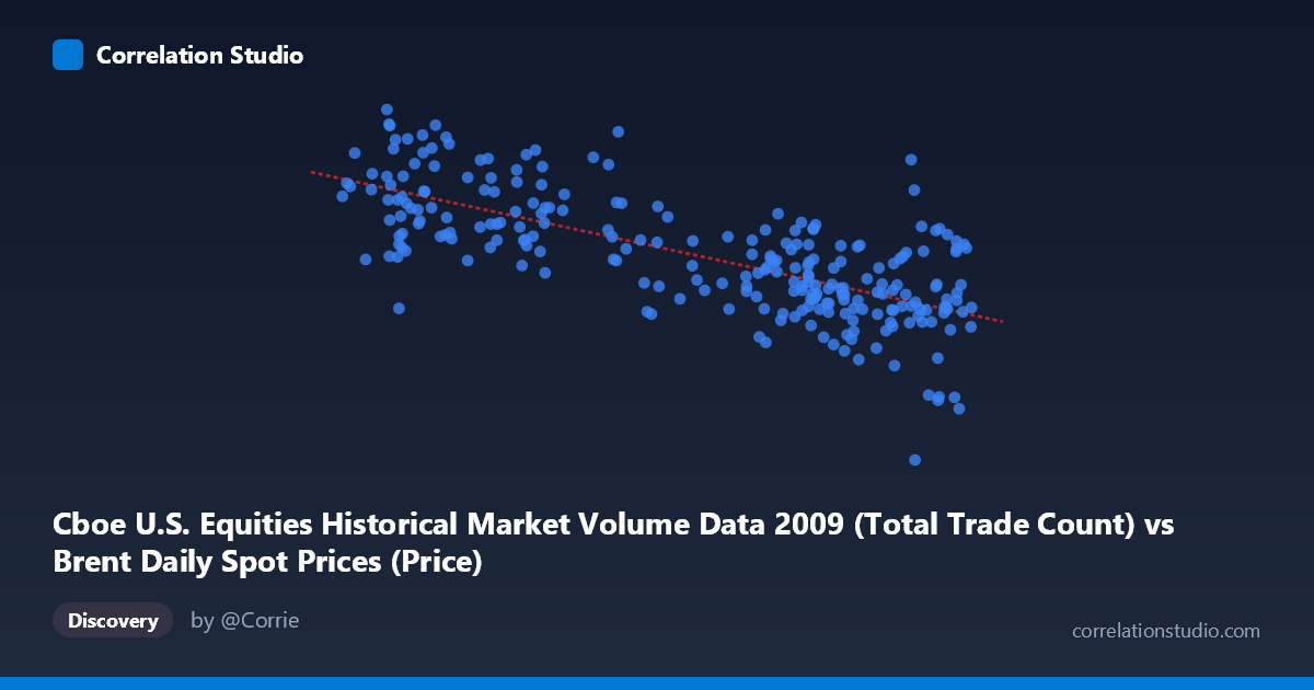
Cboe U.S. Equities Historical Market Volume Data 2009 (Total Trade Count) vs Brent Daily Spot Prices (Price)
- Pearson correlation (r)
- -0.7138
- Spearman correlation
- -0.6969
- p-value
- 0
- Sample size (n)
- 252
- 95% confidence interval
- -0.7695 to -0.6473
- Granger causality
- None
- Granger optimal lag
- 10
AI analysis
Analysis: Brent Crude Oil Prices vs. U.S. Equity Trade Count (2009)
Relationship Overview The scatterplot reveals a moderate-to-strong negative relationship between U.S. equity market total trade count (X) and Brent crude oil spot prices (Y) across 252 trading days in 2009. As daily trade counts on U.S. equity exchanges increase, Brent crude prices tend to decline, and vice versa. The linear regression equation (y = -34,632.8x + 4,805,210) quantifies this inverse dynamic: each unit increase in trade count (in the scale reported) is associated with a decrease of roughly $34,633 in the modeled price level. Visually, the data points form a downward-sloping cloud, consistent with the negative correlation, though with considerable scatter around the regression line.
Correlation Strength and Statistical Framing The Pearson correlation of r = -0.714 indicates a moderately strong negative association. More precisely, r² = 0.509, meaning approximately 50.9% of the variance in Brent crude prices is statistically explained by variation in U.S. equity trade counts — a substantial proportion for a cross-asset relationship, though it equally implies that nearly half the variance remains unexplained by this single predictor. The 95% confidence interval of [-0.770, -0.647] is narrow and entirely negative, reinforcing high certainty about the direction of the relationship. With a p-value effectively at zero across a population of N = 3,232, the correlation is statistically unambiguous. However, Granger causality tests find no significant predictive direction in either direction (X→Y: F = 1.57, p = 0.116; Y→X: F = 1.23, p = 0.270), meaning that despite the strong contemporaneous correlation, neither variable's past values reliably predict the other's future values at the optimal lag of 10 periods. This is a critical distinction: correlation here appears to reflect concurrent co-movement, not a leading-lagging predictive mechanism.
Notable Patterns, Clusters, and Outliers Several features stand out in the data. The bulk of observations cluster in two regions: higher trade counts (65–78 range) paired with lower oil prices (~$1.8M–$3.0M scaled), and lower trade counts (40–55) paired with higher oil prices (~$3.0M–$4.1M). This bimodal clustering may reflect distinct market regimes within 2009 — notably the post-financial crisis recovery period. A few notable outliers are visible: the point at approximately (75.15, 629,671) sits dramatically below the cluster at similar X-values, representing an anomalously low oil price day despite high trade activity, warranting investigation. Conversely, (42.19, 4,134,003) and (56.63, 3,911,469) represent extreme high-price observations. The scatter also suggests possible heteroscedasticity, with greater price variability at lower trade counts, hinting that a linear model may not fully capture the relationship's structure.
Confounding Factors and Interpretive Caveats This correlation almost certainly reflects shared macroeconomic drivers rather than a direct causal mechanism between equity trade volume and oil prices. The year 2009 was dominated by the aftermath of the 2008 financial crisis: early in the year, markets were in distress (low equity volumes, depressed oil prices collapsed from 2008 highs), while the recovery period brought rising oil prices alongside changing — not necessarily rising — equity trading patterns. Risk-off/risk-on sentiment, the U.S. dollar strength, global demand expectations, and OPEC supply decisions all simultaneously influenced both variables. The dataset labeling also warrants scrutiny — the column headers suggest a possible dataset-variable mismatch (Brent price data attributed to a Cboe dataset and vice versa), which should be verified before drawing firm conclusions. The optimal Granger lag of 10 periods was selected algorithmically; testing alternative lag structures could yield different results.
Actionable Insights and Further Investigation Given the absence of Granger causality, practitioners should be cautious about using either variable as a trading signal for the other, despite the appealing r value. Further investigation should include: (1) regime-segmentation analysis separating the crisis phase (Q1 2009) from the recovery phase (Q2–Q4 2009) to test whether the correlation holds within sub-periods; (2) introducing confounders such as VIX levels, USD index, and S&P 500 returns into a multivariate model to test whether the observed correlation is spurious; (3) residual analysis to assess non-linearity and heteroscedasticity, potentially motivating a log-linear or polynomial model; and (4) verification of dataset column alignment to ensure the variable assignment is correct. Exploring this relationship across other crisis and non-crisis years would also clarify whether this inverse dynamic is a persistent structural feature or an artifact of 2009's extraordinary market conditions.
X dataset: Brent Daily Spot Prices
Y dataset: Cboe U.S. Equities Historical Market Volume Data 2009
Part of experiment: Daily - Brent Daily Spot Prices vs Cboe U.S. Equities Historical Market Volume Data 2009