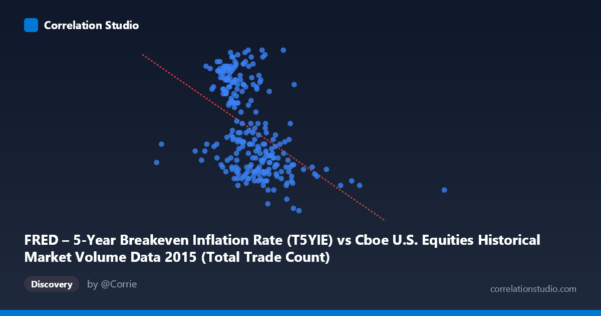
FRED – 5-Year Breakeven Inflation Rate (T5YIE) vs Cboe U.S. Equities Historical Market Volume Data 2015 (Total Trade Count)
- Pearson correlation (r)
- -0.463
- Spearman correlation
- -0.528
- p-value
- 0
- Sample size (n)
- 250
- 95% confidence interval
- -0.5552 to -0.3596
- Granger causality
- None
- Granger optimal lag
- 1
AI analysis
Scatterplot Analysis: 5-Year Breakeven Inflation Rate vs. U.S. Equities Total Trade Count (2015)
Relationship Overview
The scatterplot reveals a negative relationship between U.S. equities total trade count (X-axis) and the 5-year breakeven inflation rate (Y-axis) across 2015 trading days. As daily trade counts increase, the breakeven inflation rate tends to be lower, and conversely, higher inflation expectations correspond to relatively lower trading volumes. The linear regression equation (y = -1.888×10⁻⁷x + 1.8466) quantifies this inverse slope, indicating that each additional million trades is associated with a modest but consistent decline in the inflation breakeven rate. The data points span a wide X range — from roughly 1.0 million to 5.5 million trade counts — while the Y range is relatively compressed between approximately 1.02 and 1.72, suggesting inflation expectations were constrained throughout 2015 despite significant variation in market activity.
Correlation Strength and Statistical Significance
The Pearson correlation of r = -0.463 indicates a moderate negative correlation, and the r² of 0.214 means that only about 21.4% of the variance in the breakeven inflation rate is explained by trade count. While statistically highly significant (p = 1.09×10⁻¹⁴, effectively zero), the large majority — roughly 78.6% of the variance — remains unexplained by this linear relationship alone, signaling that many other factors drive inflation expectations. The 95% confidence interval of [-0.555, -0.360] is meaningfully narrow given the sample size of 250 paired observations drawn from a population of 3,302, reinforcing that the negative direction is reliably estimated and not a sampling artifact. However, statistical significance here is largely a function of the large N, and the practical effect size remains modest.
Granger Causality and Temporal Direction
Critically, no significant Granger causality was detected in either direction at the optimal lag of 1 period. The F-statistics are negligible (X→Y: F = 0.0036, p = 0.952; Y→X: F = 0.437, p = 0.509), meaning that neither variable meaningfully predicts future values of the other. This is a crucial caveat: despite the moderate contemporaneous correlation, there is no evidence of a lagged temporal predictive relationship. This rules out a simple leading-indicator interpretation — trade count volumes do not forecast next-day inflation expectations, and vice versa. The relationship, such as it is, appears to be coincident rather than directional, likely reflecting shared responses to common macroeconomic forces rather than any causal mechanism between the two series.
Notable Patterns, Clusters, and Outliers
The scatterplot exhibits a visibly heteroskedastic and clustered structure. The bulk of observations are concentrated in the X range of roughly 1.8M–3.2M trades, where the inflation rate spans the full vertical range (~1.1–1.7), creating a dense central cloud with considerable scatter. Above approximately 3.5M trade counts, data points become sparse and the inflation rate values cluster at the lower end (below ~1.25), which disproportionately drives the negative slope. The single extreme outlier near 5.5M trade counts at a low inflation rate (~1.13) likely represents a high-volatility event day (e.g., a flash crash or macro shock) and could be exerting leverage on the regression line. At the lower trade count extreme (~1.07M), a data point sits at a relatively low inflation rate (~1.31), which is also consistent with the pattern. The high-inflation observations (Y 1.60) appear predominantly concentrated in the moderate volume range (1.8M–2.7M), suggesting that calm, moderate-activity days coincided with more optimistic inflation expectations in 2015.
Caveats, Confounds, and Further Investigation
Several important confounding factors complicate interpretation. 2015 was a distinctive macro year, featuring the Federal Reserve's first rate hike since 2006 (December), the Chinese market turbulence of August, and sustained commodity price deflation — all of which would simultaneously depress inflation breakeven rates and spike trading volumes on specific event days. The observed correlation may therefore be largely a spurious artifact of shared sensitivity to macro volatility episodes rather than any structural relationship between trade activity and inflation expectations. Additionally, the axis labels appear to be swapped from what might be expected (trade count is on X, inflation rate on Y), so the regression should be interpreted descriptively rather than implying trade count "causes" inflation expectations. For further investigation, analysts should: (1) control for VIX or realized volatility to test whether the correlation survives risk-adjusted conditioning; (2) segment the data by date to identify whether the relationship is driven by specific event windows; (3) explore non-linear or regime-based models, as the relationship appears stronger in the high-volume tail; and (4) test longer lag structures in Granger causality analysis beyond the single-period optimum.
X dataset: Cboe U.S. Equities Historical Market Volume Data 2015
Y dataset: FRED – 5-Year Breakeven Inflation Rate
Part of experiment: Daily - Cboe U.S. Equities Historical Market Volume Data 2015 vs FRED – 5-Year Breakeven Inflation Rate