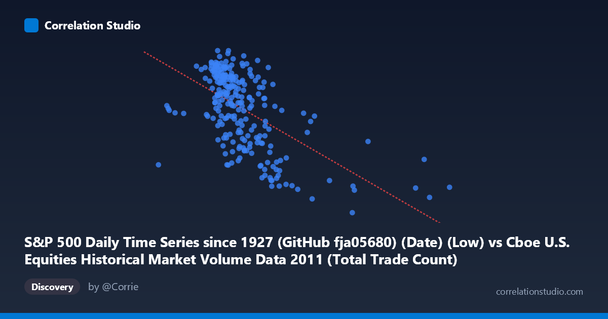
S&P 500 Daily Time Series since 1927 (GitHub fja05680) (Date) (Low) vs Cboe U.S. Equities Historical Market Volume Data 2011 (Total Trade Count)
- Pearson correlation (r)
- -0.5781
- Spearman correlation
- -0.5622
- p-value
- 0
- Sample size (n)
- 252
- 95% confidence interval
- -0.6549 to -0.4894
- Granger causality
- None
- Granger optimal lag
- 1
AI analysis
Analysis: S&P 500 Daily Low vs. Total Trade Count (2011)
Relationship Overview The scatterplot reveals a moderate negative relationship between the S&P 500 daily low price (X-axis) and the total equity trade count (Y-axis) across 2011. As the S&P 500 low increases — indicating higher price levels — the number of daily trades tends to decrease. The linear regression equation (y = −7.1246E⁻⁰⁵x + 1,401.41) quantifies this inverse slope, suggesting that for every ~14,000-point increase in the index low, trade count drops by approximately one unit. Visually, the data points form a downward-sloping cloud, most densely concentrated in the X range of roughly 1,600,000–2,200,000, with a clear rightward tail of lower-trade-count observations at higher price levels.
Correlation Strength and Statistical Significance The Pearson correlation of r = −0.578 indicates a moderate negative association, but the explained variance tells a more tempered story: R² = 0.334, meaning only about 33.4% of the variance in trade count is accounted for by the S&P 500 daily low. Nearly two-thirds of the variation in trading activity is driven by other factors entirely. The 95% confidence interval of [−0.655, −0.489] is relatively narrow and entirely negative, reinforcing that the inverse direction is robust and not a statistical artifact. The p-value of effectively zero (given N = 3,780) confirms the relationship is highly statistically significant, though significance here reflects the large population size as much as effect magnitude. Critically, Granger causality tests show no significant predictive directionality in either direction (X→Y: p = 0.929; Y→X: p = 0.776), meaning that neither variable meaningfully predicts the other's future values at a one-period lag. The correlation is contemporaneous rather than temporally sequential.
Notable Patterns, Clusters, and Outliers Several structural features stand out in the data. The bulk of observations cluster in a diagonal band between X ≈ 1,600,000–2,300,000 and Y ≈ 1,200–1,350, consistent with the S&P 500's trading range during much of 2011. However, there is a distinct lower-right cluster of points around X = 2,400,000–3,600,000 with notably suppressed trade counts (Y ≈ 1,100–1,175), including the point (3,603,943, 1,121.30) which appears as a potential outlier at the extreme right. This cluster likely corresponds to late 2011 when the market partially recovered from the summer selloff, and trading volume contracted as volatility subsided. Conversely, the upper-left region (lower price levels, higher trade counts, e.g., around X ≈ 835,000–1,200,000) aligns with the August 2011 market correction, when fear-driven activity spiked. The relationship thus appears partially driven by a volatility regime effect rather than a simple linear price-volume mechanism.
Confounding Factors and Interpretive Caveats Several important caveats apply. First, 2011 was an anomalous year for U.S. equities, featuring the S&P credit downgrade of U.S. sovereign debt in August, the Eurozone debt crisis, and flash-crash aftershocks — all of which drove unusual spikes in trade count that are not structurally representative of normal price-volume dynamics. Second, the axes may conflate conceptually distinct phenomena: the S&P 500 "low" is a price level reflecting market valuation, while "total trade count" aggregates all U.S. equity exchange activity, not just S&P 500 stocks — introducing a mismatch in scope. Third, high-frequency trading (HFT) and algorithmic activity were dominant in 2011 and respond to volatility independently of price levels, potentially inflating trade counts during turbulent low-price periods. Fourth, the lack of Granger causality suggests this correlation may be a spurious shared response to a common driver — namely, realized volatility — rather than a direct causal link between price levels and trading frequency.
Actionable Insights and Further Investigation The most productive next step would be to introduce VIX or realized volatility as a control variable to test whether the price-trade-count correlation survives after accounting for the volatility regime. If the relationship weakens substantially, it confirms that both variables are jointly responding to fear/uncertainty rather than one driving the other. Additionally, segmenting the data by market regime (pre-August calm vs. August–October turmoil vs. Q4 recovery) would likely reveal that the negative correlation is concentrated in regime transitions rather than being a persistent structural feature. Researchers interested in market microstructure should also consider normalizing trade count by market capitalization or share volume to better isolate trading intensity. Finally, extending this analysis across multiple years (the S&P dataset dates to 1927) could reveal whether this inverse price-activity relationship is a recurring feature of bear market episodes or unique to the post-2010 HFT-dominated trading environment.
X dataset: Cboe U.S. Equities Historical Market Volume Data 2011
Y dataset: S&P 500 Daily Time Series since 1927 (GitHub fja05680) (Date)
Part of experiment: Daily - Cboe U.S. Equities Historical Market Volume Data 2011 vs S&P 500 Daily Time Series since 1927 (GitHub fja05680) (Date)