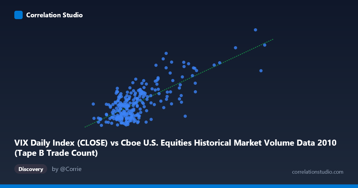
VIX Daily Index (CLOSE) vs Cboe U.S. Equities Historical Market Volume Data 2010 (Tape B Trade Count)
- Pearson correlation (r)
- 0.7426
- Spearman correlation
- 0.5866
- p-value
- 0
- Sample size (n)
- 252
- 95% confidence interval
- 0.6816 to 0.7934
- Granger causality
- Y → X
- Granger optimal lag
- 1
AI analysis
Scatterplot Analysis: VIX vs. Tape B Trade Count (2010)
Relationship Overview
The scatterplot reveals a clear positive relationship between the Cboe VIX Daily Index (close) and the Tape B Trade Count across U.S. equity exchanges during 2010. As VIX values rise — reflecting increasing market fear or uncertainty — trading activity on Tape B venues correspondingly increases. This is economically intuitive: heightened volatility tends to drive reactive trading behavior, with market participants adjusting positions, hedging exposures, or responding to price dislocations. The linear regression equation (y = 3.09×10⁻⁵x + 13.17) captures a meaningful upward slope, suggesting that for every substantial increase in volume, VIX tends to climb in tandem, though the relationship is not perfectly linear at the extremes.
Correlation Strength and Statistical Significance
The correlation of r = 0.743 is moderately strong and statistically robust. The r² of 0.5515 means that roughly 55% of variance in VIX is explained by Tape B trade count, which is notable but also underscores that nearly half of VIX's variation remains unexplained by volume alone. The 95% confidence interval of [0.682, 0.793] is comfortably narrow and does not approach zero, and the p-value is effectively zero against a population of N = 3,302, eliminating any concern about chance findings. Critically, the Granger causality analysis reveals a unidirectional relationship: Y Granger-causes X — meaning past VIX values predict subsequent trade counts, but not the reverse (X→Y: F = 3.83, p = 0.051, borderline non-significant; Y→X: F = 7.10, p = 0.008). This temporal directionality suggests VIX moves first, and trading volume follows, which aligns with a narrative where fear/volatility signals prompt traders to act with a one-period lag.
Notable Patterns, Clusters, and Outliers
The data clusters heavily in the lower-left region — VIX values roughly between 15–25 and trade counts between 150,000–350,000 — representing the majority of 2010's relatively calm trading days. Above VIX ≈ 30, the scatter fans outward noticeably, indicating increasing heteroscedasticity at higher volatility levels: volume becomes harder to predict precisely when markets are most stressed. Several high-leverage outliers are visible in the upper-right quadrant, including a point near (918,660, 41.0), which likely corresponds to the May 2010 Flash Crash or its immediate aftermath — an extreme event where both volume and fear spiked simultaneously. A handful of points also appear in the lower-right (high volume, moderate VIX), suggesting occasional volume spikes that were not accompanied by proportional fear, potentially driven by institutional rebalancing or index reconstitution events.
Confounding Factors and Caveats
Several important caveats apply. First, Tape B specifically covers NYSE American (AMEX) and regional exchange securities — a subset of total market activity — so the relationship may not generalize uniformly to Tape A (NYSE) or Tape C (Nasdaq) venues. Second, VIX is a forward-looking implied volatility measure derived from options pricing, while trade count is a contemporaneous volume metric; mixing implied and realized activity introduces conceptual asymmetry. Third, the year 2010 was idiosyncratic, containing the Flash Crash (May 6), European sovereign debt fears, and post-crisis recovery dynamics — structural breaks that could inflate the apparent correlation. Finally, lurking variables such as algorithmic trading activity, end-of-quarter rebalancing flows, and Federal Reserve policy announcements could simultaneously drive both VIX and volume, making direct causal inference hazardous beyond what Granger testing provides.
Actionable Insights and Further Investigation
The Granger causality finding that VIX leads trade count by one period is practically actionable: VIX could serve as a leading signal for expected next-day trading activity on Tape B venues, useful for exchange capacity planning, liquidity provision strategies, or transaction cost modeling. To deepen this analysis, researchers should: (1) extend the time series across multiple years to test whether the r ≈ 0.74 relationship is stable or regime-dependent; (2) disaggregate by volatility regime (e.g., VIX < 20 vs. ≥ 20) to model the apparent heteroscedasticity separately; (3) compare Tape A, B, and C trade counts to assess whether the VIX-volume relationship is venue-specific; and (4) apply a Vector Autoregression (VAR) model to more formally quantify the lagged dynamic between VIX and volume while controlling for other market structure variables such as bid-ask spreads or market depth.
X dataset: Cboe U.S. Equities Historical Market Volume Data 2010
Y dataset: VIX Daily Index
Part of experiment: Daily - Cboe U.S. Equities Historical Market Volume Data 2010 vs VIX Daily Index