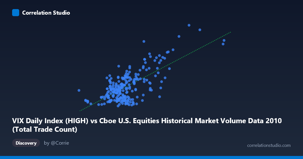
VIX Daily Index (HIGH) vs Cboe U.S. Equities Historical Market Volume Data 2010 (Total Trade Count)
- Pearson correlation (r)
- 0.7018
- Spearman correlation
- 0.4946
- p-value
- 0
- Sample size (n)
- 252
- 95% confidence interval
- 0.6331 to 0.7595
- Granger causality
- Y → X
- Granger optimal lag
- 1
AI analysis
Analysis: VIX High vs. U.S. Equities Total Trade Count (2010)
Relationship Overview The scatterplot reveals a moderately strong positive relationship between the CBOE VIX Daily High index and the total trade count in U.S. equities markets throughout 2010. As the VIX High increases — signaling greater expected market volatility — the total number of trades executed tends to rise correspondingly. This is consistent with established market microstructure theory: elevated volatility typically drives heightened trading activity as investors rebalance portfolios, execute hedges, or respond to rapidly changing price signals. The linear regression equation (y = 6.218×10⁻⁶x + 9.79) confirms a positive slope, meaning each unit increase in trade count is associated with a measurable uptick in VIX High readings.
Correlation Strength and Statistical Significance The Pearson correlation of r = 0.702 reflects a meaningful positive association, and the R² of 0.493 tells us that roughly 49% of the variance in VIX High is explained by total trade count — a substantial but incomplete picture, leaving ~51% of variation attributable to other forces. The 95% confidence interval of [0.633, 0.760] is relatively tight and excludes zero, and the p-value of effectively 0 across a paired sample of 252 observations (from a population of N = 3,302) confirms this relationship is highly unlikely to be a statistical artifact. Granger causality analysis adds important directional nuance: Y Granger-causes X (trade count → VIX High, F = 6.49, p = 0.011) at a 1-period lag, while the reverse direction (X → Y) falls just short of significance (F = 3.78, p = 0.053). This suggests that elevated trading volume may temporally precede and help predict spikes in VIX, rather than VIX simply driving volume — a subtle but practically significant distinction.
Notable Patterns, Clusters, and Outliers The scatterplot shows a broad central cluster concentrated in the lower-left region, where trade counts roughly fall between 1.5M–2.5M and VIX High readings cluster between 16 and 28, reflecting the relatively calm baseline conditions that dominated much of 2010 post-crisis stabilization. However, several notable outliers are visible in the upper-right quadrant: points like (5,514,534, 42.15) and (4,340,243, 48.20) represent days of exceptional simultaneous trading volume and volatility — likely corresponding to the May 2010 Flash Crash and its immediate aftermath. The point at (2,825,615, 41.74) also stands out as a moderately high-volume, high-volatility event. These outliers exert leverage on the regression line and may be inflating the overall correlation coefficient. There is also visible heteroscedasticity: variance in VIX readings appears to fan outward as trade count increases, suggesting the linear model fits the low-activity regime better than extreme-event days.
Confounding Factors and Caveats Several important caveats apply. First, reverse causality cannot be ruled out despite Granger results — market makers may widen spreads and push VIX higher because they observe surging order flow, creating a feedback loop. Second, the dataset covers only 2010, a structurally unique year characterized by post-financial-crisis recovery, the Flash Crash, and European sovereign debt concerns, limiting generalizability. Third, algorithmic and high-frequency trading expanded rapidly during this period, meaning raw trade count may reflect quote-stuffing or HFT activity rather than genuine investor sentiment shifts. Fourth, the relationship likely reflects a common driver — macro news shocks or systemic risk events — that simultaneously elevates both VIX and trade volume, rather than a clean causal chain. The R² of ~49% reinforces that considerable unexplained variance remains, and a non-linear model (e.g., power law or logarithmic) might better capture the relationship given visible curvature in the upper tail.
Actionable Insights and Further Investigation Practitioners could explore trade count as an early-warning signal for VIX spikes, given the Granger causality result suggesting a 1-period predictive lead. This could be incorporated into volatility forecasting models or risk dashboards monitoring intraday order flow. Further investigation should include: (1) segmenting by market regime (calm vs. stress periods) to test whether the correlation strengthens during crises; (2) fitting a non-linear or piecewise regression to better capture threshold effects visible in the upper-right cluster; (3) controlling for macro announcements (FOMC decisions, employment reports) as common confounders; and (4) extending the analysis across multiple years to test whether the 2010 relationship persists or is regime-specific. Incorporating implied volatility term structure alongside spot VIX could also clarify whether trade count responds differently to near-term versus longer-horizon uncertainty.
X dataset: Cboe U.S. Equities Historical Market Volume Data 2010
Y dataset: VIX Daily Index
Part of experiment: Daily - Cboe U.S. Equities Historical Market Volume Data 2010 vs VIX Daily Index