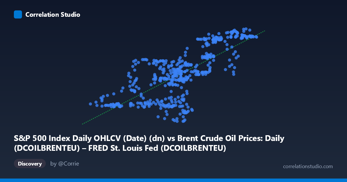
S&P 500 Index Daily OHLCV (Date) (dn) vs Brent Crude Oil Prices: Daily (DCOILBRENTEU) – FRED St. Louis Fed (DCOILBRENTEU)
- Pearson correlation (r)
- 0.7353
- Spearman correlation
- 0.7167
- p-value
- 0
- Sample size (n)
- 504
- 95% confidence interval
- 0.6924 to 0.773
- Granger causality
- None
- Granger optimal lag
- 1
AI analysis
Scatterplot Analysis: Brent Crude Oil Prices vs. S&P 500 Index (2015–2017)
1. Overall Relationship The scatterplot reveals a moderately strong positive relationship between the S&P 500 Index daily values (X-axis) and Brent Crude Oil prices (Y-axis) over the two-year period from February 2015 to February 2017. As S&P 500 values increase across their range of approximately 26 to 66 units, Brent Crude prices tend to rise from roughly 86 to 127 USD per barrel. The linear regression equation (y = 0.952x + 61.35) suggests that for each unit increase in the S&P 500 metric, Brent Crude prices rise by approximately $0.95 per barrel — a nearly one-to-one marginal relationship within this normalized range.
2. Correlation Strength, Direction, and Causality The Pearson correlation of r = 0.7353 indicates a meaningful positive association, but the more informative metric is R² = 0.5406, meaning the S&P 500 index explains only about 54% of the variance in Brent Crude prices. Nearly half the variance remains unaccounted for by this linear relationship alone. The 95% confidence interval for r of [0.692, 0.773] is relatively narrow given the large sample (n = 504), and the p-value of essentially zero confirms this correlation is statistically robust and not a sampling artifact. However, the Granger causality results are particularly important: neither direction (X→Y: F = 0.248, p = 0.619; Y→X: F = 0.121, p = 0.728) reaches statistical significance at any conventional threshold. This means that neither variable temporally predicts the other at a one-period lag — the correlation appears to reflect co-movement driven by shared external forces rather than any directional predictive relationship.
3. Patterns, Clusters, and Outliers Examining the sampled points reveals several noteworthy structural features. There appears to be clustering in the mid-range (X: 43–50, Y: 100–115), consistent with the mean values (X̄ = 48.27, Ȳ = 107.32), suggesting a dense core of typical trading-period observations. The scatter widens noticeably at the upper end of X (55–66), where Y values range broadly from ~90 to ~127, indicating heteroscedasticity — variance in crude prices increases at higher S&P levels. Several apparent outliers deserve attention: points like (50.73, 90.48), (48.81, 89.30), (49.76, 90.12), and (49.05, 89.37) show relatively average S&P values paired with unusually low crude oil prices, potentially corresponding to the 2015–2016 oil price crash. Conversely, high-X/high-Y points like (64.68, 126.75) and (65.09, 123.58) anchor the upper-right cluster. This asymmetry hints that a non-linear or piecewise model might better capture the relationship across different market regimes.
4. Confounding Factors and Interpretive Caveats Several important caveats limit causal interpretation. First, the 2015–2017 window captures a very specific macroeconomic regime: the oil price collapse of 2015–2016 and subsequent recovery, during which both assets were simultaneously depressed by global growth concerns and then recovered together — creating a spurious co-movement driven by a common third factor (global economic sentiment). Second, the axes appear to represent normalized or transformed versions of the raw indices (X range 26–66, Y range 85–127), which may compress or obscure non-linearities present in the original data. Third, the daily frequency means autocorrelation is almost certainly present in both series, which can artificially inflate the apparent sample size and thus the statistical significance of r. Fourth, the heteroscedasticity observed visually violates a key assumption of OLS regression, suggesting the linear model's reliability varies across the range of observations.
5. Actionable Insights and Further Investigation Despite the absence of Granger causality, the strong co-movement suggests both assets respond to common macroeconomic drivers such as global growth expectations, USD strength, and risk appetite — making this correlation useful for portfolio diversification analysis and macro regime identification rather than tactical trading signals. Practically, analysts should avoid using one series to predict the other directionally. For further investigation, it would be valuable to: (a) test for regime-switching behavior (e.g., separating the oil crash period from the recovery), (b) incorporate a common factor variable such as the USD index or global PMI data to test whether the correlation weakens substantially after controlling for shared drivers, (c) apply cointegration testing to determine whether a long-run equilibrium relationship exists, and (d) examine whether the relationship degrades or strengthens across different time windows to assess its stability and practical durability.
X dataset: Brent Crude Oil Prices: Daily (DCOILBRENTEU) – FRED St. Louis Fed
Y dataset: S&P 500 Index Daily OHLCV (Date)
Part of experiment: Daily - Brent Crude Oil Prices: Daily (DCOILBRENTEU) – FRED St. Louis Fed vs S&P 500 Index Daily OHLCV (Date)