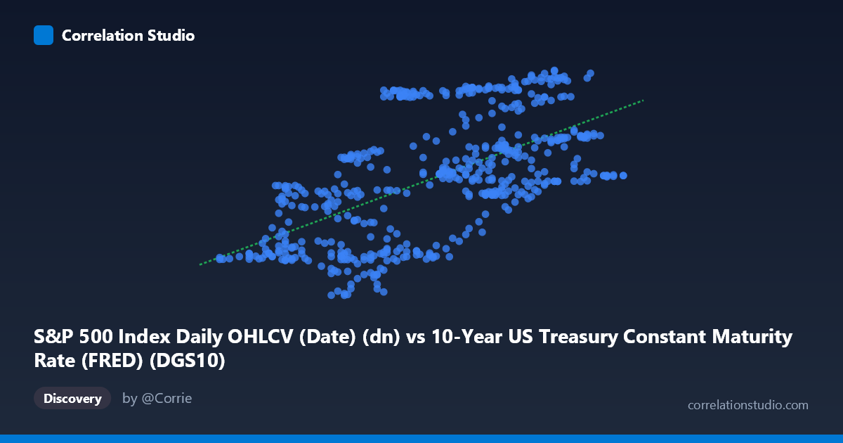
S&P 500 Index Daily OHLCV (Date) (dn) vs 10-Year US Treasury Constant Maturity Rate (FRED) (DGS10)
- Pearson correlation (r)
- 0.5972
- Spearman correlation
- 0.6181
- p-value
- 0
- Sample size (n)
- 502
- 95% confidence interval
- 0.5378 to 0.6507
- Granger causality
- X → Y
- Granger optimal lag
- 1
AI analysis
Scatterplot Analysis: 10-Year Treasury Yield vs. S&P 500 Index (2015–2017)
Relationship Overview
The scatterplot reveals a moderate positive relationship between the 10-year US Treasury constant maturity yield (X-axis) and the S&P 500 Index level (Y-axis) over the two-year window from February 2015 to February 2017. The linear regression equation (y = 22.57x + 61.65) suggests that for each one-percentage-point increase in the 10-year yield, the S&P 500 is associated with roughly a 22.6-point increase in index value. This is a somewhat counterintuitive finding at first glance — conventional financial theory often frames rising interest rates as a headwind for equities — but it reflects a specific macroeconomic regime during this period where both variables were jointly driven by improving growth expectations, particularly around the post-election "reflation trade" of late 2016. The cloud of points shows a discernible upward slope, though with considerable scatter, indicating the relationship is real but far from deterministic.
Correlation Strength and Statistical Significance
The Pearson correlation of r = 0.597 indicates a moderate positive association, with r² = 0.357 meaning that approximately 35.7% of the variance in the S&P 500 is statistically explained by variation in the 10-year yield within this sample — leaving nearly two-thirds of S&P 500 variability unexplained by this single variable alone. The 95% confidence interval for r of [0.538, 0.651] is relatively tight given the large paired sample of n = 502, and the p-value of effectively zero confirms this correlation is highly unlikely to be a chance artifact. More analytically compelling is the Granger causality result: X (Treasury yield) unidirectionally Granger-causes Y (S&P 500) at an optimal lag of 1 period (F = 4.99, p = 0.026), while the reverse direction fails to reach significance (F = 1.20, p = 0.274). This means yesterday's Treasury yield carries statistically meaningful predictive information about today's S&P 500 level, but not vice versa — a directional asymmetry with practical implications for short-term market monitoring.
Patterns, Clusters, and Outliers
Examining the sampled data points, the distribution is not uniform across the yield range. There appears to be a dense cluster in the 1.70–2.10% yield range paired with S&P 500 values of roughly 92–115, reflecting the extended low-rate environment of 2015–early 2016. A secondary, more dispersed cluster emerges at higher yields (2.2–2.5%) corresponding to higher index values (105–127), consistent with the late-2016 rate and equity surge. Several notable outliers deserve attention: points like (1.90, 123.49) and (1.93, 123.38) show high S&P 500 values at relatively low yields, deviating substantially from the regression line, while (2.03, 92.78) and (1.86, 93.25) show unusually low index values at mid-range yields — likely corresponding to the equity selloff of early 2016 when yields were also subdued. These outlier pairs suggest regime-dependent behavior and hint at potential non-linearity that a single linear fit may not fully capture.
Confounding Factors and Interpretive Caveats
Several important caveats temper interpretation. First, this is almost certainly a case of spurious co-movement driven by a shared latent factor — namely, shifting macroeconomic growth and inflation expectations — rather than a direct causal mechanism from yields to equity prices. The "reflation trade" of Q4 2016 drove both variables upward simultaneously, inflating the observed correlation within this narrow time window. Second, the axis labels appear to be swapped in the dataset metadata: the X-axis column is labeled as originating from the S&P 500 OHLCV dataset while the Y-axis column is labeled from the Treasury rate dataset, which warrants verification. Third, Granger causality captures temporal precedence, not structural causation — the predictive relationship found may reflect market participants pricing rate expectations into equities with a one-day lag rather than any fundamental yield-driving-price mechanism. Finally, this two-year window is historically unusual; over longer horizons the yield-equity relationship has frequently been negative or negligible.
Actionable Insights and Further Investigation
Despite these caveats, the Granger result suggests a potentially exploitable short-term signal: monitoring daily Treasury yield movements may offer a marginal informational edge for next-day S&P 500 directional forecasting, though transaction costs and noise would need to be carefully evaluated before any trading application. For further investigation, it would be valuable to extend the time series well beyond 2015–2017 to test whether this positive correlation persists across different rate regimes (e.g., 2018 rate hike cycle, 2020 pandemic shock, 2022 tightening cycle). A multivariate regression incorporating additional macro variables — inflation expectations (TIPS spreads), VIX, or GDP growth surprises — would likely substantially increase explained variance beyond the current 35.7%. Additionally, applying a rolling-window correlation analysis would reveal whether the r = 0.60 relationship is stable over time or specific to this reflation episode, which is critical for determining whether any predictive relationship has durability.
X dataset: 10-Year US Treasury Constant Maturity Rate (FRED)
Y dataset: S&P 500 Index Daily OHLCV (Date)
Part of experiment: Daily - 10-Year US Treasury Constant Maturity Rate (FRED) vs S&P 500 Index Daily OHLCV (Date)