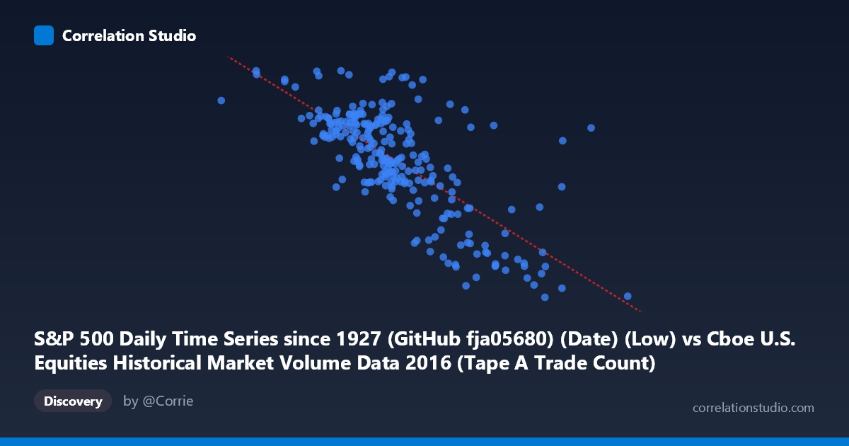
S&P 500 Daily Time Series since 1927 (GitHub fja05680) (Date) (Low) vs Cboe U.S. Equities Historical Market Volume Data 2016 (Tape A Trade Count)
- Pearson correlation (r)
- -0.7294
- Spearman correlation
- -0.6831
- p-value
- 0
- Sample size (n)
- 252
- 95% confidence interval
- -0.7825 to -0.6659
- Granger causality
- None
- Granger optimal lag
- 1
AI analysis
Analysis: S&P 500 Daily Low vs. Cboe Tape A Trade Count (2016)
Relationship Overview The scatterplot reveals a moderately strong negative relationship between the S&P 500 daily low price and the Cboe Tape A trade count throughout 2016. As the S&P 500 low increases — reflecting higher market price levels — the number of trades on Tape A (NYSE-listed securities) tends to decrease. The fitted regression line (y = −0.000259x + 2443.13) confirms this inverse trend, suggesting that periods of lower equity valuations are associated with elevated trading activity, while calmer, higher-price environments see fewer individual transactions.
Correlation Strength and Statistical Significance The Pearson correlation of r = −0.7294 indicates a substantial negative association, and the r² of 0.5321 means that approximately 53.2% of the variance in Tape A trade count is explained by the S&P 500 daily low — a meaningful but incomplete explanation, leaving nearly half the variance attributable to other factors. The 95% confidence interval of [−0.7825, −0.6659] is relatively tight and lies entirely in negative territory, reinforcing confidence in the direction and approximate magnitude of the relationship. With a p-value effectively at zero across a population of N = 3,622, the correlation is highly statistically significant and extremely unlikely to be a chance finding. However, the Granger causality tests tell a more cautious story: neither direction (X→Y nor Y→X) shows significant predictive power at the optimal lag of 1 period (X→Y: F = 0.008, p = 0.928; Y→X: F = 0.444, p = 0.506). This means that while the two variables are strongly correlated contemporaneously, neither reliably predicts the other the following day, suggesting the relationship is driven by shared underlying dynamics rather than a direct lead-lag causal mechanism.
Notable Patterns and Outliers Several features stand out in the sample data. The bulk of observations cluster in the S&P 500 low range of roughly 1,100,000–1,600,000 (index-scaled units) with trade counts between approximately 2,040–2,200, forming a dense core. There are notable high-trade-count outliers at lower price levels — for instance, the point near (1,000,524; 2,265) and (1,428,849; 2,254) — that deviate meaningfully from the regression line, suggesting episodic bursts of trading activity. At the higher price end (above 1,800,000), trade counts drop sharply toward the 1,850–1,920 range, consistent with the negative slope. The relationship also appears to show slight heteroscedasticity: variability in trade counts is wider at moderate price levels and compresses at the extremes, which may indicate that the linear model slightly misrepresents the relationship's true form.
Confounding Factors and Caveats Several important caveats apply. First, this is a within-year (2016) time series, meaning both variables share a common temporal trajectory — market prices generally trended upward across 2016, while high-volume, high-trade-count days were concentrated early in the year (January–February 2016 saw significant market turbulence). This shared time trend is a classic confound: the correlation may largely reflect the passage of time rather than a direct economic link between price level and trade count. Second, trade count and trading volume are distinct — more numerous but smaller trades can coexist with lower notional volume, and algorithmic/high-frequency trading behavior may inflate trade counts independently of price dynamics. Third, Tape A covers only NYSE-listed securities, so this does not capture the full market picture. Finally, the absence of Granger causality suggests any predictive use of this correlation for forecasting would be unreliable.
Actionable Insights and Further Investigation Practitioners interested in market microstructure should partial out the time trend by detrending or differencing both series before re-evaluating the correlation — this would reveal whether the relationship persists beyond a shared temporal drift. It would also be valuable to compare Tape B and Tape C trade counts under the same framework to assess whether the phenomenon is specific to NYSE-listed securities or market-wide. Investigating volatility indices (e.g., VIX) as a mediating variable is strongly recommended, as elevated volatility likely drives both lower prices and higher trade counts simultaneously, potentially explaining much of the observed r². Finally, extending the analysis to multiple years would test whether 2016's particular macro environment (Brexit, U.S. election) is driving an anomalously strong correlation or whether this is a structural feature of equity market microstructure.
X dataset: Cboe U.S. Equities Historical Market Volume Data 2016
Y dataset: S&P 500 Daily Time Series since 1927 (GitHub fja05680) (Date)
Part of experiment: Daily - Cboe U.S. Equities Historical Market Volume Data 2016 vs S&P 500 Daily Time Series since 1927 (GitHub fja05680) (Date)