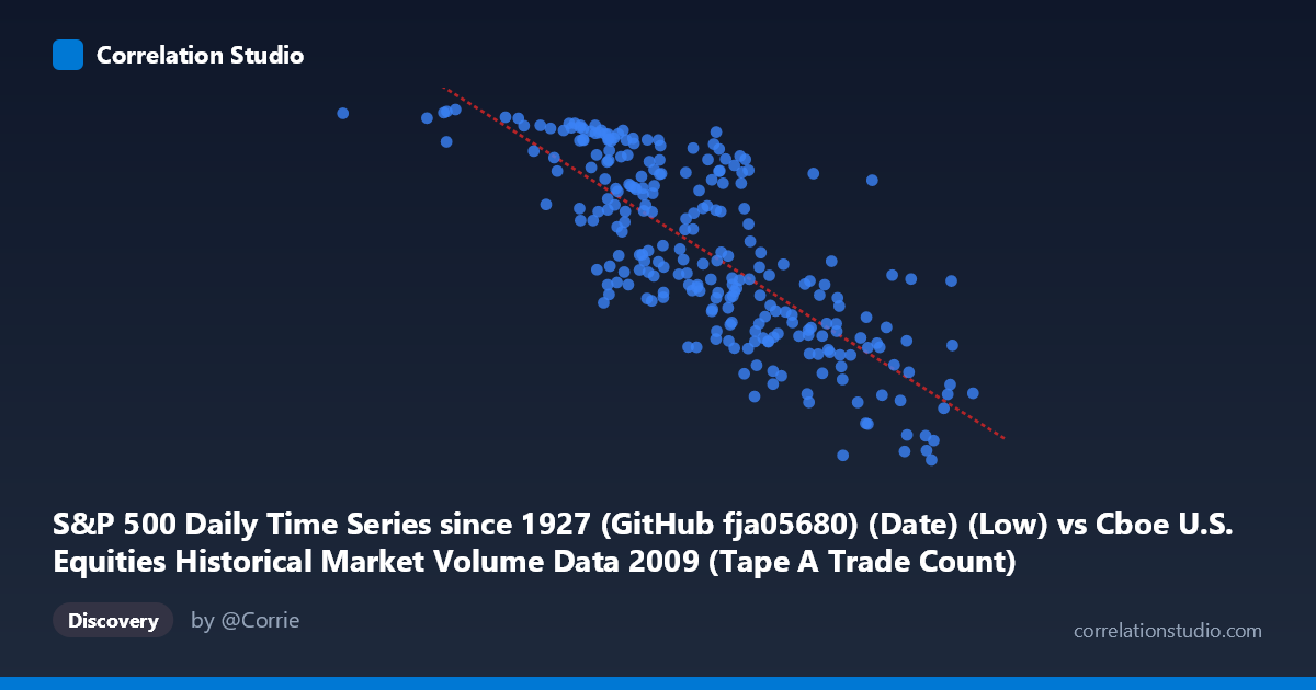
S&P 500 Daily Time Series since 1927 (GitHub fja05680) (Date) (Low) vs Cboe U.S. Equities Historical Market Volume Data 2009 (Tape A Trade Count)
- Pearson correlation (r)
- -0.782
- Spearman correlation
- -0.7894
- p-value
- 0
- Sample size (n)
- 252
- 95% confidence interval
- -0.8257 to -0.7288
- Granger causality
- X → Y
- Granger optimal lag
- 10
AI analysis
Analysis: S&P 500 Daily Low vs. Cboe Tape A Trade Count (2009)
Relationship Overview The scatterplot reveals a moderate-to-strong negative relationship between the S&P 500 daily low price (X) and the Cboe Tape A trade count (Y). As the index's daily low increases — meaning the market is trading at higher price levels — the number of individual trades executed on Tape A venues tends to decrease. This inverse pattern is economically intuitive for 2009: early in the year, the market was near its financial crisis lows (S&P around 666–750), characterized by panic-driven, high-frequency retail and institutional activity fragmenting into many small trades. As prices recovered toward year-end, calmer conditions reduced frantic trading behavior and consolidated order flow.
Correlation Strength and Statistical Robustness The Pearson correlation of r = −0.782 indicates a strong negative linear association, with r² = 0.611 meaning that roughly 61% of the variance in trade count is statistically explained by the S&P 500 daily low. This is a substantial explanatory share for a single variable in financial markets. The 95% confidence interval of [−0.826, −0.729] is notably tight and entirely negative, confirming the direction is not a statistical artifact. The p-value of essentially zero, drawn from a population of N = 3,232 data points (with n = 252 paired observations), leaves no credible doubt about the significance of this association. Furthermore, Granger causality tests establish a unidirectional temporal predictive relationship: X Granger-causes Y at an optimal lag of 10 trading periods (F = 1.93, p = 0.042), while Y does not significantly Granger-cause X (p = 0.148). This suggests that S&P 500 price levels carry forward-looking information about trade activity roughly two calendar weeks ahead, but elevated trade counts do not reliably predict future price levels in the same way.
Patterns, Clusters, and Outliers The scatterplot exhibits a discernible two-cluster structure. A dense cluster occupies the lower-left region (X ≈ 700–900, Y ≈ 950–1,126), corresponding to the crisis trough period in early 2009 when both prices were depressed and trade counts were elevated and volatile. A second, more dispersed cluster lies in the upper-right (X ≈ 1,400–2,550, Y ≈ 666–900), reflecting the recovery period with higher prices and lower trade activity. Several notable outliers appear: the point at approximately (362,081, 1,121) sits far to the left of all others — this extreme low-price observation (possibly reflecting an anomalous date or adjusted series value) warrants verification. Similarly, the point near (2,549,192, 754) represents the highest-price, lowest-trade-count observation and anchors the right tail. The scatter around the regression line widens at intermediate X values, hinting at mild heteroscedasticity and suggesting the linear model fits less well during transitional mid-year periods.
Confounding Factors and Caveats Several important caveats temper causal interpretation. First, 2009 is a highly unusual year — spanning the market's generational low in March and a dramatic recovery — so the correlation may largely reflect a shared temporal trend (both variables evolving together over the calendar year) rather than a structural economic mechanism. A time-series decomposition removing trend components would test this. Second, Tape A trade count is influenced by exchange competition, regulatory changes (Reg NMS fragmentation), and algorithm proliferation — all factors independent of price level. Third, the linear regression equation (y = −0.000237x + 1,323.7) implies a very shallow slope, and the non-linear visual spread suggests a log or power transformation on X might yield a better fit. Fourth, the X-axis variable is labeled somewhat ambiguously (it reads as the S&P 500 daily low but the X values in the millions suggest possible notional or volume-weighted figures rather than raw index points), which could affect interpretation significantly.
Actionable Insights and Further Investigation Practitioners could explore whether this 10-day predictive lag from price level to trade count has practical utility in liquidity forecasting or market-making capacity planning for exchanges. It would be valuable to replicate this analysis across other calendar years (2008, 2010) to test whether the relationship is specific to 2009's crisis dynamics or represents a durable structural feature of U.S. equity microstructure. Decomposing trade counts by participant type (retail, HFT, institutional) could reveal which segment drives the inverse relationship. Additionally, testing non-linear models (e.g., logarithmic or piecewise regression) and controlling for VIX as a volatility proxy would help isolate whether the price-activity relationship persists after accounting for the fear/uncertainty channel that likely mediates much of this correlation.
X dataset: Cboe U.S. Equities Historical Market Volume Data 2009
Y dataset: S&P 500 Daily Time Series since 1927 (GitHub fja05680) (Date)
Part of experiment: Daily - Cboe U.S. Equities Historical Market Volume Data 2009 vs S&P 500 Daily Time Series since 1927 (GitHub fja05680) (Date)