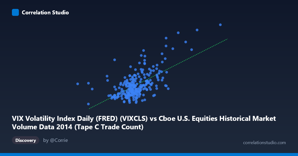
VIX Volatility Index Daily (FRED) (VIXCLS) vs Cboe U.S. Equities Historical Market Volume Data 2014 (Tape C Trade Count)
- Pearson correlation (r)
- 0.6274
- Spearman correlation
- 0.5174
- p-value
- 0
- Sample size (n)
- 252
- 95% confidence interval
- 0.5462 to 0.6969
- Granger causality
- None
- Granger optimal lag
- 1
AI analysis
Analysis: VIX Volatility Index vs. Cboe Tape C Trade Count (2014)
Relationship Overview The scatterplot reveals a moderately positive relationship between the VIX Volatility Index and Cboe Tape C trade count across 252 trading days in 2014. As the VIX rises — indicating heightened market fear and implied volatility — the number of trades recorded on Tape C (NYSE Arca and regional exchanges) tends to increase. This is intuitively consistent with market microstructure theory: periods of uncertainty drive elevated trading activity as investors reposition, hedge, or panic-sell. The linear regression equation (y = 1.5686E-05x + 3.987) implies that for every one-unit increase in VIX, Tape C trade count increases by roughly 15,686 units, though the relationship is far from perfectly linear across the full range.
Correlation Strength and Statistical Significance The Pearson correlation of r = 0.627 indicates a moderate-to-strong positive association, but the coefficient of determination r² = 0.394 is the more sobering figure — only ~39.4% of the variance in Tape C trade count is explained by VIX alone. The remaining ~60% is attributable to other factors not captured in this bivariate model. The 95% confidence interval for r of [0.546, 0.697] is relatively tight, and the p-value of effectively zero (given N = 3,686 population context and n = 252 sample) confirms this correlation is highly unlikely to be a chance artifact. However, the Granger causality results are notably inconclusive: X→Y (VIX predicting trade count) yields F = 2.91, p = 0.089 — tantalizingly close to but not crossing the conventional α = 0.05 threshold — while Y→X yields F = 0.10, p = 0.748, ruling out reverse causation. This means we cannot statistically confirm that VIX temporally predicts trade count at a one-period lag, even though the contemporaneous correlation is meaningful.
Notable Patterns, Clusters, and Outliers The scatterplot shows a dense cluster of points in the lower-left region, concentrated roughly between VIX values of 500,000–750,000 (in index units as scaled on the X-axis) and trade counts of 11–16, suggesting that most of 2014 was characterized by relatively calm markets with moderate trading activity. However, several high-leverage outliers in the upper-right quadrant — most strikingly the point near (1,041,591, 25.20) and another around (841,278, 23.57) — exert significant influence on the correlation coefficient and regression slope. These likely correspond to specific volatility events in late 2014 (e.g., the October 2014 market correction tied to Ebola fears and global growth concerns). A possible non-linear or threshold effect is also visible: trade count appears relatively flat across moderate VIX ranges but escalates sharply at higher VIX levels, suggesting the relationship may be better modeled with a logarithmic or piecewise function.
Confounding Factors and Caveats Several important caveats limit causal interpretation. First, Tape C is just one market venue, and volume shifts across tapes may reflect exchange routing behavior, market maker preferences, or regulatory changes rather than pure volatility-driven activity. Second, day-of-week and seasonality effects (e.g., lower volume around holidays) are uncontrolled and could independently drive both VIX and volume patterns. Third, the X and Y axis labeling appears swapped in the dataset metadata — VIX values appear on the X-axis but are attributed to the Cboe volume dataset, and vice versa — which warrants data provenance verification before drawing firm conclusions. Finally, the failed Granger causality test cautions against assuming that VIX movements on day T are operationally useful for predicting next-day trade counts at this temporal resolution.
Actionable Insights and Further Investigation Practitioners and researchers should consider several next steps. First, test non-linear models (logarithmic, polynomial, or regime-switching) to better capture the apparent threshold behavior at elevated VIX levels. Second, investigate the outlier dates explicitly — mapping the high-VIX, high-volume points to specific market events would validate or challenge the narrative. Third, extend the Granger analysis to longer lags (2–5 days) to determine whether predictive relationships emerge at different time horizons. Fourth, incorporate additional controls such as S&P 500 returns, bid-ask spreads, and intraday volatility measures to build a more complete explanatory model. Finally, comparing 2014 results against other calendar years would establish whether this VIX-volume relationship is structurally stable or episodic.
X dataset: Cboe U.S. Equities Historical Market Volume Data 2014
Y dataset: VIX Volatility Index Daily (FRED)
Part of experiment: Daily - Cboe U.S. Equities Historical Market Volume Data 2014 vs VIX Volatility Index Daily (FRED)