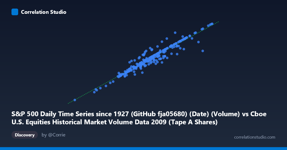
S&P 500 Daily Time Series since 1927 (GitHub fja05680) (Date) (Volume) vs Cboe U.S. Equities Historical Market Volume Data 2009 (Tape A Shares)
- Pearson correlation (r)
- 0.9564
- Spearman correlation
- 0.9453
- p-value
- 0
- Sample size (n)
- 252
- 95% confidence interval
- 0.9445 to 0.9659
- Granger causality
- None
- Granger optimal lag
- 10
AI analysis
Scatterplot Analysis: S&P 500 Volume vs. Cboe Tape A Shares (2009)
Relationship Overview The scatterplot reveals a strong, positive linear relationship between total U.S. equity market volume (X-axis, measured in shares traded) and Cboe Tape A shares specifically (Y-axis). As overall market volume increases, Tape A share volume rises in near-lockstep, which is intuitive given that Tape A securities (NYSE-listed stocks) represent a substantial and relatively stable portion of total U.S. equity trading activity. The data spans the full calendar year 2009 — a period of extraordinary market volatility following the 2008 financial crisis — and the scatter of points traces a remarkably tight diagonal band across the plot.
Correlation Strength and Statistical Significance The Pearson correlation of r = 0.9564 is exceptionally strong, and the coefficient of determination r² = 0.9148 tells a particularly compelling story: roughly 91.5% of the day-to-day variance in Tape A share volume is statistically explained by total market volume. The remaining ~8.5% reflects idiosyncratic variation in Tape A's relative share — shifts in routing, exchange competition, or stock-specific events. The 95% confidence interval of [0.9445, 0.9659] is notably narrow given the sample size of n = 252 daily observations drawn from a population of N = 3,232, reinforcing high precision in the estimate. The p-value of effectively zero confirms this relationship is not a statistical artifact. The linear regression equation y = 12.86x − 75,692,300 implies that for every additional ~77.7 million shares in total market volume, Tape A volume increases by roughly 1 billion shares, suggesting Tape A captures a relatively consistent ~77–78% of total flow. However, Granger causality tests find no significant directional predictive relationship in either direction (X→Y: F = 1.366, p = 0.197; Y→X: F = 1.390, p = 0.186) at the optimal 10-period lag. This means that while the two series move together contemporaneously, neither consistently leads the other — they are co-driven rather than causally sequential.
Patterns, Clusters, and Outliers The data points cluster most densely in the mid-range (X: ~400–530M shares, Y: ~5–7B shares), consistent with typical trading days in mid-to-late 2009 as markets stabilized after the March lows. At the lower-left end, a small cluster of points with notably low volume likely corresponds to the depressed, fearful trading environment of early 2009 and holiday-shortened sessions. At the upper-right, a handful of high-volume outliers — including one striking point near (704M, 9.1B) — almost certainly reflect the extreme volatility days of early 2009 or key macro announcement days. One potentially anomalous point near (662M, 6.3B) visually deviates from the otherwise tight regression line, suggesting an unusually low Tape A share relative to total volume on that day — possibly indicative of a session where non-Tape A (e.g., Nasdaq-listed) stocks dominated flow.
Confounding Factors and Caveats Despite the impressive r², several important caveats apply. First, this correlation is partly tautological by construction: Tape A volume is a component of total market volume, so mathematical dependency is partially baked in. A more analytically independent test would regress Tape A against non-Tape A volume. Second, 2009 was a structurally unusual year — markets experienced a historic bear market bottom in March, followed by a sharp rally, meaning high-volume days cluster around crisis events rather than representing steady-state trading. This could inflate the range and apparent correlation. Third, structural market changes in 2009 (fragmentation across dark pools, internalization, and TRF reporting) may have distorted volume figures, particularly for Tape A vs. total comparisons. Finally, the absence of Granger causality at 10 lags does not rule out very short-lag (intraday) predictive relationships that daily data cannot capture.
Actionable Insights and Further Investigation Practitioners monitoring market microstructure should note that Tape A's share of total volume appears relatively stable but meaningfully variable (~8.5% unexplained variance) — days where Tape A underperforms relative to total volume may signal rotational flows into Nasdaq-heavy sectors or heightened activity in derivatives and ETF-related volume. For further investigation, it would be valuable to: (1) partial out the tautological component by testing Tape A against Tape B and Tape C volumes separately; (2) examine the outlier near (662M, 6.3B) to identify what structural or market event drove the divergence; (3) extend the analysis across multiple years to test whether this ~91% explanatory relationship holds in normal (non-crisis) conditions; and (4) apply intraday data to revisit Granger causality at finer time resolutions, where anticipatory volume patterns in one tape may genuinely precede another.
X dataset: Cboe U.S. Equities Historical Market Volume Data 2009
Y dataset: S&P 500 Daily Time Series since 1927 (GitHub fja05680) (Date)
Part of experiment: Daily - Cboe U.S. Equities Historical Market Volume Data 2009 vs S&P 500 Daily Time Series since 1927 (GitHub fja05680) (Date)