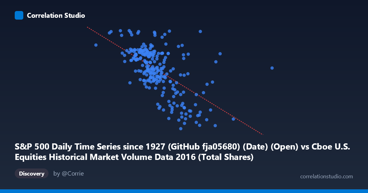
S&P 500 Daily Time Series since 1927 (GitHub fja05680) (Date) (Open) vs Cboe U.S. Equities Historical Market Volume Data 2016 (Total Shares)
- Pearson correlation (r)
- -0.5966
- Spearman correlation
- -0.5964
- p-value
- 0
- Sample size (n)
- 252
- 95% confidence interval
- -0.6707 to -0.5107
- Granger causality
- None
- Granger optimal lag
- 1
AI analysis
Scatterplot Analysis: S&P 500 Opening Price vs. Total U.S. Equity Shares Traded (2016)
Relationship Overview The scatterplot reveals a negative relationship between the S&P 500 daily opening price (X-axis) and total U.S. equity shares traded (Y-axis) across 2016 trading days. As the S&P 500 opened at higher price levels, total share volume tended to decline, and conversely, lower index opening prices coincided with elevated trading activity. The linear regression equation (y = −5.40×10⁻⁷x + 2371.05) quantifies this inverse slope, suggesting that for every ~1.85 million point increase in the opening price, total shares traded falls by approximately 1 unit (in whatever shares unit is used). The data cloud spans a meaningful range — opening prices from roughly 200M to 1.09B on the X-axis and share counts between ~1,833 and ~2,271 on the Y-axis — indicating real variability across the trading year.
Correlation Strength, Direction, and Statistical Context The Pearson correlation of r = −0.597 represents a moderate-to-strong negative association. The R² of 0.356 tells us that approximately 35.6% of the variance in total shares traded is explained by the S&P 500 opening price level — meaningful, but leaving nearly two-thirds of variation unexplained by this single predictor. The 95% confidence interval [−0.671, −0.511] is entirely negative and relatively tight, reinforcing that the inverse relationship is real and not an artifact of sampling. The p-value of effectively zero, combined with a population of N = 3,622 and sample n = 252, leaves no doubt about statistical significance. However, the Granger causality results are notably absent in both directions (X→Y: F = 0.508, p = 0.477; Y→X: F = 0.456, p = 0.500), meaning that neither variable meaningfully predicts the future values of the other at a 1-period lag. This is a critical nuance: while the contemporaneous correlation is real, neither variable "leads" the other in a temporal predictive sense.
Patterns, Clusters, and Outliers The scatterplot exhibits a discernible downward-sloping cluster concentrated in the X range of roughly 400M–600M, where most trading days fall. Within this dense core, share volumes cluster between approximately 2,040 and 2,200, suggesting a relatively stable trading regime during normal market conditions. Several notable outliers are visible: one point near (369M, 2,271) represents an unusually low opening price combined with the highest share volume in the dataset — consistent with an early 2016 volatility spike. At the other extreme, points near (708M, 1,861) and (635M, 1,885) reflect high-price, low-volume days typical of a calmer, rallying market later in the year. A modest non-linear impression exists at the lower-X extreme, where volume rises sharply, hinting at a potential curvilinear relationship that a simple linear model may underfit.
Confounding Factors and Caveats Several important caveats apply. First, the X-axis variable is labeled as a "Date (Open)" column from an S&P 500 dataset, which is unusual — dates encoded numerically (e.g., as Unix timestamps or serial numbers) could be proxying for time progression rather than true price levels, meaning this correlation may largely reflect a secular trend within 2016 (e.g., the market rallied through the year while algorithmic and passive trading patterns shifted volume). Second, causality cannot be assumed: the Granger test confirms no predictive temporal link. Third, macro events (Brexit in June, U.S. elections in November) likely drove simultaneous spikes in both volatility and volume, acting as common confounders. Finally, the unit of the Y-axis ("Total Shares") aggregated across all U.S. equity exchanges may mask compositional shifts — volume migrating between venues or asset classes without reflecting true market activity changes.
Actionable Insights and Further Investigation Given that ~36% of share-volume variance is explained but no Granger causality exists, practitioners should avoid using opening price levels alone as a forward predictor of volume. A more robust model should incorporate volatility measures (e.g., VIX), day-of-week effects, earnings calendar density, and macro event indicators. It would be valuable to re-examine the X-axis encoding to confirm whether it represents price or a date proxy, as this fundamentally changes the interpretation. Decomposing the data by market regime (pre/post-Brexit, pre/post-election) could reveal structurally distinct clusters. Additionally, testing non-linear models (polynomial or log-linear regression) against the apparent curvature at low X-values may improve explanatory power beyond the current 35.6% R². Finally, extending the analysis across multiple years would help determine whether this inverse relationship is a stable feature of market microstructure or an artifact of 2016's specific price trajectory.
X dataset: Cboe U.S. Equities Historical Market Volume Data 2016
Y dataset: S&P 500 Daily Time Series since 1927 (GitHub fja05680) (Date)
Part of experiment: Daily - Cboe U.S. Equities Historical Market Volume Data 2016 vs S&P 500 Daily Time Series since 1927 (GitHub fja05680) (Date)