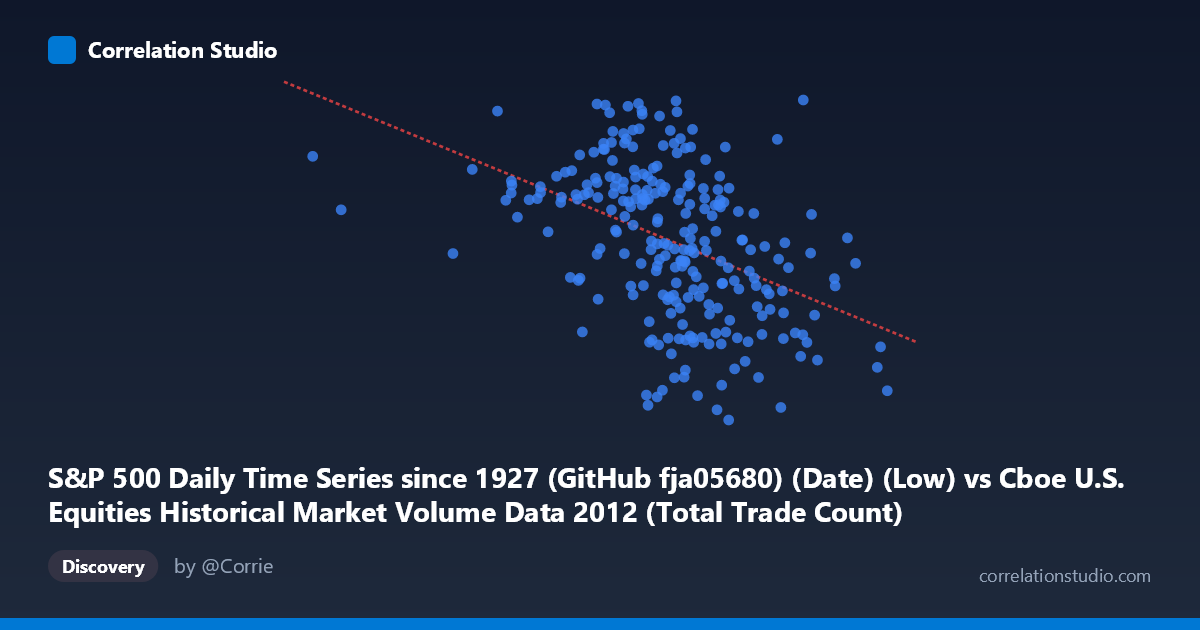
S&P 500 Daily Time Series since 1927 (GitHub fja05680) (Date) (Low) vs Cboe U.S. Equities Historical Market Volume Data 2012 (Total Trade Count)
- Pearson correlation (r)
- -0.4364
- Spearman correlation
- -0.4904
- p-value
- 0
- Sample size (n)
- 250
- 95% confidence interval
- -0.5317 to -0.3302
- Granger causality
- None
- Granger optimal lag
- 2
AI analysis
Analysis: S&P 500 Daily Low vs. Cboe Total Trade Count (2012)
Relationship Overview The scatterplot reveals a moderate negative relationship between the S&P 500 daily low price (X-axis) and the total trade count on Cboe U.S. equity exchanges (Y-axis) across 2012. As the S&P 500 daily low increases — reflecting higher index valuations — the total number of trades tends to decrease. This inverse pattern is visually apparent in the downward slope of the regression line (y = −8.756×10⁻⁵x + 1515.46), suggesting that periods of higher market prices are associated with reduced trading activity, at least in terms of raw trade counts. The data spans a meaningful range, with X values from roughly 586K to 2.28M (likely in index-point or price-scaled units) and trade counts ranging from approximately 1,259 to 1,460 (in thousands or millions).
Correlation Strength and Statistical Significance The Pearson correlation of r = −0.4364 indicates a moderate negative association, but the explanatory power is limited: r² = 0.1904, meaning only about 19% of the variance in trade count is explained by the S&P 500 daily low. While statistically robust — the p-value of 4.79×10⁻¹³ is far below any conventional significance threshold, and the 95% confidence interval of [−0.5317, −0.3302] excludes zero comfortably — practical significance is more restrained. Roughly 81% of the variation in trade count is attributable to other factors entirely. The Granger causality results are particularly telling: neither direction (X→Y nor Y→X) achieves significance at the optimal 2-period lag (F = 2.17, p = 0.117 and F = 0.43, p = 0.652, respectively). This means that while a contemporaneous correlation exists, neither variable reliably predicts the other temporally, undermining any straightforward causal narrative.
Patterns, Clusters, and Outliers The scatterplot shows considerable dispersion around the regression line, consistent with the modest r². Several features stand out. There appears to be a loose cluster of points in the mid-to-upper X range (roughly 1.5M–1.9M) where trade counts vary widely between ~1,270 and ~1,460, suggesting high variability at moderate-to-high price levels. A few apparent outliers are visible: one point near X ≈ 2,036K with a notably high Y value (~1,460) and another cluster near the lower X range (~1.2M–1.4M) with surprisingly high trade counts (~1,395–1,430), which pulls against the overall negative trend. The far-left tail (X < 800K) is sparsely populated, possibly representing early-year or stress-period data points, and warrants closer inspection.
Confounding Factors and Caveats Several important caveats apply. First, the datasets are being joined on date, meaning this correlation is fundamentally time-indexed — both variables evolved throughout 2012, and the S&P 500 generally trended upward that year while market structure changes (e.g., shifting exchange competition, fragmentation) influenced trade counts independently. This creates a classic spurious correlation driven by shared temporal trends rather than a direct causal mechanism. Second, the X-axis label references "Low" prices, which may conflate intraday volatility signals with price-level effects. Third, trade count is a microstructure metric sensitive to algorithmic trading activity, order fragmentation, and regulatory changes — factors completely orthogonal to index price levels. Finally, the N of 3,750 vs. the sample of 250 suggests subsampling; if the 250 points are not randomly drawn, selection bias could distort the estimated correlation.
Actionable Insights and Further Investigation Despite the lack of Granger causality, the moderate contemporaneous correlation warrants further decomposition. Analysts should partial out the time trend from both series (e.g., via detrending or first-differencing) to test whether the correlation persists after removing shared secular movement — if it disappears, the relationship is likely spurious. It would also be valuable to segment by market regime (low-volatility vs. high-volatility periods using VIX data) to determine whether the inverse relationship strengthens during stress periods, when investors may reduce fragmented algorithmic activity. Examining volume (shares traded) alongside trade count could clarify whether fewer but larger trades dominate high-price periods. Finally, incorporating additional Cboe exchange-level breakdowns and controlling for macroeconomic events in 2012 (e.g., European debt crisis episodes) could reveal whether the observed pattern reflects genuine investor behavior or is an artifact of a specific market episode.
X dataset: Cboe U.S. Equities Historical Market Volume Data 2012
Y dataset: S&P 500 Daily Time Series since 1927 (GitHub fja05680) (Date)
Part of experiment: Daily - Cboe U.S. Equities Historical Market Volume Data 2012 vs S&P 500 Daily Time Series since 1927 (GitHub fja05680) (Date)