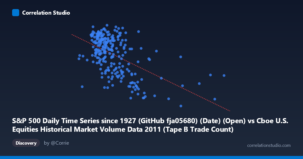
S&P 500 Daily Time Series since 1927 (GitHub fja05680) (Date) (Open) vs Cboe U.S. Equities Historical Market Volume Data 2011 (Tape B Trade Count)
- Pearson correlation (r)
- -0.5404
- Spearman correlation
- -0.4759
- p-value
- 0
- Sample size (n)
- 252
- 95% confidence interval
- -0.6224 to -0.4467
- Granger causality
- None
- Granger optimal lag
- 4
AI analysis
Analysis: S&P 500 Opening Price vs. Cboe Tape B Trade Count (2011)
Relationship Overview The scatterplot reveals a moderate negative relationship between the S&P 500 daily opening price (X) and Cboe Tape B trade count (Y) across 252 trading days in 2011. As the S&P 500 opening price increases, Tape B trade counts tend to decline. The linear regression equation (y = −0.000322x + 1,358.37) quantifies this inverse slope, suggesting that for every 100,000-unit increase in the opening price index level, the Tape B trade count falls by approximately 32 units. Visually, the data points form a downward-sloping cloud, though with considerable scatter around the trend line, indicating the relationship is real but far from deterministic.
Correlation Strength and Statistical Significance The Pearson correlation of r = −0.5404 reflects a moderate negative association. The R² of 0.2921 means that roughly 29.2% of the variance in Tape B trade counts is explained by the S&P 500 opening price — meaningful, but leaving ~71% of variation attributable to other factors. The 95% confidence interval [−0.6224, −0.4467] is entirely negative and does not cross zero, and the p-value is effectively zero against a population of N = 3,780, confirming the correlation is highly statistically significant and not a sampling artifact. Despite this significance, the Granger causality tests reveal no meaningful temporal predictive relationship in either direction — X→Y (F = 1.91, p = 0.109) and Y→X (F = 0.44, p = 0.777) both fail to reach significance at the optimal lag of 4 periods. This is a critical distinction: while the two variables are correlated contemporaneously, neither reliably predicts the other's future values, limiting any causal or forecasting interpretation.
Notable Patterns and Outliers Several features stand out in the data. The bulk of observations cluster in the X range of roughly 170,000–400,000, where trade counts span a wide band from approximately 1,150 to 1,365 — suggesting high variability at moderate price levels. At higher opening price values (above ~450,000), there are noticeably fewer data points, but trade counts tend to compress toward lower values (around 1,100–1,280), consistent with the negative trend. A few apparent outliers are visible at very high X values (e.g., ~556,000 with a trade count of ~1,121 and ~495,000 with ~1,279), which pull the regression line downward. On the lower end of X (~109,000–180,000), trade counts appear relatively elevated and tightly grouped near 1,265–1,337, anchoring the upper-left portion of the scatter. There is no strong visual evidence of non-linearity, though the variance in Y appears somewhat larger at intermediate X values, hinting at mild heteroscedasticity.
Confounding Factors and Caveats Several important caveats temper interpretation. First, 2011 was a volatile year for U.S. equities — marked by the U.S. debt ceiling crisis, S&P's U.S. credit downgrade in August, and European sovereign debt fears — meaning both price levels and trading volumes were subject to episodic, event-driven shocks that could artificially inflate the observed correlation. Second, the axes appear to conflate the S&P 500 open price with what is labeled as a volume/trade-count metric from Cboe; the "X range" of 109,000–832,000 is far larger than typical S&P 500 index levels (~1,100–1,350 in 2011), suggesting the X variable may represent total market notional volume or a composite index rather than the raw S&P 500 price — this labeling ambiguity warrants careful verification before drawing conclusions. Third, Tape B specifically covers NYSE American (AMEX) and regional exchange securities, so its trade count dynamics may reflect market microstructure and routing behaviors rather than broad market sentiment alone. Finally, the absence of Granger causality confirms that correlation here is likely driven by common underlying drivers (e.g., macro risk-off episodes simultaneously suppressing equity prices and trade activity) rather than a direct mechanical link.
Actionable Insights and Further Investigation Given the moderate correlation and its lack of Granger-causal structure, practitioners should avoid using S&P 500 opening levels as a standalone predictor of Tape B activity. Instead, several follow-up analyses are warranted: (1) Segment the data by volatility regime (e.g., using VIX quintiles) to test whether the negative correlation strengthens during high-volatility periods — the 2011 crisis events make this particularly relevant. (2) Clarify the X variable definition and re-examine whether the relationship holds when using true S&P 500 index levels versus notional volume figures. (3) Explore non-linear models (e.g., polynomial regression or spline fits) to determine whether the relationship has threshold effects at extreme price/volume levels. (4) Extend the analysis to multiple years to assess whether the negative correlation is a structural 2011 artifact or a persistent feature of equity market microstructure. (5) Include additional covariates — such as VIX, bid-ask spreads, or Tape A/C trade counts — in a multivariate framework to better explain the remaining ~71% of variance in Tape B activity.
X dataset: Cboe U.S. Equities Historical Market Volume Data 2011
Y dataset: S&P 500 Daily Time Series since 1927 (GitHub fja05680) (Date)
Part of experiment: Daily - Cboe U.S. Equities Historical Market Volume Data 2011 vs S&P 500 Daily Time Series since 1927 (GitHub fja05680) (Date)