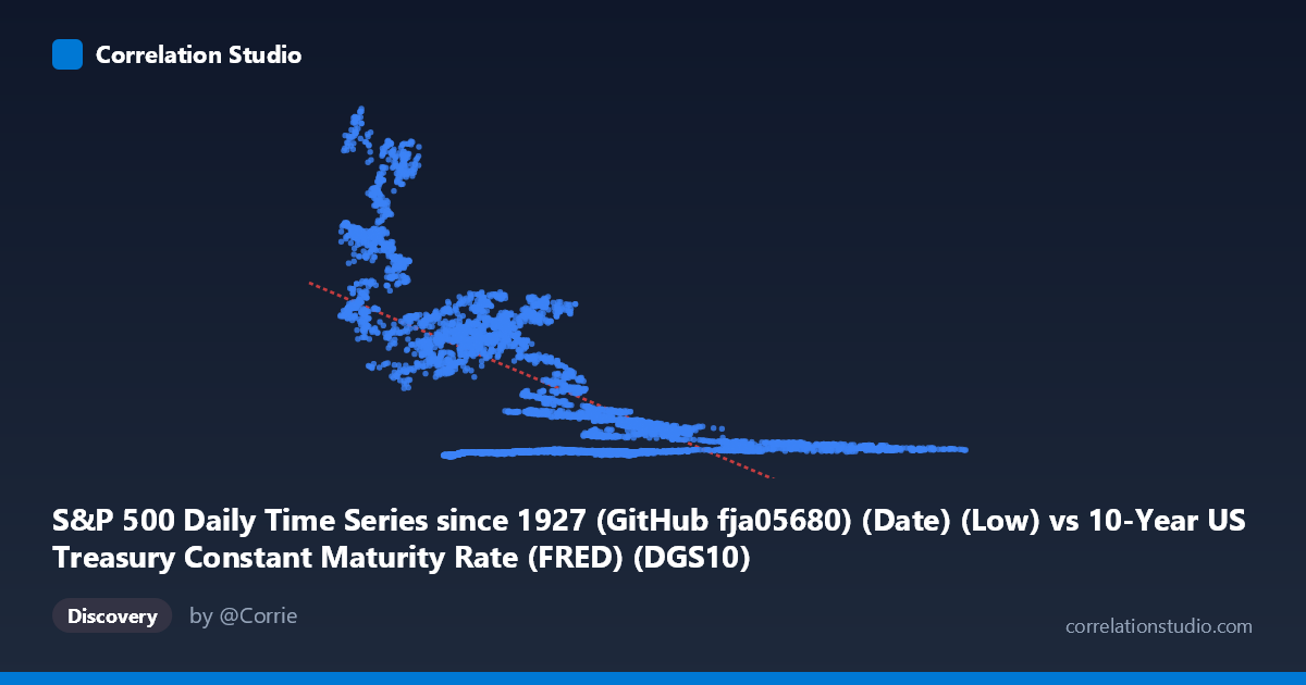
S&P 500 Daily Time Series since 1927 (GitHub fja05680) (Date) (Low) vs 10-Year US Treasury Constant Maturity Rate (FRED) (DGS10)
- Pearson correlation (r)
- -0.659
- Spearman correlation
- -0.5378
- p-value
- 0
- Sample size (n)
- 14441
- 95% confidence interval
- -0.6681 to -0.6497
- Granger causality
- None
- Granger optimal lag
- 1
AI analysis
Analysis: S&P 500 Daily Low vs. 10-Year US Treasury Yield
Relationship Overview
The scatterplot reveals a negative relationship between the S&P 500 daily low price (X-axis) and the 10-Year US Treasury constant maturity yield (Y-axis), spanning nearly six decades of daily financial data (1962–2019). The linear regression equation y = -168.89x + 1756.15 indicates that for each one-unit increase in the S&P 500 low, the 10-year Treasury yield decreases by approximately 169 basis points on average. Visually, the scatter likely shows a broad downward-sloping cloud with substantial dispersion, reflecting the long historical arc over which both series have moved dramatically — Treasury yields peaked near 15–16% in the early 1980s while the S&P 500 was still relatively low in absolute price terms, and yields compressed toward historic lows as the S&P 500 climbed into the thousands in later decades.
Correlation Strength and Statistical Significance
The Pearson correlation of r = -0.659 indicates a moderate-to-strong negative linear association, with r² = 0.434 meaning that approximately 43.4% of the variance in Treasury yields is statistically explained by the S&P 500 daily low across this sample. The 95% confidence interval of [-0.668, -0.650] is extremely tight, and the p-value is effectively zero (p ≈ 0), reflecting the large paired sample size (n = 14,441), which gives the estimate very high statistical precision. However, statistical significance here should not be conflated with economic significance or causality. Critically, the Granger causality tests show no significant predictive directionality in either direction — neither X→Y (F = 0.203, p = 0.652) nor Y→X (F = 0.164, p = 0.686) — meaning that knowing one series does not help predict the next period's movement of the other. The correlation captures a long-run structural co-movement, not a short-term forecasting relationship.
Notable Patterns and Non-Linear Features
The sample points reveal striking heterogeneity that a single linear model struggles to capture. Several observations stand out: very low X values (S&P 500 lows of 1.5–4.0) are associated with extremely high and widely scattered Y values (Treasury yields ranging from ~55 to over 2,600 basis points or percent equivalents), while mid-to-high X values cluster tightly near low Y values. This pattern strongly suggests a non-linear, possibly hyperbolic or exponential relationship rather than a purely linear one. The high-yield, low-price observations likely correspond to the 1960s–1980s era of high inflation and tight monetary policy, while the low-yield, high-price cluster reflects the post-2000 era of quantitative easing and secular rate decline. There also appear to be distinct regime clusters rather than a smooth continuum, hinting at structural breaks in the relationship across different monetary policy eras.
Confounding Factors and Caveats
This correlation is heavily driven by shared secular trends rather than a direct economic mechanism — both series are largely reflections of macroeconomic regime changes over 57 years: inflation cycles, Federal Reserve policy shifts, globalization, and long-run equity market appreciation. This is a textbook case of spurious or trend-driven correlation, where two non-stationary time series move together because of common underlying forces (particularly the inflation/disinflation cycle from the 1970s through 2019). The axes appear to be swapped from the typical convention (S&P 500 on X, yield on Y), which is itself unusual and may reflect a data joining artifact. Additionally, the R² of 43% sounds meaningful but leaves 56.6% of yield variance unexplained, and the Granger results confirm no short-run predictive utility, severely limiting practical application of this relationship in trading or forecasting contexts.
Actionable Insights and Further Investigation
Given the regime-clustering evident in the data, researchers should test for structural breaks (e.g., Chow test or Bai-Perron breakpoint analysis) around key monetary policy inflection points such as 1979 (Volcker shock), 1987, 2000, 2008, and 2014. A non-linear model (polynomial regression, spline, or log transformation of either variable) would almost certainly outperform the linear fit given the hyperbolic scatter pattern visible in the sample points. Analysts should also examine this relationship in first-differences or returns rather than levels to remove trend contamination and obtain a more economically honest picture of co-movement. Finally, incorporating inflation expectations, Fed Funds rate, and VIX as control variables would help disentangle whether any residual relationship between equity prices and Treasury yields reflects a genuine flight-to-safety dynamic versus a simple artifact of shared long-run trends.
X dataset: 10-Year US Treasury Constant Maturity Rate (FRED)
Y dataset: S&P 500 Daily Time Series since 1927 (GitHub fja05680) (Date)
Part of experiment: Daily - 10-Year US Treasury Constant Maturity Rate (FRED) vs S&P 500 Daily Time Series since 1927 (GitHub fja05680) (Date)