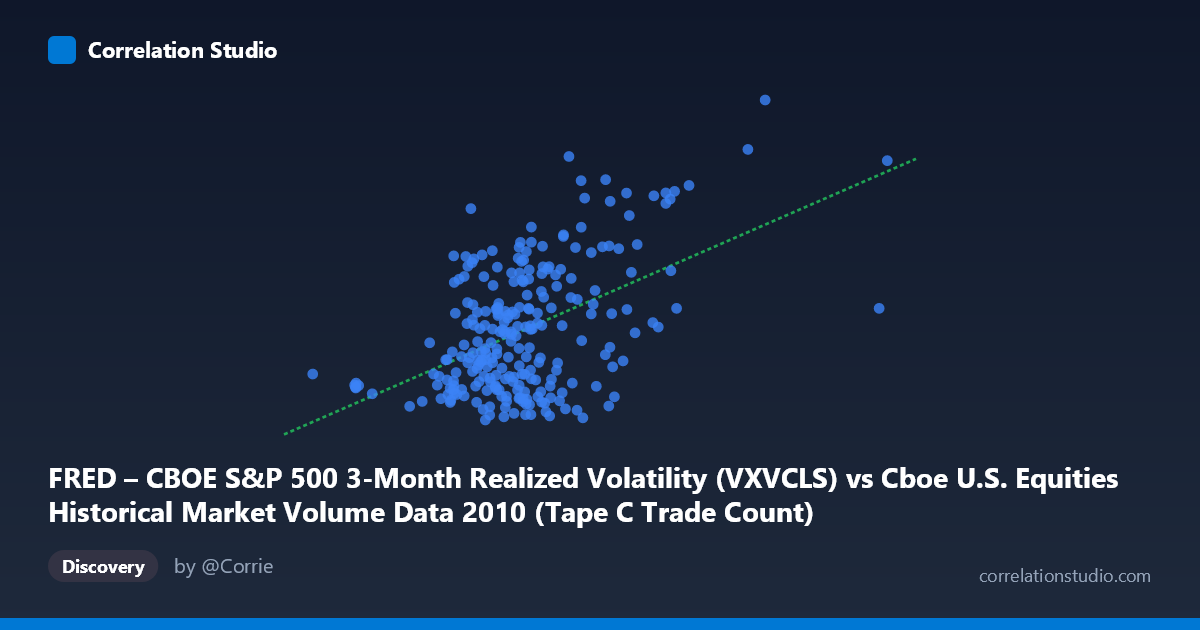
FRED – CBOE S&P 500 3-Month Realized Volatility (VXVCLS) vs Cboe U.S. Equities Historical Market Volume Data 2010 (Tape C Trade Count)
- Pearson correlation (r)
- 0.4929
- Spearman correlation
- 0.3551
- p-value
- 0
- Sample size (n)
- 252
- 95% confidence interval
- 0.3933 to 0.5811
- Granger causality
- Y → X
- Granger optimal lag
- 1
AI analysis
Scatterplot Analysis: CBOE S&P 500 3-Month Realized Volatility vs. Tape C Trade Count (2010)
Relationship Overview
The scatterplot reveals a moderate positive relationship between Cboe U.S. Equities market volume (Tape C Trade Count, on the X-axis) and the CBOE S&P 500 3-Month Realized Volatility index (Y-axis) across 252 trading days in 2010. As trade counts increase, realized volatility tends to rise, consistent with the intuitive notion that elevated trading activity and market uncertainty tend to co-occur. The linear regression equation (y = 1.44236E-05x + 15.98) suggests that for every increase of ~69,000 trades, realized volatility rises by approximately 1 point — though the scatter around this line is considerable, indicating the relationship is real but far from deterministic.
Correlation Strength and Statistical Significance
The Pearson correlation of r = 0.493 indicates a moderate positive association, but the explanatory power is more sobering: r² = 0.243 means only 24.3% of the variance in realized volatility is explained by trade count, leaving roughly 75.7% attributable to other factors. The 95% confidence interval of [0.393, 0.581] is meaningfully bounded away from zero, and the p-value of effectively 0 (given N = 3,302) confirms this is not a chance finding. Critically, the Granger causality results point in one direction only: Y Granger-causes X (F = 7.74, p = 0.006), while X→Y fails to reach significance (F = 2.87, p = 0.092). This means past realized volatility predicts future trade volume, but not vice versa — volatility leads trading activity, not the other way around. This is a practically important asymmetry: volatility spikes appear to draw traders into the market rather than volume generating volatility.
Notable Patterns, Clusters, and Outliers
The data exhibits several visually distinct features. A dense central cluster exists around trade counts of 450,000–700,000 and volatility values of 19–27, reflecting the typical 2010 trading environment. Above this core, a second, looser cluster at higher trade counts (800,000–1,100,000) and elevated volatility (28–38) suggests distinct high-activity, high-uncertainty trading regimes. Several notable outliers stand out: the point near (1,379,287; 36.62) represents the highest trade volume day and sits well above the regression line, while points like (711,283; 36.91) and (1,086,790; 37.40) show high volatility relative to their trade counts. Conversely, some high-volume days (e.g., ~795,000 trades at ~19.6 volatility) suggest that not all volume surges accompany volatility — a hint of non-linearity or regime-dependence in the relationship.
Confounding Factors and Caveats
Several important caveats apply. First, the axes appear swapped from their natural labeling — the dataset descriptions suggest trade count is on X but originates from the FRED volatility dataset, and vice versa, indicating potential metadata misalignment that warrants verification before drawing firm conclusions. Second, 2010 was a structurally unusual year, spanning the aftermath of the 2008–2009 crisis, the Flash Crash of May 2010, and a period of algorithmic trading expansion — all of which could artificially inflate this correlation. Third, Tape C specifically captures NYSE Arca-listed securities (largely ETFs), which may behave differently from broader market dynamics. Fourth, the Granger causality finding, while statistically significant at lag 1, reflects only temporal precedence, not true causation — macroeconomic news, Fed announcements, or geopolitical events could simultaneously drive both series.
Actionable Insights and Further Investigation
The Granger result — that realized volatility predicts future trade volume — has practical trading and risk management implications: monitoring the VXV (3-month realized vol) could serve as a leading indicator for anticipated volume surges, useful for exchange capacity planning, liquidity provision, and execution timing. Investigators should consider: (1) extending the analysis beyond 2010 to test whether this Granger relationship is stable across different volatility regimes; (2) applying non-linear models (e.g., regime-switching or quantile regression) to better capture the apparent behavioral differences between low- and high-volatility clusters; (3) controlling for day-of-week effects, macro announcements, and the Flash Crash period to isolate the structural relationship; and (4) comparing Tape A and Tape B volumes to assess whether the volatility-volume link is ETF-specific or market-wide. A vector autoregression (VAR) model incorporating additional variables (VIX, bid-ask spreads, institutional flow data) would substantially improve explanatory power beyond the current 24.3%.
X dataset: Cboe U.S. Equities Historical Market Volume Data 2010
Y dataset: FRED – CBOE S&P 500 3-Month Realized Volatility
Part of experiment: Daily - Cboe U.S. Equities Historical Market Volume Data 2010 vs FRED – CBOE S&P 500 3-Month Realized Volatility