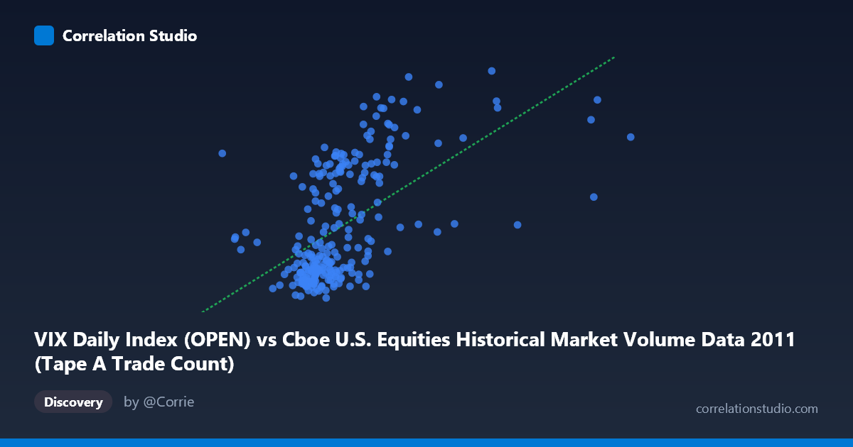
VIX Daily Index (OPEN) vs Cboe U.S. Equities Historical Market Volume Data 2011 (Tape A Trade Count)
- Pearson correlation (r)
- 0.5645
- Spearman correlation
- 0.6134
- p-value
- 0
- Sample size (n)
- 252
- 95% confidence interval
- 0.474 to 0.6432
- Granger causality
- None
- Granger optimal lag
- 1
AI analysis
Scatterplot Analysis: VIX Daily Index (Open) vs. Tape A Trade Count
Relationship Overview
The scatterplot reveals a moderate positive relationship between the VIX Daily Index opening values and Cboe U.S. Equities Tape A Trade Count across 2011. As VIX levels rise — indicating heightened market fear or uncertainty — trading activity (as measured by Tape A trade counts) tends to increase correspondingly. This is visually consistent with the regression line (y = 1.46×10⁻⁵x + 6.83), which slopes upward across the range of VIX values. The relationship is intuitive: periods of elevated volatility typically trigger more active market participation, as institutional and retail traders rush to reposition, hedge, or capitalize on price swings. However, the scatter around the regression line is substantial, suggesting this relationship is far from deterministic.
Correlation Strength and Statistical Framing
The Pearson correlation of r = 0.5645 indicates a moderate positive association, but the explanatory power is more sobering when framed through r²: only 31.9% of the variance in Tape A trade counts is explained by VIX open levels, leaving roughly 68% attributable to other factors. The 95% confidence interval of [0.474, 0.643] is relatively tight given the sample size of n = 252, and the p-value of effectively zero confirms this correlation is highly statistically significant — unlikely to be a chance artifact. That said, statistical significance here is partly a function of the large population context (N = 3,780). Critically, the Granger causality tests are non-significant in both directions (X→Y: F = 0.264, p = 0.608; Y→X: F = 0.195, p = 0.659), meaning that neither variable meaningfully predicts the other at a one-period lag in a temporal sense. This is an important caveat: while the two variables are contemporaneously correlated, neither can reliably be used to forecast the other the following day.
Notable Patterns, Clusters, and Outliers
Several structural features stand out in the data. The bulk of observations cluster in the lower-left region — VIX values roughly between 900,000–1,300,000 and trade counts between 14–25 — reflecting the predominance of relatively calm market days during 2011. A distinct upper cluster is visible at higher VIX values (approximately 1,400,000–1,900,000), corresponding to elevated trade counts in the 30–46 range, likely associated with the August 2011 U.S. debt ceiling crisis and S&P downgrade, which drove extreme volatility spikes. One notable outlier appears near x ≈ 2,126,542 with y ≈ 41.94, representing an extreme volatility day far removed from the main cluster. A separate group of points near x ≈ 500,000–800,000 shows moderate trade counts, suggesting low-VIX days do not necessarily produce the lowest trading volumes — hinting at a possible non-linear or threshold dynamic where the relationship strengthens only above certain volatility levels.
Confounding Factors and Interpretive Caveats
Several important caveats temper interpretation. First, temporal autocorrelation is likely present in both series — volatility clusters and trade volumes exhibit persistence — meaning data points are not fully independent, which can inflate apparent correlations. Second, the axes may be reversed from their natural causal framing: the dataset notes indicate VIX data appears on the Y-axis but is drawn from the "VIX Daily Index" dataset labeled as Tape A Trade Count, and vice versa — suggesting a possible metadata labeling inconsistency that warrants verification before drawing directional conclusions. Third, exogenous macroeconomic shocks in 2011 (European sovereign debt crisis, U.S. credit downgrade, Federal Reserve communications) likely drove both variables simultaneously, creating spurious correlation via a common third cause rather than a direct link. Finally, using only Tape A data excludes Tape B and C volumes, potentially underrepresenting total market activity.
Actionable Insights and Further Investigation
Practitioners should treat VIX levels as a rough contemporaneous signal of trading activity rather than a predictive tool, given the Granger causality null results. To improve predictive modeling, analysts should: (1) investigate non-linear specifications (e.g., polynomial or piecewise regression), as the relationship appears to strengthen significantly above VIX thresholds associated with crisis regimes; (2) incorporate lagged volatility measures and volume across all tapes to build a more complete picture; (3) segment the analysis by market regime — separating calm periods from the August 2011 stress episode — to test whether the correlation is regime-dependent; and (4) resolve the metadata labeling ambiguity to ensure the axis assignments accurately reflect the underlying variables. A Vector Autoregression (VAR) model with additional control variables (e.g., S&P 500 returns, bid-ask spreads) could better decompose contemporaneous co-movement from genuine predictive relationships.
X dataset: Cboe U.S. Equities Historical Market Volume Data 2011
Y dataset: VIX Daily Index
Part of experiment: Daily - Cboe U.S. Equities Historical Market Volume Data 2011 vs VIX Daily Index