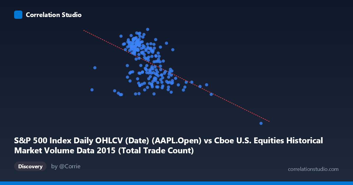
S&P 500 Index Daily OHLCV (Date) (AAPL.Open) vs Cboe U.S. Equities Historical Market Volume Data 2015 (Total Trade Count)
- Pearson correlation (r)
- -0.4905
- Spearman correlation
- -0.5005
- p-value
- 0
- Sample size (n)
- 222
- 95% confidence interval
- -0.5844 to -0.3836
- Granger causality
- None
- Granger optimal lag
- 1
AI analysis
Scatterplot Analysis: AAPL Opening Price vs. Cboe Total Trade Count (2015)
Relationship Overview The scatterplot reveals a moderate negative relationship between Apple's (AAPL) daily opening price on the S&P 500 and the total trade count recorded across Cboe U.S. equity exchanges. As AAPL's opening price increases, the aggregate number of trades across U.S. equity markets tends to decrease. The fitted regression line (y = -7.68×10⁻⁶x + 140.006) captures this downward trend, though the scatter around the line is substantial, indicating that the linear model leaves considerable variance unexplained. The relationship is perhaps counterintuitive at first glance — one might expect higher-priced, active stocks to coincide with higher market-wide trading activity — but it likely reflects broader market dynamics at play throughout 2015.
Correlation Strength and Statistical Significance The Pearson correlation of r = -0.4905 indicates a moderate negative association, with r² = 0.2406 meaning that only 24.1% of the variance in total trade count is explained by AAPL's opening price. While statistically highly significant (p = 7.77×10⁻¹⁵), the remaining ~76% of variance is driven by other factors entirely. The 95% confidence interval of [-0.5844, -0.3836] is reasonably narrow and does not cross zero, reinforcing that the negative direction is reliable and not a sampling artifact. However, the Granger causality results are unambiguous: neither direction (X→Y: F=0.543, p=0.462; Y→X: F=0.224, p=0.637) achieves significance, meaning that AAPL's opening price does not temporally predict trade count, nor vice versa. The correlation is real in a cross-sectional sense but carries no predictive causal weight in the temporal domain — a critical distinction for any practical application.
Notable Patterns, Clusters, and Outliers The bulk of data points cluster in the X range of roughly 1.9M–3.1M (AAPL opening price) and Y range of 110–132 (trade count), forming a relatively dense central mass with visible downward drift. However, there are two notable outlier regions that warrant attention. A high-X outlier near X ≈ 5.55M, Y ≈ 94.87 sits dramatically isolated from the main cluster — this single point represents an extreme trading event and exerts significant leverage on the regression line, potentially inflating the apparent negative slope. Additionally, a point near X ≈ 4.08M, Y ≈ 111 and another near X ≈ 1.07M, Y ≈ 118 suggest the relationship may be non-linear or driven largely by these extreme observations. The main cluster itself shows substantial vertical spread at any given X value, reinforcing the weak-to-moderate nature of the linear fit.
Confounding Factors and Caveats Several important caveats apply. First, the axis labels appear inverted relative to their dataset sources — AAPL opening price is drawn from the Cboe dataset and trade count from the S&P dataset, suggesting a possible data join or labeling issue that should be verified before drawing firm conclusions. Second, the extreme outlier at X ≈ 5.55M is likely a data error, a corporate action (e.g., stock split adjustment), or a market anomaly; its removal could materially weaken the correlation. Third, confounding temporal factors throughout 2015 — including Federal Reserve interest rate decisions, the August 2015 market volatility spike, and seasonal trading patterns — could independently drive both variables, creating a spurious correlation. Finally, the mismatch between N=506 (population) and n=222 (paired sample) suggests that a substantial portion of trading days lacked matched data across both datasets, which may introduce selection bias.
Actionable Insights and Further Investigation Given that Granger causality is absent, this correlation should not be used as a predictive signal for trading strategies. Instead, the relationship likely reflects a shared sensitivity to broader market conditions rather than a direct link. Recommended next steps include: (1) investigating and potentially removing or winsorizing the extreme outlier near X ≈ 5.55M to assess its influence on the correlation; (2) testing for non-linear relationships (e.g., quadratic or spline fits) given the visual curvature suggested by the outlier structure; (3) introducing control variables such as VIX (volatility index), daily S&P 500 returns, or trading volume to partial out confounding market-wide effects; and (4) verifying the dataset join logic and axis label assignments to ensure the paired observations are correctly aligned temporally. A time-series decomposition separating trend, seasonality, and residual components could also clarify whether the correlation persists after removing the shared temporal trend across both series.
X dataset: Cboe U.S. Equities Historical Market Volume Data 2015
Y dataset: S&P 500 Index Daily OHLCV (Date)
Part of experiment: Daily - Cboe U.S. Equities Historical Market Volume Data 2015 vs S&P 500 Index Daily OHLCV (Date)