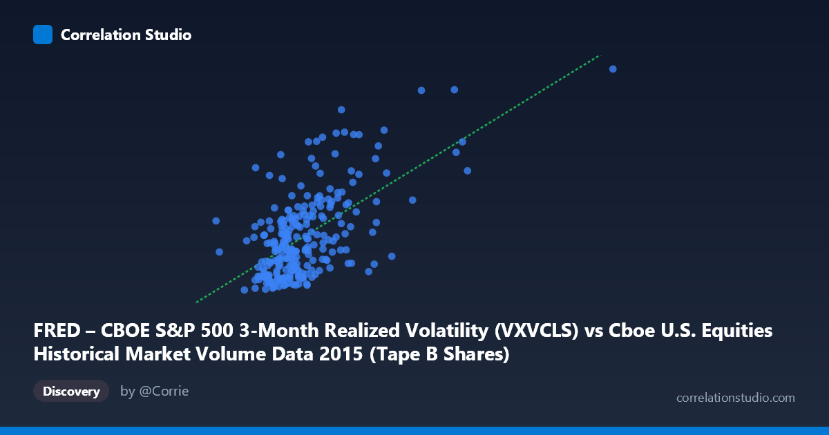
FRED – CBOE S&P 500 3-Month Realized Volatility (VXVCLS) vs Cboe U.S. Equities Historical Market Volume Data 2015 (Tape B Shares)
- Pearson correlation (r)
- 0.6123
- Spearman correlation
- 0.5188
- p-value
- 0
- Sample size (n)
- 252
- 95% confidence interval
- 0.5288 to 0.6842
- Granger causality
- None
- Granger optimal lag
- 1
AI analysis
Scatterplot Analysis: CBOE S&P 500 3-Month Realized Volatility vs. Tape B Shares Volume
Relationship Overview
The scatterplot reveals a moderately positive relationship between CBOE S&P 500 3-Month Realized Volatility (VXVCLS) on the X-axis and Tape B Shares volume on the Y-axis across 252 trading days in 2015. The linear regression equation (y = 6.85×10⁻⁸x + 11.421) confirms the positive slope: as realized volatility increases, Tape B share volume tends to rise as well. This is intuitively consistent with market microstructure theory — elevated volatility environments typically drive higher trading activity as market participants hedge, rebalance, or react to price uncertainty. The relationship is visible but far from deterministic, with considerable vertical scatter at any given X value, suggesting that volatility alone is an incomplete predictor of volume.
Correlation Strength and Statistical Framing
The Pearson correlation of r = 0.6123 indicates a moderate-to-strong positive association. However, the coefficient of determination r² = 0.3750 is the more sobering metric: volatility explains only 37.5% of the variance in Tape B share volume, leaving 62.5% attributable to other factors. The 95% confidence interval of [0.5288, 0.6842] is relatively tight given the sample size (n = 252), and the p-value of effectively zero confirms that this correlation is statistically indistinguishable from chance. Despite this robust statistical significance, the Granger causality results tell a different story temporally: neither direction (X→Y: F = 0.1169, p = 0.7327; Y→X: F = 0.1005, p = 0.7515) approaches significance. This means that while the two variables co-move, past values of realized volatility do not meaningfully predict future Tape B volume, and vice versa — the relationship is contemporaneous, not predictive.
Notable Patterns, Clusters, and Outliers
Several structural features stand out in the data. The bulk of observations cluster between roughly 60M–130M on the X-axis and 14–22 on the Y-axis, forming a dense core cloud with a visible upward tilt. However, there are clear high-leverage outliers in the upper-right quadrant — points such as (205M, 29.58) and (213M, 23.47) represent days of extreme volatility coinciding with elevated volume, likely corresponding to the August 2015 market sell-off (a well-documented volatility spike). A secondary cluster appears around (128M–131M, 26–28), suggesting episodic bursts of correlated activity. At the lower-left, many points with low volatility (60–80M range) still exhibit a wide spread in Y (14.5–20), indicating that low-volatility regimes do not reliably suppress volume. The scatter widens noticeably at higher X values — a potential heteroscedastic pattern that may violate standard linear regression assumptions.
Confounding Factors and Caveats
Several important caveats apply. First, the axis assignments appear counterintuitive — VXVCLS (a volatility index) is plotted on X yet originates from the Cboe equities volume dataset, while Tape B Shares (a volume metric) is on Y but sourced from the FRED volatility dataset. This labeling inversion warrants verification before drawing conclusions. Second, 2015 was not a typical year — the August 2015 flash crash introduced extreme observations that likely inflate the correlation and disproportionately influence the regression slope. Third, Tape B specifically covers NYSE American (AMEX) and other regional exchange tapes, which may respond differently to macro volatility than broader market volume measures. Finally, calendar effects (month-end rebalancing, quarterly options expiration) and sector-specific news are plausible confounders that could simultaneously drive both volatility and volume without a direct causal link.
Actionable Insights and Further Investigation
Despite the absence of Granger causality, the contemporaneous correlation is strong enough to be practically useful in real-time regime monitoring: spikes in realized volatility reliably co-occur with elevated Tape B volume, making VXVCLS a reasonable coincident indicator for liquidity and execution cost modeling. For further investigation, analysts should: (1) re-examine the data provenance to resolve the apparent axis/dataset labeling mismatch; (2) apply robust or quantile regression to reduce the influence of the August 2015 outliers and test whether the relationship holds across the full distribution; (3) test lagged cross-correlations beyond a single period, as the Granger test used only lag = 1; (4) segment the data by volatility regime (e.g., VIX < 15 vs. VIX 20) to determine whether the correlation is driven primarily by high-stress periods; and (5) incorporate additional covariates — such as options expiration cycles, Fed announcement days, and bid-ask spreads — to better account for the unexplained 62.5% of variance.
X dataset: Cboe U.S. Equities Historical Market Volume Data 2015
Y dataset: FRED – CBOE S&P 500 3-Month Realized Volatility
Part of experiment: Daily - Cboe U.S. Equities Historical Market Volume Data 2015 vs FRED – CBOE S&P 500 3-Month Realized Volatility