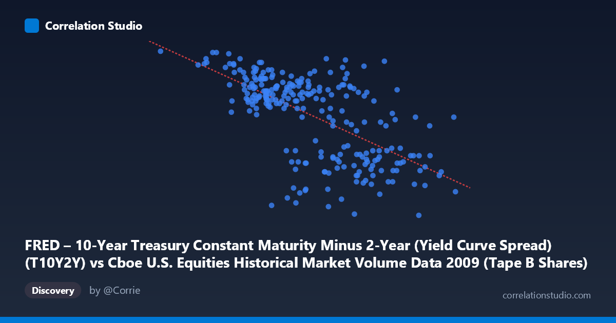
FRED – 10-Year Treasury Constant Maturity Minus 2-Year (Yield Curve Spread) (T10Y2Y) vs Cboe U.S. Equities Historical Market Volume Data 2009 (Tape B Shares)
- Pearson correlation (r)
- -0.6294
- Spearman correlation
- -0.6148
- p-value
- 0
- Sample size (n)
- 250
- 95% confidence interval
- -0.6989 to -0.5481
- Granger causality
- None
- Granger optimal lag
- 1
AI analysis
Analysis: Yield Curve Spread vs. Tape B Share Volume (2009)
Relationship Overview
The scatterplot reveals a moderate negative relationship between the 10-Year minus 2-Year Treasury yield curve spread and Cboe Tape B share volumes during 2009. As the yield curve steepened (higher spread values), trading volumes in Tape B equities tended to decline, and conversely, periods of a flatter or compressed spread corresponded with elevated share volumes. This pattern is visually coherent across the sample points — lower-X observations (spreads near 33M–100M basis point units) cluster at higher Y values (spreads around 2.6–2.8), while higher-X observations tend toward lower Y values (1.5–2.0 range).
Correlation Strength and Statistical Significance
The Pearson correlation of r = -0.6294 indicates a moderate-to-strong negative association, which is statistically robust given the large population (N = 3,232) and a p-value effectively equal to zero. The 95% confidence interval of [-0.699, -0.548] is relatively tight and does not cross zero, reinforcing genuine signal rather than sampling noise. However, the R² of 0.396 is the critical anchor for practical interpretation: yield curve spread explains roughly 40% of the variance in Tape B volumes, meaning a substantial 60% of volume variation remains unaccounted for by this variable alone. The linear regression equation (y = -4.89×10⁻⁹x + 3.026) quantifies the slope but reflects a very shallow rate of change, emphasizing that while the direction is clear, the relationship is far from deterministic.
Patterns, Clusters, and Outliers
Several structural features stand out in the data. A noticeable high-volume cluster exists at the lower end of the X range (~34M–120M), where Tape B volumes consistently exceed 2.4–2.8 — this likely corresponds to the volatile early-2009 period when market stress was acute and the yield curve had not yet dramatically steepened. A second lower-volume cluster emerges at higher X values (180M–255M), consistent with the mid-to-late 2009 recovery as the curve steepened aggressively post-Fed intervention. The point at (33,822,027, 2.82) stands out as a potential outlier at the extreme low end of spreads with maximum volume, possibly reflecting the peak stress period in early January 2009. Some scatter around 160M–175M shows considerable Y-axis dispersion (values ranging from 1.57 to 2.65), suggesting this middle zone of spread is where other factors dominate.
Confounding Factors and Caveats
Several important caveats temper causal interpretation. Most critically, Granger causality tests in both directions are statistically insignificant (X→Y: F = 0.33, p = 0.57; Y→X: F = 0.01, p = 0.91), meaning neither variable temporally predicts the other — the correlation reflects co-movement driven by common underlying forces, not a predictive relationship. The dominant confound is almost certainly the 2008–2009 financial crisis trajectory: the same macro shock (credit crisis, Fed emergency interventions, TARP, quantitative easing) simultaneously suppressed the yield curve spread and amplified equity market volumes during early 2009, then reversed both as conditions stabilized. This creates a classic spurious correlation via shared time-trend, where both variables are responding to the same causal driver rather than influencing one another. Additionally, Tape B specifically captures regional exchange volume (NYSE American, etc.), which may behave differently from total market volume.
Actionable Insights and Further Investigation
Given these findings, several investigative paths are warranted. First, decompose the time series using breakpoint analysis — separating Q1 2009 (crisis peak) from Q2–Q4 (recovery) may reveal that the correlation is largely driven by regime differences rather than a continuous relationship. Second, introduce controls for the VIX (volatility index) and Fed Funds rate as covariates to test whether the yield curve spread retains explanatory power after accounting for broader risk sentiment. Third, test whether Tape A and Tape C volumes exhibit the same directional relationship, which would confirm a market-wide phenomenon versus a Tape B-specific artifact. Fourth, extending the analysis across multiple years (2007–2012) would test whether this negative correlation is stable across the full credit cycle or an artifact unique to 2009's extraordinary conditions. The absence of Granger causality strongly suggests that neither variable should be used as a leading indicator of the other in any trading or risk model without additional structural validation.
X dataset: Cboe U.S. Equities Historical Market Volume Data 2009
Y dataset: FRED – 10-Year Treasury Constant Maturity Minus 2-Year (Yield Curve Spread)
Part of experiment: Daily - Cboe U.S. Equities Historical Market Volume Data 2009 vs FRED – 10-Year Treasury Constant Maturity Minus 2-Year (Yield Curve Spread)