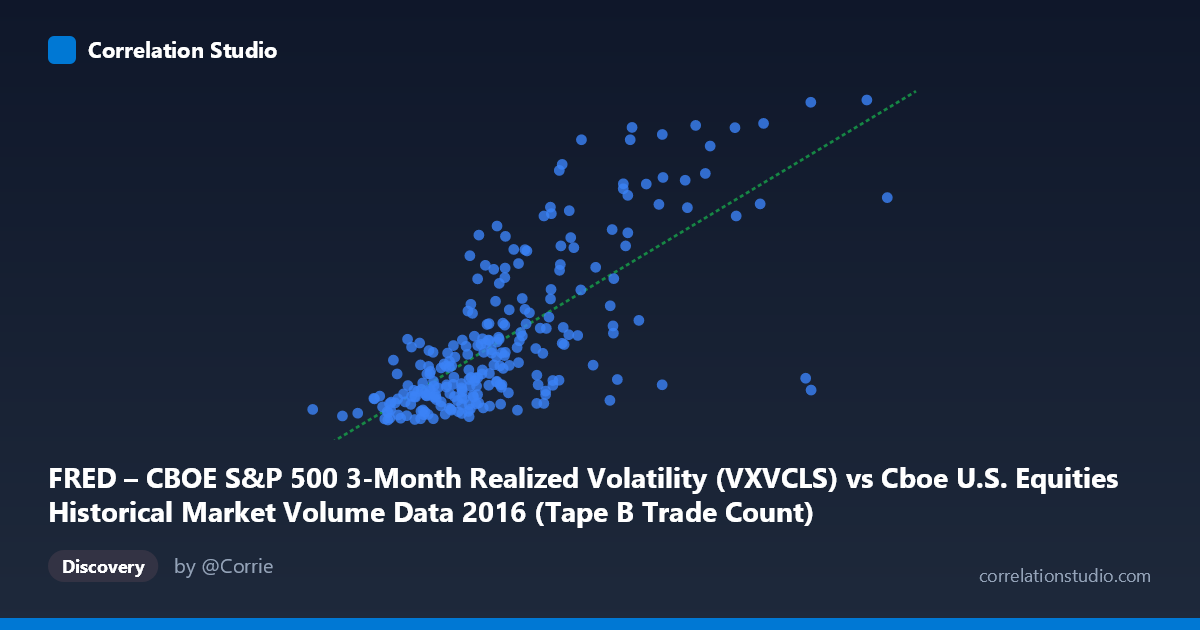
FRED – CBOE S&P 500 3-Month Realized Volatility (VXVCLS) vs Cboe U.S. Equities Historical Market Volume Data 2016 (Tape B Trade Count)
- Pearson correlation (r)
- 0.7288
- Spearman correlation
- 0.7195
- p-value
- 0
- Sample size (n)
- 252
- 95% confidence interval
- 0.6652 to 0.782
- Granger causality
- None
- Granger optimal lag
- 1
AI analysis
Scatterplot Analysis: CBOE S&P 500 3-Month Realized Volatility vs. Tape B Trade Count (2016)
Relationship Overview The scatterplot reveals a moderately strong positive relationship between CBOE S&P 500 3-Month Realized Volatility (VXVCLS) on the X-axis and Tape B Trade Count on the Y-axis across 252 trading days in 2016. As realized volatility increases, trade count in Tape B (which covers NYSE American and regional exchange-listed securities) rises correspondingly. The linear regression equation (y = 2.33×10⁻⁵x + 10.80) suggests that for every 100,000-unit increase in the volatility index, Tape B trade count increases by approximately 2.33 units — a meaningful but modest marginal effect that becomes significant at scale. The relationship is intuitive: elevated market volatility typically drives higher trading activity as participants react to price uncertainty.
Correlation Strength and Statistical Significance The Pearson correlation of r = 0.729 reflects a moderately strong positive association, with r² = 0.531 indicating that roughly 53% of the variance in Tape B trade count is explained by realized volatility. While this is a substantial explanatory share for a single-variable model, it also confirms that nearly half the variance remains unexplained by this factor alone. The 95% confidence interval of [0.665, 0.782] is relatively narrow given the sample size of 252, and the p-value of effectively zero confirms the correlation is not attributable to chance. However, the Granger causality tests undercut any directional inference: neither X→Y (F = 0.007, p = 0.935) nor Y→X (F = 0.024, p = 0.878) reaches significance at a one-period lag, meaning realized volatility does not temporally predict trade count in a leading sense, nor vice versa. This strongly suggests the two variables move contemporaneously — they respond to the same underlying market conditions rather than one driving the other.
Patterns, Clusters, and Outliers The scatterplot shows a relatively dense core cluster concentrated in the X range of roughly 200,000–380,000 and Y range of 15–20, reflecting the majority of "normal" 2016 trading days. There is a visible upper-right dispersion of points, corresponding to high-volatility, high-trade-count sessions — likely associated with episodic market stress events in 2016 (e.g., Brexit vote in late June, U.S. election in November). Several notable outliers sit well above the regression line, including points near (558,190, 26.71) and (448,445, 24.02), suggesting that on the most volatile days, trade count surges disproportionately relative to the linear trend. Conversely, a handful of low-volatility sessions show unexpectedly modest trade counts, hinting at possible thin-volume days or holiday-adjacent sessions near (202,782, 15.09).
Confounding Factors and Caveats Several important caveats apply. First, reverse causality cannot be ruled out — high trade volumes themselves contribute to realized volatility measurement, creating a circularity risk. Second, both variables are likely jointly driven by macro event risk (earnings seasons, geopolitical shocks, Fed announcements), meaning the correlation may largely reflect co-movement with a latent common factor rather than a structural link. Third, Tape B specifically covers smaller regional venues, and its trade count dynamics may partly reflect market structure effects (e.g., algorithmic fragmentation, routing decisions) that are independent of realized volatility. Finally, the dataset covers only 2016 — a year with distinctive events — limiting generalizability, and the N of 3,622 referenced suggests the underlying population may span a broader period than the 252-day sample used here.
Actionable Insights and Further Investigation For traders and risk managers, the co-movement pattern suggests that Tape B liquidity provisioning and execution strategies should be recalibrated during elevated VXVCLS regimes, as higher trade counts may imply increased slippage or adverse selection risk. To deepen this analysis, it would be valuable to: (1) decompose the residual 47% variance by incorporating additional predictors such as VIX level, total market volume, or time-of-day effects; (2) test Granger causality at longer lags (2–5 periods) to check whether the relationship has a delayed structure not captured at lag 1; (3) segment the data by event type (e.g., FOMC days, earnings windows, macro announcements) to determine whether the correlation is primarily event-driven; and (4) replicate the analysis across other years to assess whether 2016's unique political and macroeconomic environment inflates the observed r value.
X dataset: Cboe U.S. Equities Historical Market Volume Data 2016
Y dataset: FRED – CBOE S&P 500 3-Month Realized Volatility
Part of experiment: Daily - Cboe U.S. Equities Historical Market Volume Data 2016 vs FRED – CBOE S&P 500 3-Month Realized Volatility