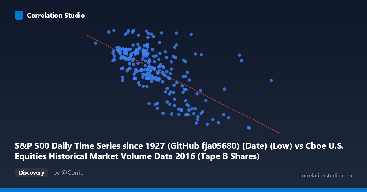
S&P 500 Daily Time Series since 1927 (GitHub fja05680) (Date) (Low) vs Cboe U.S. Equities Historical Market Volume Data 2016 (Tape B Shares)
- Pearson correlation (r)
- -0.6303
- Spearman correlation
- -0.6031
- p-value
- 0
- Sample size (n)
- 252
- 95% confidence interval
- -0.6994 to -0.5495
- Granger causality
- None
- Granger optimal lag
- 1
AI analysis
Analysis: S&P 500 Daily Low vs. Cboe Tape B Share Volume (2016)
Relationship Overview The scatterplot reveals a moderate negative relationship between the S&P 500 daily low price and Cboe Tape B share volume throughout 2016. As the S&P 500 daily low increases (i.e., the market trades at higher price levels), Tape B share volume tends to decrease. This inverse pattern is consistent with a well-documented market microstructure phenomenon: when equity prices are elevated and markets are calm, investors tend to trade fewer shares in aggregate, whereas periods of lower prices — often coinciding with heightened volatility and uncertainty — tend to attract elevated trading activity as participants react, hedge, or reposition.
Correlation Strength and Statistical Significance The Pearson correlation of r = -0.6303 indicates a moderate-to-strong negative association. The R² of 0.3973 means that approximately 39.7% of the variance in Tape B share volume is statistically explained by the S&P 500 daily low — a meaningful but far from complete explanation, leaving roughly 60% of variance attributable to other factors. The 95% confidence interval of [-0.6994, -0.5495] is relatively tight and does not straddle zero, and the p-value is effectively zero, confirming this relationship is highly unlikely to be a product of random chance in a sample of n = 252 paired observations drawn from a population of N = 3,622. Despite strong contemporaneous correlation, the Granger causality tests reveal no significant temporal predictive relationship in either direction (X→Y: F = 0.74, p = 0.39; Y→X: F = 0.60, p = 0.44). This is a critical nuance: knowing yesterday's S&P 500 low does not meaningfully improve forecasts of today's Tape B volume beyond what is already known, and vice versa. The relationship appears to be concurrent rather than predictive.
Patterns, Clusters, and Outliers Several notable features are visible in the data. The bulk of observations cluster in a central band roughly spanning S&P 500 lows of 85M–115M (in price units) and Tape B volumes of 2,000–2,200, forming a relatively dense core with a discernible downward slope. A distinct cluster of high-X, low-Y outliers appears at the right tail — points near 130M–170M on the X-axis with Tape B volumes dipping toward 1,848–1,920 — likely corresponding to the late-year market rally following the U.S. presidential election in November 2016, when prices surged but share-count volume compressed. Conversely, the point at approximately (78.9M, 2265) stands out as a high-volume, low-price outlier, possibly corresponding to an early 2016 market selloff period. The scatter also shows heteroscedasticity: variance in Tape B volume appears wider at lower X values and narrows at higher price levels, suggesting the relationship may not be perfectly linear across the full range.
Confounding Factors and Caveats Several important caveats apply. First, price-to-share-count mechanics are inherently confounding: as index prices rise, the same notional dollar value of trading naturally requires fewer shares, creating a mechanical inverse relationship that may be partially spurious rather than behaviorally meaningful. Second, 2016 was an atypical year with structural breaks — early-year volatility from global growth fears, mid-year Brexit shock, and the post-election rally — meaning the correlation may be driven by a few distinct macro regimes rather than a stable continuous relationship. Third, the Tape B designation (NYSE American, regional exchanges, and certain ATS venues) may have its own liquidity dynamics distinct from broader market volume, introducing venue-specific noise. Finally, the Granger non-causality result strongly cautions against any causal interpretation; both variables are likely responding to a common underlying driver (market volatility regime or investor sentiment) rather than one causing the other.
Actionable Insights and Further Investigation Practitioners should avoid interpreting this correlation as implying that lower S&P prices cause higher Tape B volumes or vice versa. Instead, the relationship is better understood as both variables co-responding to latent volatility regimes. A natural next step would be to introduce VIX or realized volatility as a control variable to test whether the X–Y correlation weakens or disappears once volatility is accounted for — which would confirm the confounding hypothesis. Additionally, segmenting the data by market regime (e.g., pre/post-election, high/low VIX periods) could reveal whether the correlation is stable or concentrated in specific episodes. Extending the analysis to multiple years would help distinguish whether this ~40% explained variance is a robust structural feature or an artifact of 2016's unique macro environment. Finally, testing notional volume rather than share count for Tape B would help disentangle the mechanical price effect from genuine behavioral changes in trading activity.
X dataset: Cboe U.S. Equities Historical Market Volume Data 2016
Y dataset: S&P 500 Daily Time Series since 1927 (GitHub fja05680) (Date)
Part of experiment: Daily - Cboe U.S. Equities Historical Market Volume Data 2016 vs S&P 500 Daily Time Series since 1927 (GitHub fja05680) (Date)