FRED – 10-Year Treasury Constant Maturity Minus 2-Year (Yield Curve Spread) (T10Y2Y) vs Cboe U.S. Equities Historical Market Volume Data 2009 (Tape B Trade Count)
- Pearson correlation (r)
- -0.7522
- Spearman correlation
- -0.7106
- p-value
- 0
- Sample size (n)
- 250
- 95% confidence interval
- -0.8015 to -0.6928
- Granger causality
- None
- Granger optimal lag
- 1
AI analysis
Analysis: Yield Curve Spread vs. Tape B Trade Count (2009)
Relationship Overview
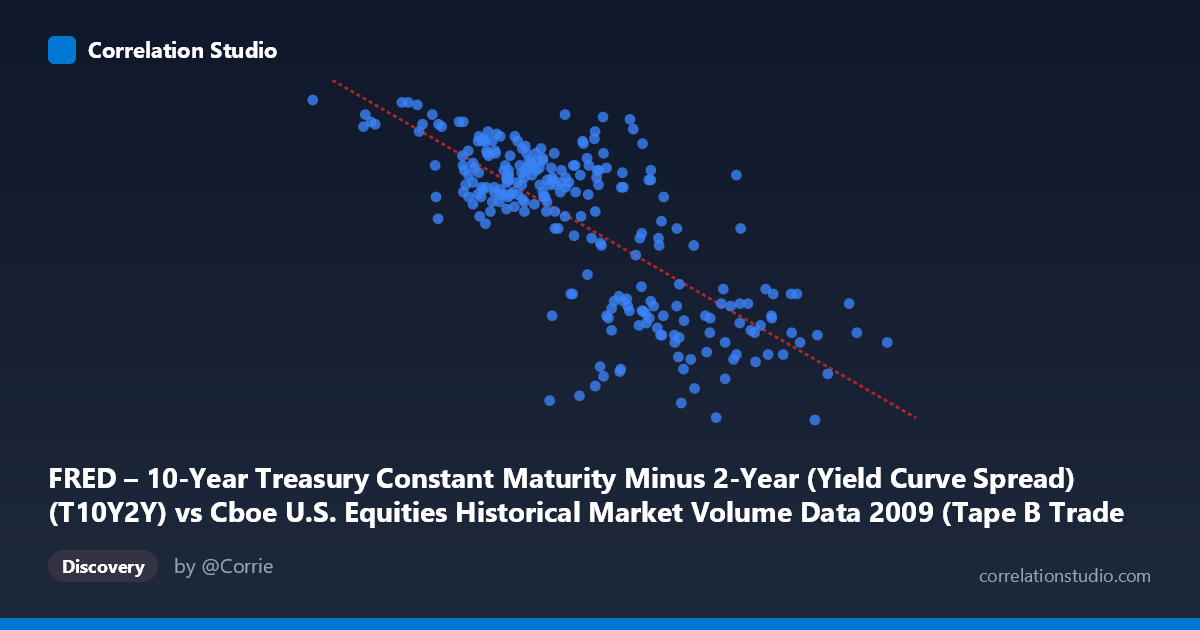
The scatterplot reveals a moderately strong negative relationship between the 10-Year minus 2-Year Treasury yield curve spread and Cboe Tape B trade counts across 2009. As the yield curve spread widens, Tape B trade counts tend to decline, and conversely, compressed or narrower spreads are associated with elevated trading activity. The linear regression equation (y = -2.003×10⁻⁶x + 3.1128) confirms this inverse slope, with the fitted line descending clearly from left to right across the chart. Visually, the data points form a recognizable downward-trending cloud, though with meaningful scatter around the regression line, suggesting the relationship is real but far from deterministic.
Correlation Strength and Statistical Significance
The Pearson correlation of r = -0.7522 indicates a strong negative association, and crucially, the R² of 0.5659 means that approximately 56.6% of the variance in Tape B trade counts is explained by variation in the yield curve spread — a substantial proportion for financial market data, but also a reminder that nearly 43% of variance remains unexplained by this single factor. The 95% confidence interval of [-0.8015, -0.6928] is notably tight and does not include zero, and the p-value is effectively zero across a sample of 250 paired observations drawn from a population of 3,232 trading days, making the correlation highly statistically significant. However, the Granger causality results are striking in their null findings: neither direction (X→Y: F=1.06, p=0.30; Y→X: F=0.07, p=0.80) approaches significance, meaning that past values of the yield curve spread do not temporally predict future Tape B trade counts, and vice versa. This decouples statistical correlation from predictive causality — the two variables move together contemporaneously in 2009, but neither leads the other in a meaningful temporal sense.
Notable Patterns and Outliers
Several features stand out in the sample data. The lower-left region of the chart is anchored by observations with very low X values (e.g., 81,703 at Y=2.82; 156,192 at Y=2.72; 195,624 at Y=2.81), which correspond to the early months of 2009 when the yield curve was still relatively flat following the financial crisis and trading volumes in certain tape segments were elevated. Conversely, the upper-right cluster of high-X, low-Y points (e.g., 766,764 at Y=1.82; 662,859 at Y=1.82; 629,100 at Y=1.92) reflects the latter part of 2009 as the yield curve steepened dramatically during recovery. There is a notable vertical spread around X values of roughly 400,000–500,000, where Y values range from approximately 1.57 to 2.65 — suggesting that at mid-range spread levels, trade count behavior was highly variable and influenced by other factors. No extreme outliers violate the general trend, but the dispersion in this mid-range zone hints at non-linear or threshold dynamics not captured by the linear fit.
Confounding Factors and Interpretive Caveats
Several important caveats apply. First, 2009 was an extraordinary year — spanning the tail of the global financial crisis, the March equity market bottom, and a robust recovery — meaning this relationship may be period-specific and driven by a common third driver (systemic risk, Federal Reserve policy, or investor sentiment) rather than any direct mechanism between yield curve shape and Tape B activity. Second, the axes appear to be swapped in labeling (the dataset description notes T10Y2Y on the X-axis comes from the Cboe volume dataset, and vice versa), which warrants verification before drawing firm conclusions. Third, Tape B specifically covers NYSE American (AMEX)-listed securities, which may behave differently from broader market volume metrics, limiting generalizability. Fourth, the optimal Granger lag of just 1 period may be too short to capture meaningful delayed dynamics, and testing across longer lags could yield different conclusions.
Actionable Insights and Further Investigation
Given that over half the variance in Tape B trade counts is associated with yield curve dynamics contemporaneously, this relationship warrants further decomposition. Analysts should segment the 2009 timeline into pre- and post-March sub-periods to test whether the correlation is driven primarily by the crisis or recovery phase. Incorporating additional explanatory variables — VIX levels, Fed funds rate changes, equity index returns, or broader market volume — into a multivariate model could identify whether the yield curve spread is a true driver or a proxy for underlying market stress. Testing this same relationship across other calendar years (especially more stable periods) would reveal whether this is a structural feature of markets or a crisis artifact. Finally, given the Granger null result, practitioners should be cautious about using yield curve spread as a leading indicator for trading activity planning without corroborating evidence from longer-lag or regime-specific models.
X dataset: Cboe U.S. Equities Historical Market Volume Data 2009
Y dataset: FRED – 10-Year Treasury Constant Maturity Minus 2-Year (Yield Curve Spread)
Part of experiment: Daily - Cboe U.S. Equities Historical Market Volume Data 2009 vs FRED – 10-Year Treasury Constant Maturity Minus 2-Year (Yield Curve Spread)