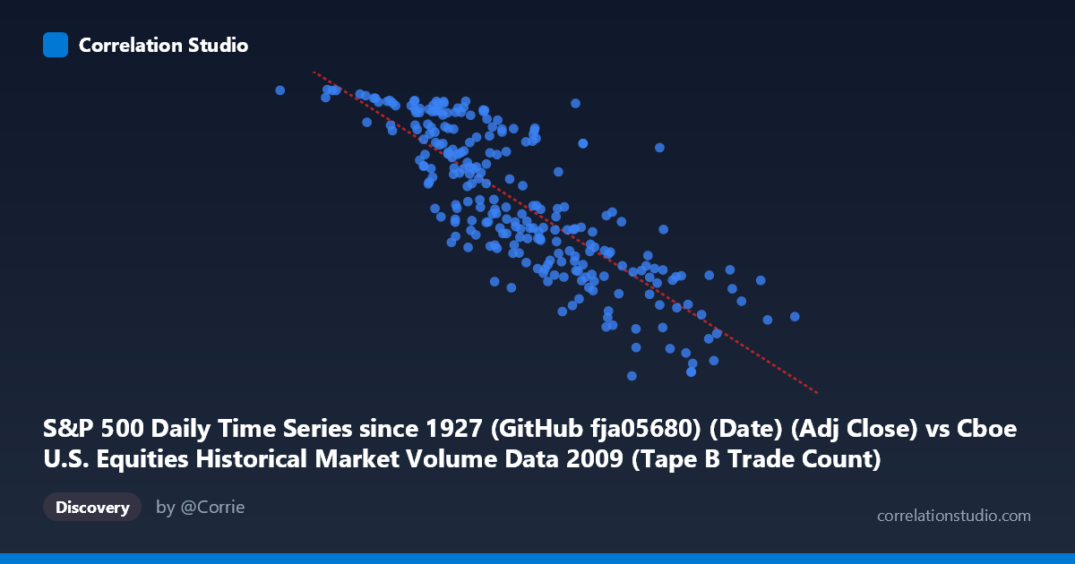
S&P 500 Daily Time Series since 1927 (GitHub fja05680) (Date) (Adj Close) vs Cboe U.S. Equities Historical Market Volume Data 2009 (Tape B Trade Count)
- Pearson correlation (r)
- -0.8154
- Spearman correlation
- -0.8293
- p-value
- 0
- Sample size (n)
- 252
- 95% confidence interval
- -0.853 to -0.7693
- Granger causality
- Bidirectional
- Granger optimal lag
- 10
AI analysis
Analysis: S&P 500 Adjusted Close vs. Cboe Tape B Trade Count (2009)
Relationship Overview The scatterplot reveals a clear negative relationship between the S&P 500's adjusted closing price and the Cboe Tape B trade count throughout 2009. As equity prices recovered from their post-crisis lows, trading volume (measured by trade count) declined — a counterintuitive but financially meaningful pattern. The linear regression equation (y = −0.000755x + 1251.61) captures this inverse trajectory well, suggesting that for every ~1,300-point rise in the S&P 500, Tape B trade count falls by approximately 1 unit, though the practical scaling depends on the units involved. Visually, the data points form an elongated, downward-sloping cloud with moderate dispersion, consistent with a strong but imperfect linear association.
Correlation Strength and Statistical Robustness The Pearson correlation of r = −0.8154 indicates a strong negative linear relationship, and the R² of 0.6648 means that roughly 66.5% of the variance in Tape B trade count is explained by S&P 500 price levels alone — a notably high figure for financial market data with a single predictor. The 95% confidence interval of [−0.853, −0.769] is tight and entirely negative, providing strong evidence that this inverse relationship is not a sampling artifact. The p-value of essentially zero further confirms statistical significance across the 252-day sample drawn from a population of N = 3,232 records. The bidirectional Granger causality (X→Y: F = 2.22, p = 0.018; Y→X: F = 2.26, p = 0.015) at an optimal lag of 10 trading periods is particularly notable — it suggests that neither variable is strictly "driving" the other in isolation, but rather that past values of each help predict the other with roughly equal force. This is consistent with a feedback system where price movements influence trading activity and vice versa, rather than a clean unidirectional causal story.
Notable Patterns, Clusters, and Outliers Several structural features stand out. First, there is visible clustering at two extremes: a group of high-trade-count, low-price observations (roughly X < 250,000, Y 1,050) corresponding to the distressed early-2009 market environment, and a broader cluster of lower-trade-count, higher-price observations reflecting the mid-to-late 2009 recovery. The point near (81,703; 1,126) and (156,192; 1,126) appear as outliers in the upper-left — unusually high trade counts paired with the very lowest price levels — potentially representing panic-driven volume spikes in January–February 2009. Conversely, (766,764; 770) in the lower-right suggests that even at relatively elevated price levels late in the year, trade counts had moderated substantially. There is also modest non-linearity visible in the mid-range (X ≈ 350,000–550,000), where the data fans out more broadly, hinting that a simple linear model may underfit the transitional recovery period.
Confounding Factors and Interpretive Caveats Several important caveats apply. The most significant is that both variables are indexed to time — the S&P 500 rose roughly 65% from trough to year-end in 2009, while post-crisis deleveraging and regulatory shifts likely suppressed trade counts independently. This means the observed correlation may largely reflect a shared temporal trend (a classic spurious correlation risk) rather than a direct economic mechanism between price levels and Tape B specifically. Additionally, Tape B covers NYSE American (AMEX) and regional exchange securities, not the full market, so the relationship may not generalize. Market microstructure changes (algorithmic trading evolution, exchange fee changes), seasonality, and macroeconomic shocks (e.g., the March 2009 bottom, TARP announcements) could all act as confounders. The bidirectional Granger causality, while statistically present, should not be interpreted as structural causation — Granger tests are sensitive to lag selection and omitted variables.
Actionable Insights and Further Investigation Practitioners and researchers should consider several follow-up analyses. Detrending both series (e.g., by first-differencing or regressing out the time trend) would test whether the correlation persists beyond shared momentum, providing a cleaner estimate of the true relationship. Extending the analysis to multiple years (particularly comparing 2008 crisis vs. 2010 normalization) would reveal whether this inverse pattern is a 2009-specific recovery phenomenon or a stable structural feature. It would also be valuable to decompose trade count into retail vs. institutional flows or compare Tape A/B/C splits to assess whether the effect is exchange-specific. Finally, given the 10-period Granger lag (~2 trading weeks), a short-term trading strategy backtest using lagged price signals to predict volume (or vice versa) could be worth exploring, though transaction costs and data-snooping risks would need rigorous control.
X dataset: Cboe U.S. Equities Historical Market Volume Data 2009
Y dataset: S&P 500 Daily Time Series since 1927 (GitHub fja05680) (Date)
Part of experiment: Daily - Cboe U.S. Equities Historical Market Volume Data 2009 vs S&P 500 Daily Time Series since 1927 (GitHub fja05680) (Date)